Somewhere along the line, the powers-that-be realized that perhaps Liefeld’s “greatest” weaknesses — complete lack of page layout ability, utter disregard for basic anatomy, the wordsmithing of a Tourette’s-afflicted kindergartner, unnatural fixation on shouting/grimacing/overwrought faces — could be turned into strengths if he were used as a cover artist instead of a regular interior penciler. Which gives us horrors like the following:

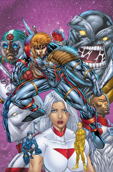
The beauty of the cover layout is that you can easily avoid the little niggling details that bedevil you as an artist, such as anatomical bits you can’t really draw. Which Liefeld has managed to screw up by actually including feet. In his defense, however, it’s really hard to illustrate a scene were a dozen super-powered individuals watch in horror as one of their members takes a power-dump right in front of them without including a foot or two.
It’s hard for me to figure out any other explanation for what this cover is supposed to portray; all I can come up with is perhaps this team consists of a collection of metahuman proctologists, and we’ve interrupted an exam? What’s worse is, judging by the look on the brickish fellow’s face in the upper right quadrant, the exam results are not going to be good news for our hero.
While we’re looking at that guy, notice the lovely spread of phlegmings he’s sporting. I always try to figure out if the clingy ropes of spittle festooning these wide-gaping maws spell something, like an alphabet soup of mucous in some kind of disgusting homage to Hirschfeld hiding his name in his drawings. I think in this case it’s “RAR”, which is possibly Liefeld crying out for help by saying “REPENTANT ARTIST RAVAGER” or “RESIST AVENGER REHASHES”. Or maybe it’s like a double-layered dose of screaming savagery as, denied the right to make word balloons out of inchoate screams of rage, he’s managed to embed a mighty RAAAAAARRRR! in his figure’s mouth anyway. Fight the good fight, Rob, don’t let The Man keep you down!
Of course you’re also given a number of other Liefeld staples here, unfettered by the bonds of a panel. You’ve got plenty of room, for instance, to dwell lovingly on the wicker shoulder pads; the impossibly-held sword hilts; the aforementioned ab-clenching power-squat stance; the background figure with no nose in the full face mask (seriously, how does that guy breathe?!); the spray-paint-on-boobs “t-shirt”; the lack of any sort of background setting other than a generic “space stars”; and random full figures floating about in the foreground. What the hell is that girl doing squatting there? Why is she so very tiny? And what is she standing on that makes a squat necessary?
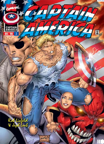
The classic bad Rob Liefeld cover, of course, is the infamous “Floating Body Parts” Captain America joint, which I will urge you to not look at, even though I am putting it next. Look away and save yourself, I beg you!

Again you have the power-dump-squat, although this time the main figure appears to be pooping out random body parts, like the weird disembodied hand or the skull-less face, which seems oddly chipper given the alimentary odyssey it’s just been through. Indeed, the power of this intestinal expulsion is so mighty it appears to have bent Cap’s unbreakable shield, forming it into a bizarrely foreshortened and distended bowl. But the worst is how the massive strain is clearly about to make his entire upper chest explode into a mass of hemorrhaged veins. No wonder Nick Fury looks so depressed; you would too if you had to appear on a Rob Liefeld cover.
And anything that makes Colonel Fury sad gives me reason number nine that I hate Rob Liefeld’s art.
(Top image ©Rob Liefeld; bottom image © Marvel Comics.)


Is it just me, or does Captain America’s neck and upper chest look badly fire-scarred? Guess that blue chainmail must chafe.
Jeff,
What IS up with the floating head and hand? Is it an unfinished drawing of a character, or does the girl have the power to “phase” through objects? Either way, I think he should have left her off of the cover page, but still that only helps MARGINALLY.
Liefeld, you need to enroll at Joe Kubert’s, pronto…. And damn your ‘Bloodblood’ movie….
I’m frankly surprised that you have left out the best of the best:
http://robliefeld.net/xfc1.htm
What the HECK happened to Cable? What’s going on? Better minds than mine have tried to figure out this strange rectangular squat, and we still don’t know what he is doing there.
Oh yeah, and I forgot to add this one:
http://robliefeld.net/cable1.htm
It is the same unreal squat. What is going on?
oh wow… lol These are hilarious! I always thought that the heroes Reborn comics had major problems in the art dept, and now I know why – Liefield did the drawing! And what is his fascination with the squat, anyhow? Has it been determined as of yet, or is it still an unknown? My guess is he’s got an image from when he was young and it’s stuck in his mind as THE “heroic” pose.
Jeff, I have a question: what is the difference between Rob Liefield art and Jim Lee’s art from the same period? Because I was looking at (one of) the cover from X-men 1 (oct. 1991) and I had a hard time figuring out what in this particular cover was different from Liefield. It looks very similar: No feet, a lot of lines, very ripped people, and the yellow/brown Wolvie costume. Maybe you could do a comparative column next time?
The composition and the anatomy in these 2 cover is badly done. If I were Liefield I would consider purchase a few anatomy books to pore over so i can properly draw the characters, as well as draw the main character , then move the characters, as well as the background elements around to find the most dynamic or harmonious composition.
Why does Captain America’s head look so small? Is it the angle or has he been to a headshrink?
Is it just me or does it look like Cap’s hoping for a hand/blow-job from those body-parts just floating there? (they’re oddly close to the crotch)
I have to agree with Zorba-kun there about the body parts there. The location where they were set totally boggles my mind.
What I want to know is: since when do the Red Skull’s eyes glow like computer LED lights?
This artist I find is very bad
this is not about the covers but make some bows and more tops + legwear
For crying out load, enough already guys! Stop expecting realism from a medium that make money out of fantastic ideas like flying alien supermen and an America where justice is championed or even recognised as a worthwhile concept by anyone in authority.
The cover’s of comics aren’t meant to represent stuff or depict scenes form the story – they’re symbolic representations of the nature and tone of the story within each issue.
If you read into the symbolism of the Captain America conver you’ll realise that, like the lady, it’s a disjointed story, possibly a postmodernist narrative intended to force you to reflect back on your own sense of identity and power, further represented by the strong looking hand without an arm – all strength and no support or leverage. The disjointed nartratvie may also be the product of poor writing ability, but whatever the reason at least its flagged for the discerning and visually literate reader so they are not caught upawares by what may seem to the layperson to simply be a bad story.
The Big red guy is exaggerated in size and with glowing eyes because it tells us that the evil in this story is REALLY REALLY EVIL (subtle) and Nick Fury is almost equally powerful, setting up some sort of conflict between good and evil with Captain America stuck in the middle of it. See how intellectual this is?
As for the Cap’n’s stance, well that symbolises that the following story is… well… crap. Painfully so, judging by Cap’s expression.
So cut liefield a break – at least he’s honest about his own work.
I think I set a new typo record in that last post
Rob? Is that you, Rob? Nurse, nurse, Mr Liefeld’s gotten out of bed again!
A superlative analysis, HalLoweEn JacK.
I think the body parts came from a Star-Trek comic where the was some kind of mishap during operation of the beaming machinery(I’m not a Star-Trek fan) and body parts ened up on the cover of another comic book.
In the X-Force cover, Cannonball is high tailing it out of there, because of that toxic cloud building up from the trifecta of squat dumps.
In the Cable cover, Cable has made a tremendous dump, (that would make a blue whale jealous) and has compressed himself inward from the extreme force he had to apply to his bowels. Which is how he came up with the new name for the New Mutants.
One detail that irritates me: all male characters of Liefeld have coke-addict cheeks.