I've updated the HeroMachine 3 Alpha with the following changes:
- Masking now works. More on that below.
- Flipping items now works (though if you then scale it, it will flip back, a bug I hope to fix soon).
- Paintbrush feature now works (applies the current color scheme to whatever you click on).
- Color Hair now works (click it applies the current hair item's color scheme to all "hair" type items).
More on all of this after the jump.
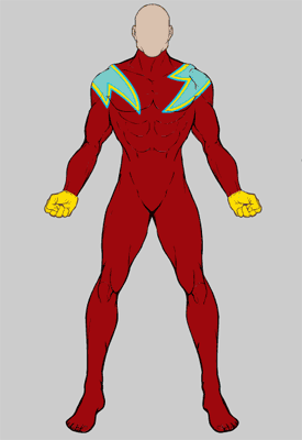
First, a word on masking. To "mask" one item with another means that you only see the bits of the current item that overlap the item you pick as the mask. For instance, imagine you have a Lightning Bolt "insignia" item that you like but you don't want the entire bolt to show up on the character's chest, just one end of it to get a "Lightning Lad" like effect. To do this, you'd do the following in order:
- Choose a Body and add it to the stage.
- Chose the Insignia slot and add a Lightning Bolt insignia to the stage.
- Click the "mask" button, which means you want to select a Mask for the current item.
- Click on the Body you picked and voila. Move the Lightning Bolt around and you'll see that only the parts that overlap the Body will show.
Here's how that looks (from a Warrior update I did a while back):

The most common application of this will be with the HandLeft/Right and ItemLeft/Right slots, and the practical effect of that is to make it look like (for instance) a gun is actually being held in the hand. To do this, you'd do the following in order:
- Pick a HandLeft item.
- Pick an ItemLeft to put in it, like the big bladed Poleaxe.
- With the Poleax as your current item, click Mask.
- Click on the HandLeft item. Voila, the Poleax shaft now looks like it's in the character's hand. Move it around and the mask stays in place, so you can reposition or scale the Poleaxe and always have it look properly held.
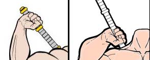
Here's a sample of the difference between not masking (on the left) and masking (on the right):

The difference is subtle but can have a significant impact on how believable the image looks, especially with things like swords and guns. You can also create some nifty uniform effects by using the geometric shapes in "Insignia" (with more of those to come).
The design debate at this point is whether I should automatically Mask any ItemLeft/Righ item with the most recent HandLeft/Right item (if any). What do you think of that idea? In the Modern Warrior contest it didn't seem like very many people understood that, because most of the hand-held items weren't masked, which made them look like they were floating on top of the hands instead of being held in them.

