Most of the time, when you're drawing a comic you want to master page layout as I've discussed before but also to master the position of the characters within a panel as well. In other words, you want to make sure two people standing in a room really look like they're both standing in the same room at the same time.
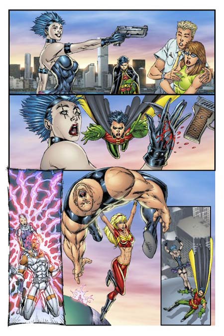
But if you're Rob Liefeld, you just draw each figure as if it were in a stand-along pinup and say to hell with making them relate, as you can see here:

Start at the top, and mentally draw a line from the point of Goth Girl's gun muzzle to the to the couple. For this exercise you'll have to pretend that the hand is holding the gun, instead of how it's drawn here. Because if that hand were actually holding that gun, the muzzle would be pointed way off into the sky.
But I digress.
Drawing that imaginary line, clearly she's not going to be shooting those two people, which makes you wonder why a) they're cowering in fear, since they're in absolutely no danger and b) why he's copping a feel in a supposedly life-threatening situation. "Oh my god, she's going to shoot one of us! I better feel Becky up while I've got the chance!!" Still, none of the four figures here look as if they were drawn together, they all look like they exist in their own separate little world.
So we move to the next panel down, where Robin has chucked a Batarang (Robinrang?) through her hand. Robin, of course, doesn't look like he actually threw the weapon, because he's suddenly five feet in the air and laid out horizontally, both arms straight out in front. Typically when throwing a boomerang-like contrivance, you'd end up with one arm across the body and the other behind you. But then again, you wouldn't be magically levitating, either. Thus the Robin figure in panel two isn't really related to the Robin figure in panel one, since the action matches neither his former position nor the current result. You also have to wonder how his Robinrang made it through the gun handle to slice her palm, since her hand was facing away from him.
Moving on, suddenly we've got pinups of two other sets of figures presumably duking it out elsewhere on the rooftop. Look how long Cyborg's thighs have to be stretched to make his shoulders come up to where the woman's hands are. For this layout to work she'd have to be about four feet tall and he'd have to have the femurs of a giraffe. It's honestly like they were each drawn separately, then fudged to fit in the same panel.
Which is at least better than the second to last scene, where Wonder Girl appears to be flinging the large screaming fellow by holding his kneecap in one hand and his right testicle in the other. I guess I'd scream too in that situation. She looks like she's about ten feet behind the guy she's supposedly holding; I know he's way bigger than she is, but her positioning just isn't right relative to where he is. You wouldn't hold someone that way to throw them, and it looks really awkward. Furthermore you presume she's flying but the way her foot overlays the rooftop makes it look like she's just slipped off it, which is weird given how small the Cyborg-frying duo is in the background.
Finally you're left with Goth Girl delivering a flying kick to Robin on top of the largest water tower I've ever seen. How did they get there? What happened after Robin threw the Robinrang and hovered? Wouldn't they have been right next to each other in melee combat after that jump, in which case how did she get far enough away to leap at him? Or in the intervening two panels did we miss a whole bunch of back-and-forth fisticuffs?
You never get the sense that all of this action is taking place in the same place between the panels, and you never get the sense that the actors are all sharing the same space within the panels. Good comics clearly establish a setting, and then lets their characters inhabit it. This page fails at both ends of that essential task, with no one having any relation to either their setting or each other.
And that's reason number six I hate Rob Liefeld's art.

