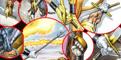
When I say Rob Liefeld can't handle the truth, I mean the truth is that he can't handle anything with a handle. Like swords:

Study those for a bit and see if you can tell the fundamental mistake he's making. Pay particular attention to the one at the top right of the image and try to imagine how in the hell anyone could actually use a sword "held" like that, with the hilt perpendicular to the hand instead of parallel.
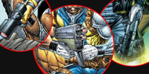
Once you're ready -- feel free to put on sunglasses or something, facing directly into this sort of thing can lead to blindness -- take a look at how he treats hand-held guns (and there are even more guns than swords in any Liefeld comic):

Why are there no fingers curling around the handle of the guns on the left and on the right? What the hell is his left arm grasping in the center image? Again, there's a pattern here. See if you can spot it.
Give up? The explanation is pretty straight-forward, particularly if you remember that Rob Liefeld is a lazy artist:
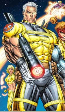
He draws the figures first, with their hands however he knows to draw them, and then adds the items in the hands later. As if they were an afterthought. Which they are, because while shooting guns is kewl, hands holding guns are not. Think I'm crazy? Take a look at this beauty:

First of all, where the hell is that thing pointing? If it's like every other gun ever manufactured in the history of projectile-throwing, the handle ought to be on the opposite side of the sights, otherwise aiming it would be a cast-iron bitch. But in this case that would mean he's going to be pulling the trigger with his penis, which I think even Rob Liefeld understands is probably less than optimal battlefield strategy.
But he didn't draw the gun until after he was done drawing the figure, you see, and by then he was bored with the whole thing and couldn't be bothered with actually drawing his weapon parallel to the arm holding it. That's why you've got the penis-fired orientation and the fact that he's holding it as if it were pointing towards the bottom right side of the panel, and yet the barrel is practically facing the viewer.
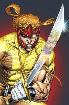
Still don't believe me? Consider this, then:

I defy you to explain that weapon in that hand in that position any other way. Liefeld only knows how to draw hands in three or four different positions. And figuring out how to jam a weapon in those positions takes too much time, so he just crams them in however they'll fit, twisting them however he needs till it looks right enough to get out the door.
Here's what happened with that particular cover, I guaran-damn-tee you. He drew the figure first, thinking "It'll be awesome to see Cannonball reflected in the sword!" But then when he was done with the fun part -- the figure -- he realized that if he put the sword actually in its hands, the thick part of the blade would be off-panel, and you couldn't see the reflection. So instead of just redrawing the hands, he skewed the sword blade thirty degrees and called it kewl.
Because he's lazy.
And he doesn't know how to draw things in hands.
And that is reason number six why I hate Rob Liefeld's art.

