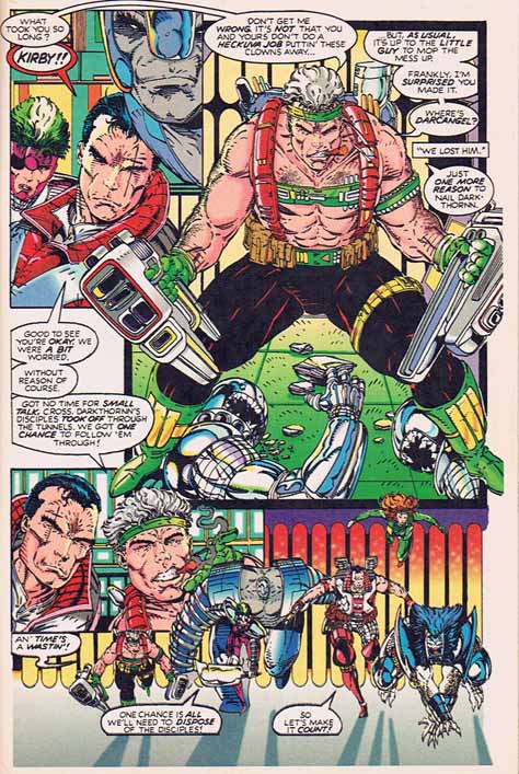
Setting matters, and in comics you establish and maintain setting in every panel, on every page. Rob Lifeld, being lazy when it comes to his art, of course can't be bothered with a) figuring out where the action takes place, much less b) either drawing or remembering it as he goes along. As a case in point, I bring you page 3 from "Youngblood" number 2:

Try to figure out where this might be taking place, I dare you. And don't feel bad, even if you have the entire issue as I do, you still can't figure it out. At some points they appear to be running through a long technical tunnel of some sort with a blue floor. Then on the next page (the one shown above), the floor is green tile. Figures appear from nowhere , seeming to be added and removed from the stage like some power-mad director showing off at the community theater. Notice how at the top right, "Kirby" has dead enemy agents at his feet, but immediately following they are nowhere to be found as the heroes run down the suddenly-enormous tunnel.
The backgrounds add to the confusion. You don't have to draw detailed scenes every panel, but you have to give the reader something to go on. Here you've got random blocks of color interspersed with an advancing wall of pill-shaped glowing blobs. Why? Who cares, it's time to blow some shit up!
It's not just the backgrounds or the relative positioning of the characters in the scene, either, it's also the actual layout of the page itself. Layout is one of those extremely difficult skills which, when properly executed, is completely transparent. Like a referee in a sporting event, good layout should never be noticed, it should just make everything work better.
Try to follow the dialog progression here, which gets shoved up against the walls like furniture in a bachelor's apartment. At the top left you get confused as to who's saying "What took you so long?" because there's a giant gray-headed, wrestling-mask-protected noggin in the way. Would it have been so hard to move that over to the middle so that "Cross", the guy speaking next in shocked reaction (with an immobile face right out of the Kevin Costner Acting School) and his corresponding balloon would be closer to where your eye needs to go next?
The dialog to the upper right and lower left of "Kirby" is pretty much interchangeable, you could read either set and it would make just as much "sense". Which is good, because come on, it's not easy to tell which should be first based on where they appear.
A good comics page layout draws your eye naturally in sequential order, presenting the story in an interesting and intuitive way. The alternative is to do what Liefeld does here, also known as the "Story in a blender" approach.
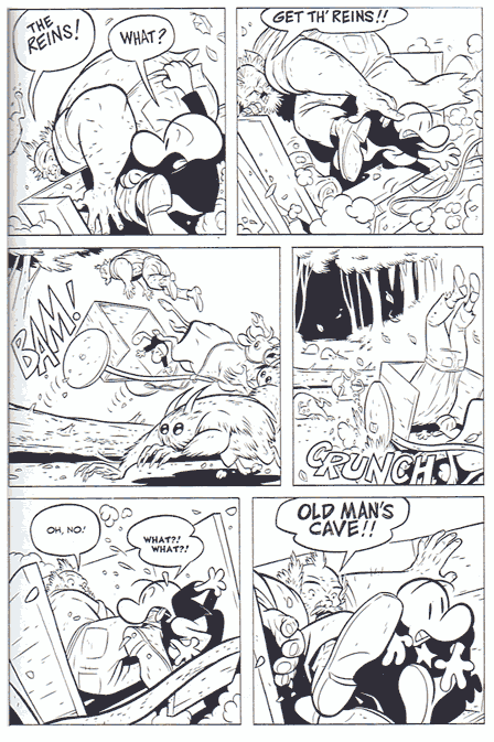
Lest you think I am being too picky, I would like to show you a proper comics page. Jeff Smith's "Bone" was published at about the same time as the Liefeld "Youngblood" issues, but take a look at how different the reading experience can be:

Granted, Smith's is in black and white, not subject to the horror that is Brian Murrays "color design", but regardless, look at how clean this page is. With fewer actual lines than Liefeld's "the cost of ink is no object!" approach, Smith clearly establishes a setting (forest on a path), positions all the actors in a coherent manner, and is able to generate a real sense of motion, danger, and action. For all of the sturm and drang of Liefeld's mightily-muscled characters, bristling with weapons and incipient violence, you never get a sense of what's really going on in the page.
Look at how Smith goes from a close-up of the two figures in the cart to a long establishing shot showing why they're suddenly airborne, back to progressively tighter views to hype up your understanding of the characters' feeling of imminent danger. You never get lost as to where they are, or what's going on, and the result is that you really feel like you're in the middle of the action.
I realize comparing Jeff Smith to Rob Liefeld is like asking you to consider Einstein and Captain Kangaroo's scientific theories on the same playing field, but the point is that layout matters. Setting matters. There were people in the past who mastered it. There were people working at the same time as "Youngblood" who had mastered it. And there are people now who have mastered it. But none of them made as much money or had as much of an impact on comics as Rob Liefeld.
And that is reason number four why I hate his art.
(First image and characters © Rob Liefeld, 1992, from “Youngblood” #2. Second image and characters ©1994. Jeff Smith.)

