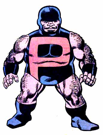
I like John Byrne's art. It's clean, simple, anatomically accurate, dynamic, and interesting. And usually, I like his costume designs, particularly his "Alpha Flight" team, but one of those Canucks has always bugged me:

I sympathize with Puck's dilemma. He wants a big ol' letter on his chest just like Superman, but he's so small the letter takes up his entire body. It still looks ridiculous, though, as if his mom wrote his initials in his costume so he wouldn't lose it at camp, only she drew them REALLY REALLY BIG.
The other problem is that the short-shorts conspire with the fireplug helmet to make him look even shorter. It'd be like Fat Albert wearing horizontal stripes; why accentuate your problem areas?
I do appreciate Byrne throwing a bone to the more hirsute members of his reading audience (werewolves, yetis, and me) by throwing on the copious amounts of body hair, but any time you have a character whose head is at waist-level to most people, the last thing you want to do is to make them think "pee". I'm just sayin'.

