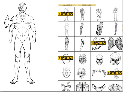
The biggest challenge so far in designing HeroMachine 3 has been how to let the user control multiple items in the same slot, particularly multiple examples of the same item in that slot. For instance, if you want three Colt .45's on the character, trying to present the controls for them in an intuitive way is hard. Today I've been working on how that might work, and I have a screen shot of the simple test movie:

The idea here is that when you click on an item to add it to your character, a tool bar gets added to that item's preview box. At a glance, then, you can tell which items are loaded and which are not, which is a deficiency in the current round of Minis. The first item in the new item tool bar is a number with a little drop-down arrow next to it. The idea on this is that if you have the aforementioned three Colt .45s loaded, clicking on the dropdown will cycle through each one in order, from 1 to 2 to 3 and then back to 1. I would probably add something that would briefly highlight the actual item on the character, too, so you know which number goes with which of the guns.
The next button on the tool bar is a lock/unlock toggle. Clicking that will lock the current item so it doesn't get removed when you add another item from that slot.
Next comes the Delete Item button, which would remove that item from the character (and the toolbar from the preview box, so you know that item's not loaded any more).
Finally you have the Reset button, which will return the item in question to the default rotation, scale, and colors.
The "Dupe" button would go away in this scenario. I think it was confusing and non-intuitive to use, and hope that this new way -- focusing on the items -- might be easier.
What do you think?

