Rather than focusing on a bad costume this week, I want to take a moment and talk about another common blight on the super-hero comic landscape: bad anatomy.
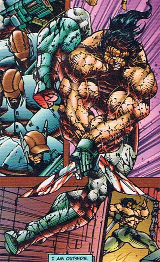
Examples abound, but let's focus on just this one panel from "Prophet" number 4, which is ©1994, Rob Liefeld. Note that Liefeld isn't the illustrator here, just the creator/writer*. No, the "honors" for the inking and pencils both go to Stephen Platt (which shows why having the same guy do the inking and penciling both can be a really bad idea, but that's a rant for another day). Anyway, here's the panel:

Yes, this is the same issue the second-to-last Caption Contest was taken from -- it's the gift that keeps on giving.
Just look at this panel for a few moments. Once you're able to separate out the figure from the surrounding elements (made much more challenging by the atrocious color design, nonsensical panel layout, and obscure -- at best -- backgrounds), see if you can tell what's off about it.
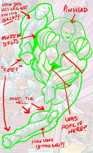
Done? All heaved out? Good. I've taken the liberty of diagramming the image in Photoshop for you, pointing out some of the ways Platt went off the rails here:

Exaggerated human anatomy is one of the staples of the genre, from the 7-head tall body to the big muscles to the extremely dramatic poses. But you have to understand the basic anatomy before you can successfully exaggerate it. That's part of the problem with the Image-style necks, bulbous thighs, and enormous forearms, they just throw in huge groups of muscles and bones that simply don't exist. At all. That's not exaggeration, that's invention, and it's extremely difficult to get right.
Look again at that Prophet illustration. His legs are broken, flat out. There's no other way for the human body to get into that position. His forearms are literally the same width as his upper arms. And finally, not to be crude, but he's got an ass-hole the size of Brooklyn if you look at where his legs join the torso. That can't be healthy.
It's like someone took a Todd McFarlane Spider-Man drawing and pumped it full of helium till it ballooned to the desired proportions. And the only thing about McFarlane that should be that full of hot air is McFarlane himself. At least he earned it.
*Goodness knows I could write reams about how awful the writing and concept are as well, but focus, people, FOCUS!

