I spent the latter half of last week finishing up client change requests on the "Horror Mini" (you remember, the one that was supposed to come out at the beginning of December? Yeah, right) and the Zombie Mini, both of which I think are finally Done with a capital D. I think. Hope.
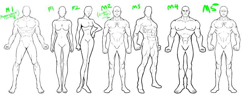
So the last two days or so have been spent thinking more about HeroMachine 3, and drawing out some figures. I'm a bit torn on this score, as I have the sneaking suspicion that the art style I'm using sucks. It's hard to say from the inside, because I don't know if there's a moment when you as a creative person think "OK, this is my style, that's how I'm doing it from here on out." It seems more organic than that to me, that you just sort of fly along, doing what you do, and eventually you look back and realize you could pick out something you drew from a thousand other pieces, not just because you know you drew it but because it looks like you somehow. And wham, there's your style.
I'm not there, not by a long shot. I think the basic figure of the Minis is decent, and I like the stuff I'm doing as the prizes for the Caption Contests, but I still (at almost 40 years of age, blegh!) don't feel like I've figured out yet how I draw.
It's like this. When I look at the Her-O-Matic, everything in it is very tight and cohesive. And that's because he is using Bruce Timm's style, which is very well thought-out and meticulous in its adherence to its own rules. As any animated series must be, when you're relying on hundreds of people overseas who don't even speak the same language you do to draw all those thousands of cels. You have to have your art direction absolutely rock-solid, and it definitely shows in all of Timm's DC Animated Universe stuff.
So when you look at output from the Her-O-Matic, you know in an instant what you're looking at. And it works. It's absolutely a cohesive illustration.
I don't have that, certainly not in HeroMachine 2, which isn't surprising given that it consists of artwork strung out over the course of almost ten years. Given the (let's be honest) not very good figures the whole thing is based on, a lack of a satisfying portrait is unsurprising.
That's one of the things I'm most excited about for HM3 and with the Minis, that I was getting to start from scratch and rework it all from the ground up. And I have to say, when I see the stuff people have come up with, it definitely looks a lot tighter than any previous version. I can't wait till the Game Contest is over and I can see all the entries, but even just the ones in the gallery UGO put out were pretty nice looking.
Which is all a long, angst-ridden way to show the figures I've come up with so far for possible HM3 usage, and to ask if you're happy with the artwork in the recent minis.


