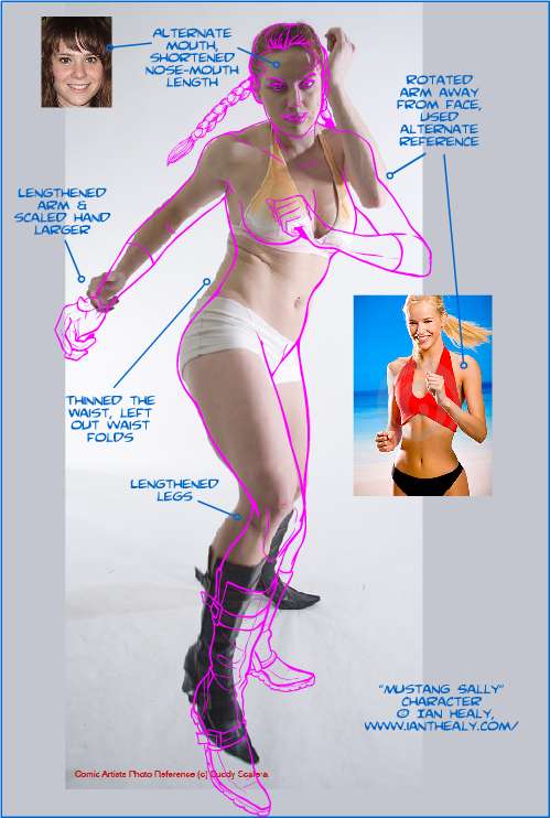
I thought you might like to see how an illustration is put together. After the jump I'll post an edited image I created while putting together Ian's prize for winning Caption Contest 42.

I've put the actual "inked" illustration lines in pink so you can see them more easily. The final illustration itself is here.
The large reference photo in the background is from a great book/DVD set called the "Comic Artist's Photo Reference: Women and Girls". Author/photographer Buddy Scalera put together photo shoots with a variety of models in a series of different poses of use to illustrators working in comics or related fields. You get them leaping into the air, holding swords, swirling capes around themselves, that sort of thing. Having all of the images (and more) from the book on the accompanying DVD is a great aid for me, since I work completely digitally; I just cut and paste the image into Flash, slap a new blank layer on top, and off I go.
The key thing when doing something like this is that you must understand what it is you're drawing. For instance, you can see I've lengthened the figure's right arm considerably, and made her hands much larger. Obviously the photo is anatomically correct, but the mind doesn't process images literally. When you see a photo of someone who is supposed to be heroic, you expect the proportions to be heroic as well. The head should be smaller in relation to the body than average, the hands and feet are usually a bit bigger, the legs are longer, etc. You need to be aware of that when using photo reference, or your super-heroes are going to look like ... well, like the people they're trying to save, rather than the one doing the saving.
Halfway through the illustration, I realized I didn't like having her left arm up around her face, so I had to move it down and in front. I wanted to be able to see her face clearly, to get a better idea of what kind of character she is. I also wanted to give the impression that she's about to take off running, which is her super-power. Meaning super-speed, not cowardice, that would hardly be a good power, now would it?
Anyway ... yes, the arms. I found a reference photo of a woman's arm in the right position, and sketched that out, copying and pasting it into the original figure and sizing it to fit. I did the same with a more appropriate smile. Once I had the basic figure down, I added the other elements like gloves, costume, braids, etc. I also had to fill in the bits that were previously covered by her arms but which were now visible.
And then she was done, and Ian was pleased, and there was much rejoicing.
Hope you enjoyed this little behind-the-scenes look at how some illustrations are put together. And that you realize that the figures you see in comics, or in advertising in general, are idealized figures and not terribly accurate ones at that. Even photographs of famous models have the legs stretched, blemishes removed, eyes artificially re-tilted, hair highlighted and thickened, on and on. The world is full of illusions, my friends!

