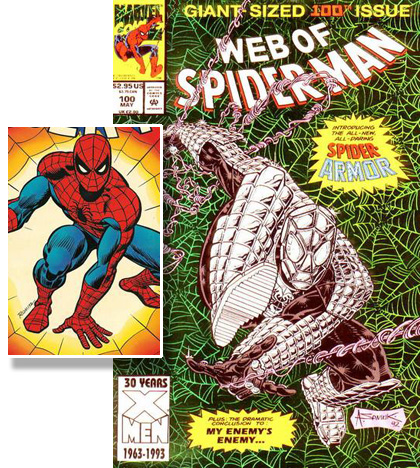
Sometimes, ideas should just stay in the editor's pitch room. Sadly that didn't happen in the case of Armored Spider-Man:

Spider-Man's actual costume is a classic, with bold simple colors, the eerie eyes, and of course the webbing that really clinches the deal. This armor redesign takes all of those great elements and spits on them. Without getting too fan-boi on you, let's just say that if the Michelin Man decided to go into the armored-insect-hero not actually based on a real armored insect business, this is the costume he'd design.
Is that metal, or padding? Why, if you're building armor, would you make the eyes that huge? How does Peter grip onto walls and ceilings with giant metal cleats on his feet? Many questions, but only one answer -- armor was hot in the Nineties, so they put it on everything.
What really irks me about this is that Spider-Man's whole thing is avoiding the big hit -- that's what his Spidey Senses are for. Given that, why would you weigh yourself down with dozens of pounds of metal? I can't imagine anyone being either nimble or quick in that getup, unless they're planning on hitting the bad guys while they're doubled over in laughter.
When you've got a classic, leave it alone. I'm looking at you New Coke, Armored Spider-Man, and Rob Liefeld's Captain America!

