Monthly Archives: November 2008

Contest 33 Winner!

The winner of Caption Contest 33 is ... MLS!
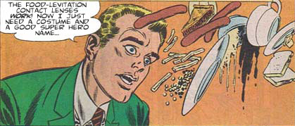
contest33-winner.jpg

MLS wins a custom black and white illustration of whatever they like (within reason), which I'll post to the blog when completed.

There were a lot of really good entries this time, I guess everyone gets inspired by floating wienies. I know I do. Here were the ones I thought were particularly funny:

  • Meg: Unidentified frying objects!
  • Vengeance: Cry havoc! And let slip the pies of war!
  • Will: Oh no! My “dinerkinesis” manifests itself at the worst times!
  • Niall Mor: This is the second weirdest breakfast buffet I’ve ever seen.
  • Kaldath: I know I said I wanted my order to go but this is ridiculous!
  • Rick: I said I like the same thing every day not everything the same day!
  • Danny Beaty: I’ll never eat at Chez San Andreas again!
  • Yusuf Mumtaz: The Telekinetic Waiters union is getting too powerful.
  • Whit: This isn’t what I meant when I ordered a float!

It was a real toss-up for me between MLS's entry and Meg's, Vengeance's, Will's, and Niall Mor's. All of them I thought were especially creative and funny and I had a really hard time deciding. I particularly tip my hat to Will for coining a wonderful new term; I look forward to Marvel's upcoming "Dinerkinesis Man", I think we can all agree that would rawk. I think what finally decided me in MLS's favor was the whole concept of a guy deliberately setting out to create -- on purpose -- lenses whose whole purpose was to levitate food. That's just awesome. And then imagining what kind of outfit that kind of guy would come up, that just cracks me up and tickles my brain in just the right way.

Many thanks to everyone's awesome entries this week, they are truly inspired. Congratulations to MLS, and to all of the honorable mentions as well. Great job everyone!

Your chance to win your own custom black and white illustration of whatever you like is coming up in just a bit, so be sure to check the site often!

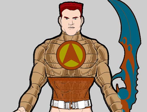
Warrior mini insignia sample

Here's a screen grab showing the way the Insignia slot is really going to make some cool things possible:

insigniasample.jpg

I've chosen the banded shiny metal Top here to serve as the base. I selected a round Insignia, colored the outside orange and the inside light bronze. I checked the "Dupe" box, and added a chevron-shaped insignia, made both color areas orange, flipped it top to bottom, and scaled it narrower to fit inside the previous circle. I then set the outline of the chevron to 0% visibility, so I just had the color areas.

Finally I chose a square Insignia and sized it to fit the width of the character's waist. I chose lighter and darker orange for the two colors, and changed the alpha for the inside color to 60%. I added the scale pattern to make it look like chain mail, and finally Masked it with the Top item, so you only see the Captain America-ish stomach band.

Pretty neat, ain't it?!

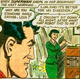
Random Panel: From the upcoming Superman-Vision crossover!

loisbackentrance5zq.jpg

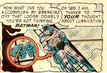
Random Panel: "To the bat-lube, Robin!"

badthoughts5ci.jpg

(With thanks to Superdickery.com)

META: Out all day workin' that pole … er, polling place

Just a heads-up that I'll be out all day working the election for Burnet County, so be super to each other. Or something.

Warrior mini patterns

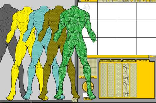
I spent the day today programming in the "patterns" for use in the upcoming Warrior Mini. Here's a screen shot of the ones I have so far:

patternssample.png

If that's hard to see, they are fishnet/diagonals; hexagons; scales; rivets; and camouflage. The camo in particular is pretty neat. All of the patterns are semi-transparent lines & shades of gray, so the color you pick for the item in question comes through and tints the line. That way you can have green jungle camo pants, or sandy desert camo pants, or snow white and gray camo pants, etc. One drawback to that is, you can't directly change the color of the pattern, it relies on the color underneath it. So you can't, for example, make the actual rivets a different color from the shirt they're put on.

Another drawback is that you can either have the item serving as a mask or hosting a pattern, but not both. So for example, if you wanted the lightning bolts to be masked by the body (so you could get the off-shoulder look I had in a previous sample), you couldn't do that AND have a pattern on the body too. Well, you probably could if you had two bodies, one regular with the pattern on it, and another turned to be invisible serving as the mask for the lightning bolts. I assume Kaldath et. al. will be plumbing the depths of these sorts of things and showing me things I didn't think were possible 🙂

Anyway, I hope it's a good feature that will make the applet all that much more useful and fun.

By all means, please feel free to suggest other patterns you'd like to see, I've got room for at least two more, and I can resize the buttons to fit in as many as seem worthwhile.

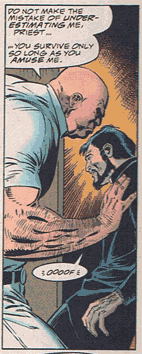
Random Panel: The altar boy's revenge!

firebrand-6-father.png

Poll Position: Game changers

This week's poll position posits:

{democracy:55}

I originally thought, "What power would, if everyone in the world had it, most dramatically change human society?" but then I thought it might be more fun to speculate on what you yourself would do if you were singularly gifted, and everyone else stayed the same. So here we go!
Continue reading

Random Panel: When great ideas are a littttle too far ahead of their time

eclipso-4-steer.jpg

Random Panel: Next, awkward silence when they tell him to "Jiggle the mouse"

mighty-mouse-7-enter.jpg