Monthly Archives: November 2008

The horror, the horror!

"So Jeff," I hear you asking out there in Internetland, "just what the heck are you doing with your time, since clearly you are not bringing teh funnah on such a regular basis the last two weeks and the Warrior Mini is pretty much done?" To which I reply, "Why am I hearing voices in my head again, did I not take my lithium?"

Seriously, joking about mental illness is not funny, I regret that last sentence and refer you to my many other substantive, caring, mature posts dealing with such weighty matters as cabbages, thinly veiled penis jokes, and vaguely homoerotic spandex fetishes, not to mention the thousands of words I have penned regarding the pressing scatological issues of our time.

To answer your impertinent and personal questions, however, the fact is that I have been spending night and day for the last two weeks drawing skulls, bones, horns, pulsating skinless muscles, spike-clad leather pants, and much more, all in service to a new client-sponsored top secret HeroMachine Mini I like to call ... "Mini Horror!"

Hmm, that doesn't spawn the sort of bone-chilling dread I'd hoped. I instead have flashes of Mini-Me in latex cracking a whip at me, which results in giggles. Not at al the effect I was going for. I think instead I'll settle on "HeroMachine Horror Edition" instead, at least it sounds somewhat professional.

I'll post some sample images below the fold, and if you have any particularly gruesome or morbidly fantastic items you've always wanted to see in a HeroMachine version, speak now or forever hold your severed head. Or whatever.

Continue reading

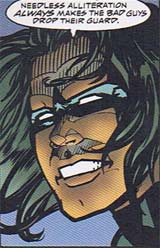
Random Panel: Robin's combat tip #24

batman-doj-1-alliteration.jpg

At least it's not a spork

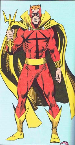
For your bad costuming consideration, I present Marvel's "Hellstorm":

bad-hellstorm.jpg

The actual costume isn't that bad, with a strong and simple color scheme and some nice elements to it. What has me concerned is that weapon.

Not to put too fine a point on it, but he's trying to threaten people with a fork.

Don't get me wrong, in terms of tableware a fork is definitely right up there behind the knife, and certainly well ahead of the spoon. So props to him for that, but I just can't help but recommend, were I advising him, to perhaps get away from implements of fine dining altogether. Consider farm tools, perhaps, or even (if he's feeling bold) actual weaponry, you know?

Still, a fork is what he chose, and to give him credit he did try to jazz it up a bit, with all the curves and the long outer tines and the shiny gold and whatnot. But despite what some super-villains would have you believe, size does matter, at least if you're waving place settings around, and this one is just too short. Granted, he can make the handle grow longer to become a true trident, but as it is this looks silly.

And repeating the design as his logo isn't helping. Oh no. Even when the thing's at maximum extension, one look at the chest emblem is going to remind everyone that while it's not the size of the boat but the motion of the ocean, nonetheless Hellstorm's usually sporting a dinghy. Metaphorically speaking.

I do think it's cute that he made the cape ties look like little skulls because nothing butches up an outfit like tiny, tiny bones. Ooh, he killed some mice, look out, he really means business with that fork!

(Image and character ©Marvel Entertainment Group, Inc.)

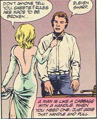
Random Panel: More great moments in bad analogies

vamps-3-man-cabbage.jpg

Caption Contest 36: "MOM! I TOLD YOU TO KNOCK FIRST!!"

It's time once again for the Internet's Mightiest Caption Contest, brought to you by Jokin' Jeff the Japemeister and the entire Bertram Bullpen!

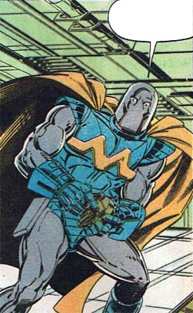
Whoops, got taken over by the spirit of Stan Lee for a moment there, my apologies. But you can understand the confusion, given that the Caption Contest panel for this week was drawn by none other than that mighty penciler of legend and Stan Lee contemporary, John Buscema!

squadron-supreme-7.jpg

If you come up with the funniest/best replacement dialog for this comic book image, you'll win your very own custom black and white illustration by professional artist Jeff Hebert of whatever you like (within reason). The rules are simple: No more than three entries per person, left in the comments to this post, which are all to be PG-13 rated or better. That's it, so put on your thinking cap and start captioning!

Contest 35 Winner

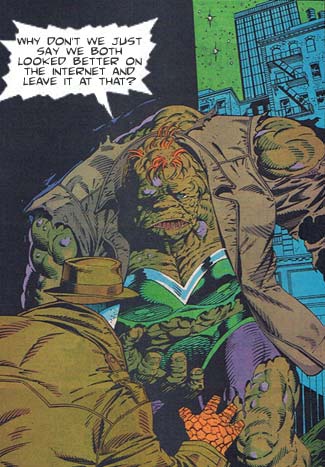
The winner of Caption Contest 35 is ... Meg!

contest35-winner.jpg

Meg will receive a free custom black and white illustration of whatever he or she likes (within reason). Look for your chance to win your own professional drawing every Tuesday right here at HeroMachine.com!

The other honorable mentions from this week were:

  • TheNate:
    1) Excuse me, are those Bugle Boy Jeans you’re wearing?
    2) Ding dong! Avon calling!
  • Rick: Yancy Street Makeover my ass!!!
  • Meg: Honey? Does this crusty greenish skin make me look fat?
  • C. Yusuf Mumaz: Those people at Maybelliene… I’ll give’em a real challenge!
  • The Doomed Pixel: “Dad, I think I’m allergic to bees!”
  • John D: I…want….MIDOL!!!!!!!!

I almost went with Meg's other entry, because I like to use the word "crusty" whenever possible, but I thought maybe the internet one had broader appeal. I also liked the unspoken assumption that Ben Grimm would go out on a blind date wearing a mask, as if to hide his identity without noticing his giant orange rock hands poking out the ends of his coat.

Finally, as I said in the comments, Rick gets bonus points for the old-school Yancy Street Irregulars shout-out.

Nice job everyone, many thanks for your creativity!

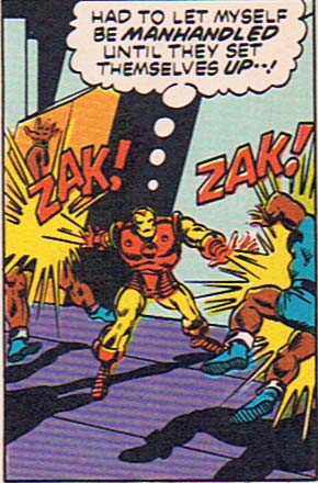
Random Panel: You keep telling yourself that, Tony

marvel-4-manhandled.jpg

Poll Position: Super stopper

The Poll Position for this week is:

{democracy:57}

Discussion after the jump.
Continue reading

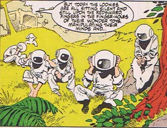
Random Panel: What political bloggers are doing now that the election's over

rocketraccoon-4-loonies-silent.png

Retroview: The Life of Captain Marvel

These random comic book baggies are strange. Sometimes I can go through all ten and I get nothing worthy of comment, just a big pile of meh. Other times, one issue is so chock full of great, mockable items I almost can't believe it. A case in point is "The Life of Captain Marvel", a 1985 reprinting of Jim Starlin's 1968 "Captain Marvel" run:
Continue reading