Art Adams can flat out draw, folks, and what's more is, he understands how to draw for comics, a skill set that's unfortunately rare even among professional comic book artists. I was lucky enough to pick up the first issue of his creator-owned series "Monkeyman and O'Brien" recently and every page is just jam-packed with the kind of hyperkinetic, frenzied, fun, sharp layout that you can only find in truly accomplished super-hero titles. I want to do a full retroview of it on Saturday, but in the meantime I'm going to focus specifically on how well Adams understands and uses the power of onomontoPOWia to enhance his storytelling.
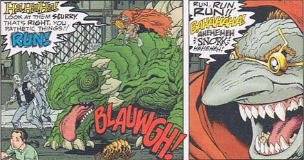
First I want to highlight how his incorporation of onomontoPOWia into the actual word balloons themselves brings even the dialog to life:

You rarely see this technique, probably because it's so easy to do poorly. And when done poorly, it really breaks down the third wall and destroys the reading experience. Done well, though, it's very powerful; I feel like I can almost touch the words coming out of The Shrewmanoid's pointy-toothed mouth. Were they left simply as computer-rendered text, you'd lose a lot of the richness you get from the varied colors and style treatments, that extra sense of just how nuts this guy is. Even little things like the color choices for the words are good here, helping to sell tonal qualities that you can normally only get through actually, you know, hearing.
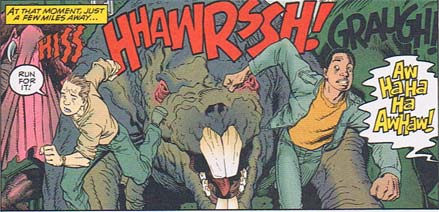
You see the same sort of thing at work in the next panel, although the bulk of the audio storytelling here falls to the more traditional sound effects coming from the giant mutant creatures:

You're probably not going to see "HHAWRSSH" or "GRAUGH" in other comics, but they don't seem too artificial or forced like a lot of the stuff I read. Partly, I suspect, that's due to Adams' integration of the onomontoPOWia into the planning of the panel itself. When you know ahead of time (by virtue of being the sole illustrator on the job) that the giant rat mutant is going to be making a sound, you can match the audio to the facial expression so they're in harmony. Contrast that to a penciller just being told "There'll be some sound here" (if that) and having to wing it, and the effect only getting added later during lettering. Note that even the contours of the word balloon help sell the maniacal laughter; Adams is completely in control of the visual vocabulary he's using to tell this story, and it shows.
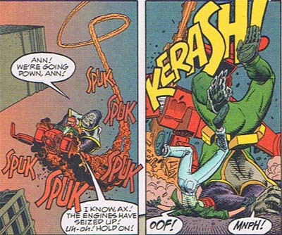
Finally, I want to show how well onomontoPOWia can be used to help propel a panel forward in time. Remember, all comics are static images of kinetic moments and onomontoPOWia is the only tool the creator has for trying to portray something that ordinarily exists only in time -- sound. Watch how Adams is able to take that disadvantage and turn it around to give life and movement to the scene here:

The combination of the changing size of the "SPUK" sounds, aligned with the smoke contrail and the brilliantly subtle color gradient from lighter to darker orange, help drive home the feeling that Monkeyman and O'Brien are hurtling directly towards you. It's like cognitive kung-fu, forcing your brain to put the figures at each stage of the timeline being hinted at here, subconsciously making you do the work of assembling the little movie in your head. It's brilliant, and I love it -- motion through motionless, sound through static, dynamism through stasis. That's comics, folks!
I also want to point out that Adams doesn't have to go overboard with the background to sell these panels. The burden of conveying just enough realism falls on the shoulders of the figures and the onomontoPOWia, particularly in that second panel. Other than the crashing airfoil and the tops of a couple of buildings, you pretty much just have a blue plane there. But it works. And the reason it works is that Arthur understands panel composition, how to put everything just where it needs to be to make a powerful and effective scene.
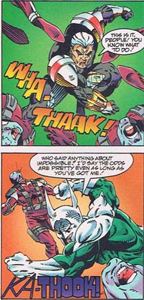
Contrast that mastery with the following two panels from Image Comics' "Brigade", published just three years earlier:

Just like in the earlier example, you've only got a plain colored background in the two panels, but what a difference in storytelling impact! The onomontoPOWia here is artificial and incidental, standing apart from the action rather than being integrated into it. Because of that it comes off as lame and unnecessary, detracting from the action instead of enhancing it. In the top panel you have a color gradient just like in the Adams example, but here it serves to call attention to the words. Adams uses the effect to help sell the idea that the sound is coming closer and closer to the user, leveraging our instinctive visual interpretation of perspective. In the Image effort, the gradient's just there because, hey, cool Photoshop effect!
I'm not even going to get into the Grand Canyon-sized talent gap between the figure-drawing ability of the two artists. It's embarrassing, and I frankly don't know if I have a harder time believing that Image actually charged people money for this amateurish, hackish crap or that people actually went ahead and paid for it anyway.
Look, do yourself a favor next time you're in your local comics shop or half priced book store, and find some Arthur Adams work. The guy's brilliant, and your time hunting through the back issues box will be well rewarded by panels like what you've seen here -- fun, entertaining, professional comics from someone in full command of the entire visual toolchest that makes the medium so amazing.
(First three images ©1996, Arthur Adams, "Monkeyman and O'Brien", No. 1. Story and art, Arthur Adams; lettering by L. Lois Buhalis; coloring by Laura Allred.
Last image ©1993, Rob Liefeld, "Brigade" No. 3. Pencils by Marat Mychaels; lettering by Kurt Hathaway; "color design" by Brian Murray; inks by Paul Scott and Norm Rapmund. Yes, it took TWO people to ink that stuff, and still that's as good as they could make it.)

