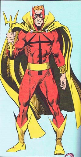
For your bad costuming consideration, I present Marvel's "Hellstorm":

The actual costume isn't that bad, with a strong and simple color scheme and some nice elements to it. What has me concerned is that weapon.
Not to put too fine a point on it, but he's trying to threaten people with a fork.
Don't get me wrong, in terms of tableware a fork is definitely right up there behind the knife, and certainly well ahead of the spoon. So props to him for that, but I just can't help but recommend, were I advising him, to perhaps get away from implements of fine dining altogether. Consider farm tools, perhaps, or even (if he's feeling bold) actual weaponry, you know?
Still, a fork is what he chose, and to give him credit he did try to jazz it up a bit, with all the curves and the long outer tines and the shiny gold and whatnot. But despite what some super-villains would have you believe, size does matter, at least if you're waving place settings around, and this one is just too short. Granted, he can make the handle grow longer to become a true trident, but as it is this looks silly.
And repeating the design as his logo isn't helping. Oh no. Even when the thing's at maximum extension, one look at the chest emblem is going to remind everyone that while it's not the size of the boat but the motion of the ocean, nonetheless Hellstorm's usually sporting a dinghy. Metaphorically speaking.
I do think it's cute that he made the cape ties look like little skulls because nothing butches up an outfit like tiny, tiny bones. Ooh, he killed some mice, look out, he really means business with that fork!
(Image and character ©Marvel Entertainment Group, Inc.)

