In 1985, Marvel (through their mature-audience "Epic Comics" line) published a six-issue limited series written by Chris Claremont and illustrated by John Bolton titled "The Black Dragon". A "historic fantasy" set in medieval Europe, it was an unusual offering in a super-hero-crowded market. Claremont himself, of course, was best known as the genius behind the enormously successful "Uncanny X-Men", and has likely been responsible for more comics sold than any other individual in history.
On his web site, Claremont says that he is "especially proud" of his creator-owned "The Black Dragon", so when I encountered several issues of it in the Great Random Comics Pile, I thought it would be interesting to take a look at why that might be.
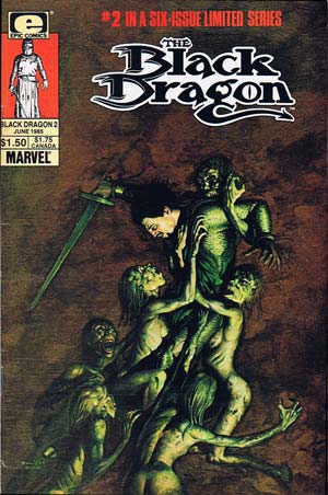 The creative team on "The Black Dragon" boasted not only the multiple-award-winning Claremont, but the equally illustrious John Bolton. No, not the walrus-mustachioed US Ambassador to the UN, but the English artist of the same name. You can tell from the cover of issue number 2 (left) that Bolton is a master of the horror genre, and it's when the story shifts to the supernatural that the comic really comes to life.
Unfortunately, those elements are too few and far between. I really struggled with reading this series, and I've been hard pressed to understand why I don't like it very much. I'm a huge fantasy fan, and (obviously) love comics, so this certainly seems to be a natural fit. But the whole project just doesn't work for me.
I think it starts with the uneasy balance between Claremont's very ambitious script and Bolton's panel layout. Take a look at this sample:
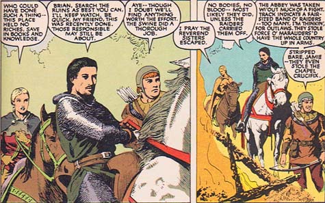
The mass of words running across the top seems to physically weigh the panels down, almost threatening to crush the figures below them. Compounding the problem is Bolton's "Prince Valiant" style of art on the project. The detail of the figures ought to contrast nicely with the plain pastel backgrounds, but instead it just makes them seem even more static and lifeless. There's so much going on in the detail of the figures, from the beautiful chain mail to the horse's mane to the smoldering embers of the fire that, combined with the huge amount of text, it just wears me out looking at it.
Even in the strongest parts of the series, when fantastic or horrific elements come into play, that same sense of lifelessness pervades:
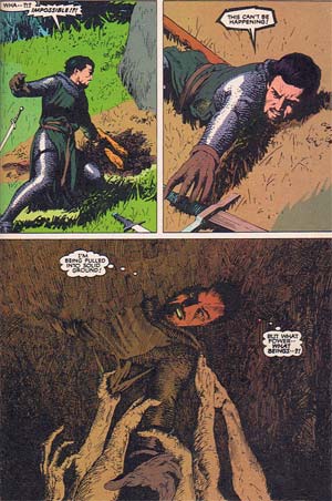
As odd as this sounds, I think the main problem is that you're almost always at chest- or eye-level with the characters in the panel. It makes you feel like you're just standing there watching, instead of being an active participant in the action. For my money, the ability to change the "camera angle" is one of the strongest weapons in an artist's arsenal, and yet Bolton has pretty much surrendered it.
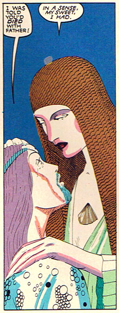
I also find Bolton's inking distracting. Sometimes, like in the undead ghouls dragging James Dunreith into their underground grave, it's really strong and helps support the action. But much more often, his thin and reedy lines and excessive hatching weaken the figures instead. Here, for instance, the lead female character Ellianne DeValere speaks, again under threat of assault by excessive word balloonage:
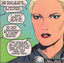
The pastel gradient background combines with the uniformly thin lineart on her face to make her seem washed-out and ethereal. Sometimes that technique works, as when Bolton is illustrating the action in the world of faerie:
But when applied to the very realistic figures of the "real" world, the technique clashes with the high level of detail to create a confusing, frustrating muddle. The coloring contributes to that muddled muddiness, living in subdued earth tones and pastels. Combined with the static figure posing, the hatchy inking, the lack of differentiation in camera angles, and the mass of details, I'm left a bit dizzy.
Clearly, Claremont and Bolton were going for a very grounded, believable setting here. I can see that they wanted to produce a story that was believably set in the actual world, with the fantastic elements becoming thus much more powerful. But rather than enhancing the tale they're telling, that approach instead betrays it. The result is that most unfortunate word a creator can hear -- it's boring. Reading each page quickly became a chore, and not in the same satisfying, that-was-worth-the-effort sense you get from reading the original "Lord of the Rings", either, but rather in that "My English teacher made me read this and I hate it" kind of way.
"The Black Dragon" fails to use the most powerful aspects of the comics genre to help tell Claremont's story, and the result is a muddled mixture of too much novel and not enough graphic that leaves me feeling frustrated and unsatisfied. I hate to deliver a bad review, even twenty years after the fact and to such a distinguished duo, but I really didn't care for this series at all.
(All images and text are from "The Black Dragon" series, ©1985, Chris Claremont and John Bolton, published by Marvel Comics Group.)

