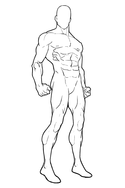
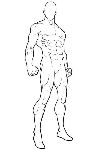
Which do you like better, the first proposed new HM-mini body template, or this one:

This one has more "attitude", I think. The first is workable, but it looks more like an avatar screen in a game or something, I suspect this one might make for better actual character images. The angle's from just below waist-level, which might be different enough to cause some problems.
I don't know, what do you all think?
UPDATE: With thanks to commenter TheNate and John, here's an updated version with the right foot pointed in a more solid direction, and the right hand no longer stapled to the buttocks.


