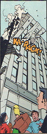
I have a second great example of OnomontoPOWia from the pages of Flash number 131:

The camera angle here is great, giving you a street-level view of the impending collapse. The rendering on the building is perfect as well, with the dramatic vertical lines drawing the eye up to the falling corner, further heightening the visual drama. So already you've got a very good comics panel, a moment fraught with maximum peril heightened by suspending it in time, the crowd below (including the reader!) just realizing the danger they are in.
Once again, the onomontoPOWia sound effect is perfectly sized and positioned. Any bigger and it would overwhelm the falling section of building, any smaller and it would get lost. Positioning it at an angle following the fault line works as well, the dangerous angle accenting the tension and danger. I even like the orange color; it stands out nicely from the gray of the building and draws attention without being overpowering.
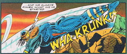
I want to contrast that with the use of sound in this panel, from "Battle Tide II" (I should send Marvel UK a check, as much entertainment value as I've gotten from mocking this one issue):

The onomontoPOWia does nothing to help this panel. Granted, helping this panel would be a tall order for anything short of a shredder, but if you're going to go through the effort of making a bunch of lines anyway, why not make them good lines? The lettering itself is clunky and clumsy , the uneven spacing and line weight making it all look sloppy and slapdash. Contrast that with the earlier example, where the letters have a dynamic feel to them and the thick black outline enhances their look.
Both panels put the sound effects on a slant, which in theory increases the dramatic tension of the scene, but here the letters seem to fight against the motion of the figure. The word goes parallel to the plane of the panel (try saying that three times fast!) while the figure is supposed to be coming out at an angle.
Even the color is bad. That flat yellow blends in with the light orange of the unfortunate demon victim, getting lost and washed-out. Again, contrast that with the "Flash" panel, where the onomontoPOWia definitely stands out, in a good way.
Anyway, the spirit of Mark Millar is here and he's asked me to sum this post up Millar style, so here goes:
Flash kicks Battle Tide II's ass.
(Top image and character ©1996 DC Comics, “The Flash”, #116.)
(Second image and characters ©1993, Marvel Comics, UK, Ltd., from “Battletide II”, No. 3.)

