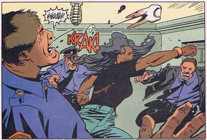
A good onomontoPOWia doesn't have to be flashy or obnoxious; sometimes subtle works better, as in this example from "Hitman" number 9 (DC Comics):

This panel encapsulates a lot of what makes comics as a medium so powerful and unique. It captures the moment of maximum effect incredibly well, by which I mean that you see everything at its most dramatic possible instant. Look at the policeman in the back -- if he leans any further to his left he'd fall over. He's been captured at the very moment of maximum movement.
So is the female detective's punch. In the very next moment the arm will begin to swing back away from the reader, momentum slowed and its power completely spent. Were she drawn with the fist earlier in the punch, there would still be too much energy to come, spent on potential rather than kinetic visual impact.
And of course, the tooth. Captured just as it's about to leave the panel completely, trailing blood making for motion lines, almost leaping from the page.
In this context, of a timeless moment of intense drama with every movement captured at maximum intensity, the "KRAK!" in intense red, filled with sharp angles and an aggressively pointed "A" is the perfect cherry on top, the extra garnish on the plate that makes the meal. Anything more would be too much, anything less would be disappointment. Sound can only exist in time, and yet it's been captured here in static form. When you put that time-dependent element into a tableaux that is frozen time, the contrast is uniquely "comics".
And uniquely onomontoPOWia.

