I've posted about this before elsewhere, but I thought you might enjoy seeing how an illustration for a magazine or role playing game happens from start to finish. I begin with the art specification (spec) from the art director:
Character illustration — [super villain]: [super villain] is an enormous brute of a man, 6'8" tall and with the super-muscular build one would expect of a man who can lift 400 tons. He's technically white, but the internal solar fires that give him his powers have "burned" his skin a sort of charcoal grey and caused all the hair on the top of his head to fall out. His costume is a sort of gold-colored leotard and tank top that resembles a professional wrestler's outfit; he doesn't wear gloves or a mask, but does have oversized black boots ("the better to stomp you with," as he sometimes puts it).
And here's how I proceeded.
First I needed some kind of reference for what I wanted him to look like. I did a Google Image search for "wrestler", and one of the images that came up was for Goldberg, a popular pro. I thought he had the right kind of look, so I did a new image search for "Goldberg wrestler" and found that really nice photo below from here.
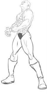
When using reference materials like this, it's important to take it as inspiration and not just to copy it. The character I am drawing is not Goldberg, after all, but a totally separate person. Plus, I needed a full-body image and this one is just the head and shoulders. So I imported the photo into Flash, put it on a locked layer, made a new layer over it and traced the basic lines in lime green (so the new lines would show up on top of the dark image). I refined it as I went, for instance leaving off the beard and changing the shape of the eyes and nose a bit, and ending up with this rough sketch:

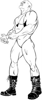
The top half was pretty close to what I wanted, but I was much less sure of what to do with the legs. So those were sketched in a much rougher manner with placeholders for the boots. I did another search for "combat boots" and found a nice reference, and again copied that with some changes. I had to move the feet around so they'd fit in the boots I'd found and as a result the stance was much stronger. I also had to stretch his right leg to make it fit, as it started out too short. Finally, the shoulders were not broad enough for a "super" villain, and the head was too large. So I shrunk the head down (which has the effect of making the whole body seem much bigger) and broadened the shoulder. This involved essentially reconstructing the entire deltoid area and eliminating some of the shoulder blade showing behind Goldberg's arm. Here's what I ended up with:

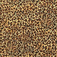
Another key part of the art spec was the leopard skin leotard he wears. I initially drew some in by hand, but it didn't look quite right. So instead I found the image shown, imported it into Photoshop, desaturated it (since this was for a black and white/grayscale image), and cut and pasted it into the shape of the leotard.

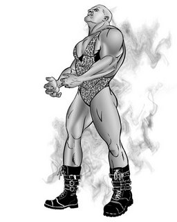
Finally, I colored the "fire-darkened" skin using a 10 pixel feather on the lasso and filling it with a gradient, and added the smoke effect. My mental image for the scene was that this villain had just gotten blasted by a flying energy blaster type of hero, and was glaring up before going and finding a car to hurl at his nemesis. The final version is at the last picture in the set you see here:

I hope you enjoyed this look into the creative process. This was a genuine professional gig for one of my favorite gaming companies; the art director was excellent, and the character came out really well. I had a great time drawing him, and I think the client was happy at the end of the day.

