I was going through some old sketch books yesterday, and came across some of the very first ideas I had for HeroMachine. What struck me was how similar they are to some of the knockoffs I've seen since then, and how some of the ideas back then may surface in HeroMachine 3. Since part of what I want to do with this blog is to include you in the process of developing a piece of software, I thought I should share those old drawings; here goes!
In the beginning, all I knew was that I wanted to do something like the old "Mighty Men and Monster Maker" set I'd had as a kid:
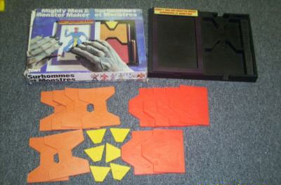
It was like "fashion plates" for boys, you had separate tiles for the head, torso, and legs that fit into a holding device -- in the photo, the head tiles are yellow, the torso tiles are orange, and the leg tiles are red. Each plate had an embossed image on it. You'd lay your paper over the combined set of three tiles, and make a rubbing with the included crayon to get your final character image. I wanted to replicate that digitally, so you'd have a lot more options than the dozen or so that came with the set originally. But I wasn't sure how to even begin, as you can see from this sketch book scan:
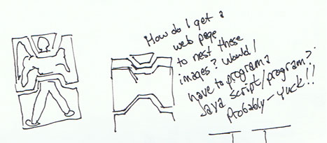
I didn't know anything at all about JavaScript or programming of any sort. I'd built a web page in basic HTML, and that was the extent of my knowledge. But, I knew I wanted to make this thing, it was just a matter of figuring out how.
Eventually I decided to investigate VisualBasic because (and I'm not kidding) I figured that if it had the word "Visual" in it, it might be good for doing something with images. Brilliant, right? But it did lead to a modification of the design into something more "computery":
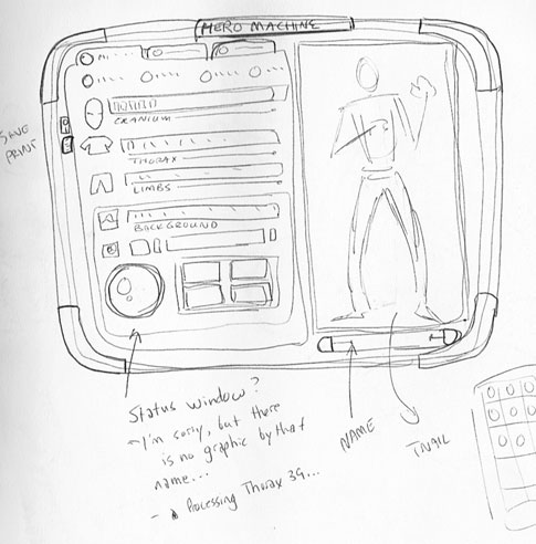
What strikes me about this now, fifteen years later, is the tabbed interface. I don't have any clue what was supposed to be on those tabs, but it's something that has resurfaced as I've been thinking about HeroMachine 3. There is so much more information to keep track of now than I originally thought, when there were only four components (I got bold and included "background", as you can see in the sketch), that I have to be careful not to overwhelm the user with too much clutter.
In the early design stages, I kept getting stuck with the thought that it ought to look like it could be held in your hand. I don't know why. But I see it again and again in the early sketches. HeroMachine version 1 still has that legacy a bit with the sliding doors rotating around to show your choices, but it's pretty much gone in HeroMachine 2.
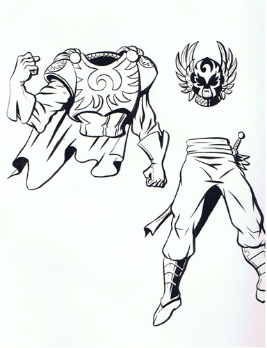
I even found the original two sets of heads, bodies, and legs I did for this very simple first version of HeroMachine, a hawk-warrior guy and some sort of aquatic ruler guy; I don't think these have ever been seen before in this format:
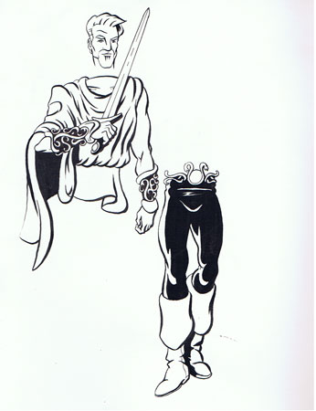
The last little nugget I uncovered was a set of possible heads for inclusion. You can see my inking skills were pretty poor, and I didn't have a clue how to draw hair. I know, I know -- what's with the past tense, you no-hair-drawing, bad inker?

I do still think there's some good value in doing a very simple, limited set of components like this. I could pose the bodies however I wanted, there'd be a lot more flexibility in terms of expressions, the overall design of the pieces would be much tighter, etc. I still might do a one-off like this at some point, depending on how things go. And I have a feeling that the tab interface, at least, is going to survive and re-emerge in HeroMachine 3 down the road.
Anyway, I hope you got something out of this little trip down memory lane.

