The process of converting items from one body style to another is long and tedious, as you can tell from how long it takes me to get a new set out there. I thought it might be intresting to see just how it's done, so after the jump I've put together a couple of screenshots to do just that.
I start by copying the whole Flash file I need to convert from the old directory to the new one, and rename it from (for instance) m1-Overshirt-Expansion1.fla to m3-Overshirt-Expansion1.fla. I open the new file, which has all of the old items all laid out with the proper code on them. I delete the layer holding the old body template, and paste in the new one. Now I have a big ol' hulking body with items sized for an athletic one, so I have to redraw them all:

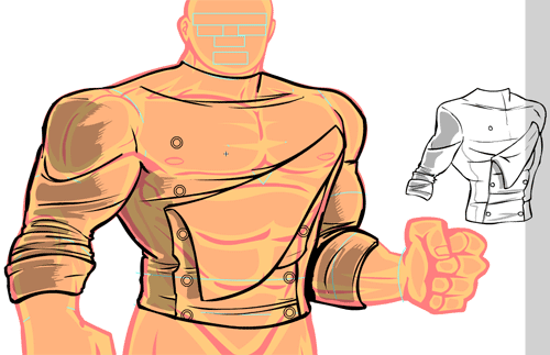
In the screen shot above, you can see the original lineart off to the right side, showing me what it is I am supposed to be drawing. On the left side, overlaying the washed-out figure guide, is the new art.
As you can see, sometimes I have to add more to the item. Here, for instance, the original figure's left arm is hidden behind the torso, so there's no need for a left upper-arm sleeve. The new figure, however, does have that arm revealed, so I have to add it in. It also needs more buttons, since the chest is so much bigger. Finally, I took advantage of the opportunity to upgrade the buttons as well, using concentric circles instead of the free-hand singletons in the original.
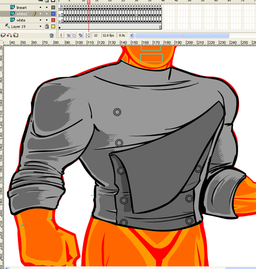
Here's what the finished item looks like in the native Flash file:

I use a light gray for the primary color area (the layer labeled "White" in the timeline at the top) and a darker gray for the secondary color area (the layer labeled "White2" in the timeline) so I can tell at a glance if they're lined up correctly.
The timeline at the top of the screen (the part that looks likes a bunch of gray boxes all lined up and stacked) shows a bit of HeroMachine's structure. At the top is the layer for the black lineart, which is actually a button. That's the part that lights up green when you mouse over it in the final product, and which switches to that item when you click it. The actual black lineart is inside that button. The next two layers hold the color areas. Stacking the black lineart over the top makes sure it can always be seen, so I don't have to worry about a color blob covering up something important.
The last layer holds the body template. It's set to a "guide" layer in Flash, meaning it won't be visible in the final output.
The little "a" symbol in each box of the "lineart" layer indicates there's a bit of code on that frame, which basically says "Hey, when you enter this frame, the item is x." Not shown is the "Preview" layer, which contains the box full of thumbnail items. It also has a big chunk of code in it so that it always shows up in the right place.
When I create an entirely new set of items, like the very first bunch of Expansion stuff for the first male figure, I have to change some of the coding in addition to drawing the items. I have to make sure the name of the item matches in three places -- the frame you see in this screengrab with the "a" on it, the name of the frame itself, and the button in the Preview box that corresponds to the item. Once that first set is done and I'm just converting over to a new body template, like here, I get to skip that step. Yahooo!
Luckily that's all I have to do; I don't have to reprogram anything, because the basic shell of code is already there. I'm just filling it with new items and naming them appropriately. Even so, it takes a long time, especially when you're going from a thin figure to a big beefy one like this, because I have to hand draw every single item and its color areas.
I hope that gives you a little insight to what goes into producing something like the HeroMachine.

