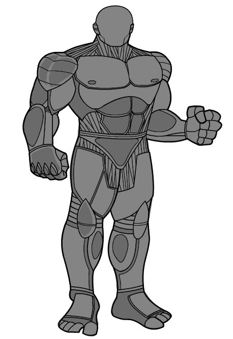
The "robot" skin probably takes longer to draw than any other single item in the program, but I think the one for the male Brick has turned out the best of all:
What takes forever is all of the little accent lines and making sure everything fits properly. On the Skins in particular, you have to make sure nothing sticks outside the basic outline or it causes problems when you try to layer clothing on it.
I think my favorite part of this particular illustration is the figure's right arm. Something about that oval color swatch does it for me. I don't often like what I draw, but in this case I definitely do. I also like that in this skin I'm able to define the character's jaw and cheekline. I've always hated the head shape of the male brick, it's way too soft and rounded to look right. I've tried to remedy that by adding better contours in the "Face" set (located under the "Eyes" component, I think) and by having some cheek lines in the "Beard" component. In the Expansion set, I've also added more chins and jaws in the "Mouth" component, which I think helps quite a bit.
Still, the basic jawline sucks. The stronger one in this illustration makes me happy.


