Home › Forums › The HeroMachine Art Gallery › Suleman's creations
- This topic has 387 replies, 49 voices, and was last updated 2 years, 12 months ago by
Suleman.
-
AuthorPosts
-
July 22, 2015 at 9:00 am #126841
SkoulParticipantWow very mean looking. I likey!
July 22, 2015 at 6:21 pm #126851
SulemanParticipantThanks a lot, Skoul and Vampyrist! The Alien Cyborg turned out to be more popular than I expected, it was a fairly quick and simple idea. I guess the gleam effect I used when shading the metal parts worked pretty well!
Also, here is a Dwarf Princess, out to break some skulls and hearts.
 July 30, 2015 at 5:26 am #127058
SulemanParticipantJuly 31, 2015 at 3:34 pm #127110
SulemanParticipantI wrote a basic guide for how I approach shading in Heromachine. It doesn’t go into the nitty gritty details, but it might be interesting if you’re not a shading expert. Check it out!
August 1, 2015 at 2:01 am #127111
SulemanParticipantI made a second part of the basic shading guide. Check it out and tell me what you think!
EDIT: A third one!
August 2, 2015 at 11:43 am #127135
SulemanParticipantFourth basic guide! This time, I go over how I construct faces, step by step.
You can find it here.
August 17, 2015 at 8:19 am #127880
SulemanParticipantAugust 18, 2015 at 4:14 am #127911
SulemanParticipantAugust 18, 2015 at 5:59 am #127915
CosmicComicsParticipantLady Anaconda is by far my favourite of your recent work ! Well done !
August 18, 2015 at 1:32 pm #127942
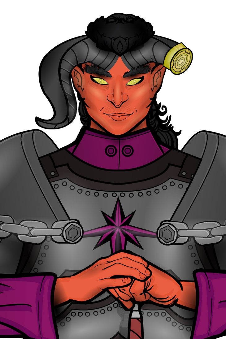
VampyristParticipantThe tiefling is great.
August 19, 2015 at 6:46 am #127987
SulemanParticipantThanks, guys! I still want to make more warrior and armor designs, but I’m looking for more ways to improve the general quality of my stuff.
Everyone: Could you give me some advice on how to improve my works? Is there something in specific that I could do better in terms of shading, design, posing?
I still don’t feel super comfortable doing backgrounds, I don’t have lots of ideas for them.August 22, 2015 at 4:22 pm #128106
SulemanParticipantSo here’s the Ale-Drinking Wizard. She’s just here to have a pint. Don’t disturb her. Just. Don’t. They still haven’t gotten rid of the stains of the last idiot who tried something like that.
This was mostly just a perspective exercise. Not quite satisfied with it, yet. I have no art education or training, so I’m just improvising here. Bear with me.
August 22, 2015 at 4:27 pm #128107
Ruffblade027ParticipantI really like the background on that one
August 23, 2015 at 6:53 am #128117
SulemanParticipantThanks, man! The whole perspective thing got started when I couldn’t find a good piece for the bar table. Here’s what my earlier sketch looked like:

In retrospect, I probably should have kept the pipe.
September 21, 2015 at 4:08 pm #129075
SulemanParticipant -
AuthorPosts
You must be logged in to reply to this topic.


