Home › Forums › The HeroMachine Art Gallery › Linea24’s Astra Universe
- This topic has 405 replies, 44 voices, and was last updated 8 years, 11 months ago by
Linea24.
-
AuthorPosts
-
September 12, 2015 at 3:31 pm #128724
VampyristParticipantThey’re beautiful!
September 12, 2015 at 6:04 pm #128736
StulteParticipantSimply spectacular! The dancing pose is excellent.
September 13, 2015 at 3:29 pm #128775
Linea24ParticipantThanks everyone!
Another leader:
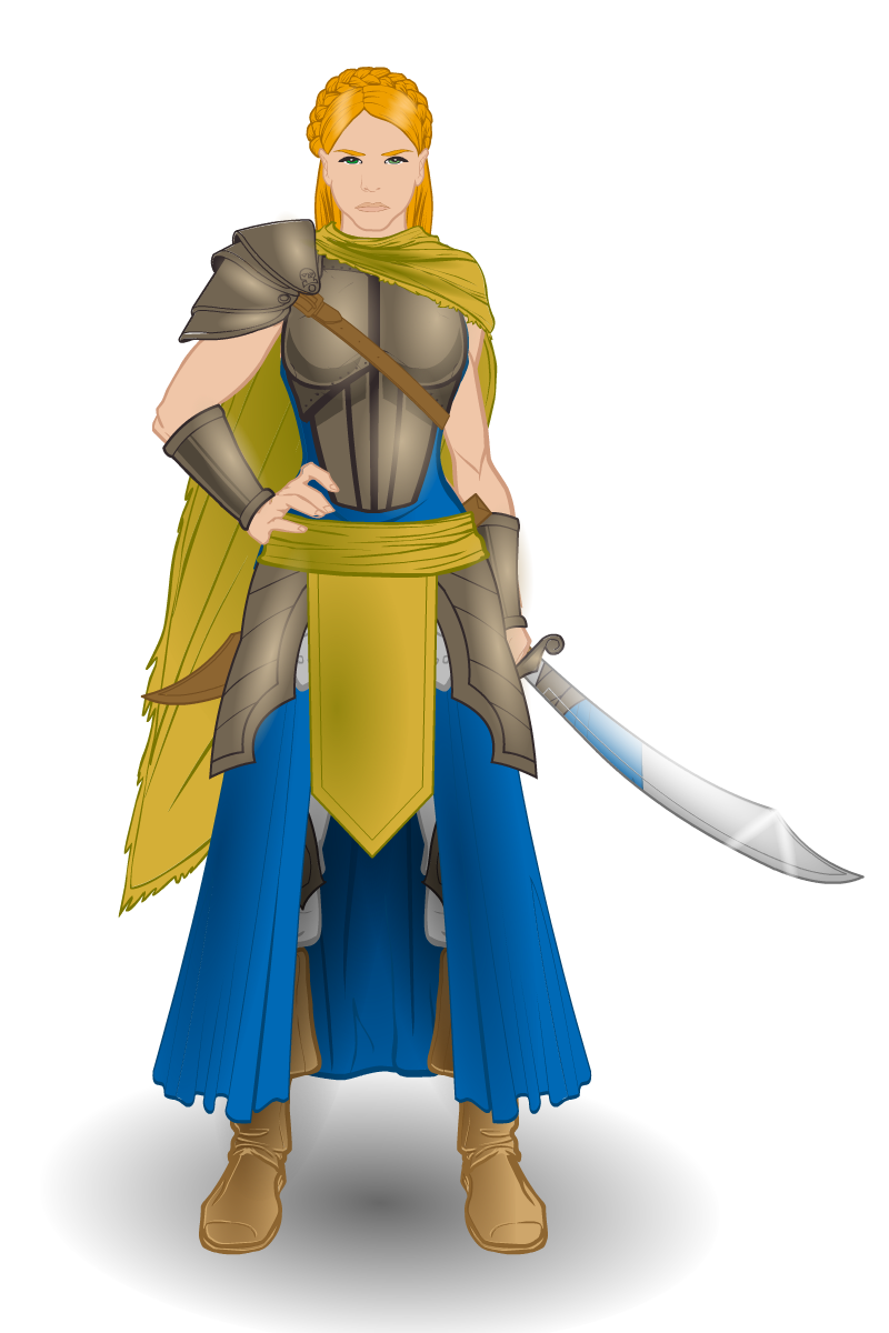
General Delita Riese

General Delita is the leader of the Riese. They are the main brunt of Antian’s defense, coming before the Virsa in battle.
Attachments:
You must be logged in to view attached files.September 13, 2015 at 3:48 pm #128778
NugParticipantBad A$$ed!
September 14, 2015 at 4:35 pm #128813
Linea24Participant@Nug: Thanks!
Guide Arthasi Cerca

Guide Arthasi Cerca is the wandering leader of the Cerca. The Cerca proclaim is the home of the Cercan Healing Arts, which is a fiercely guarded secret and rarely shared with outsiders.
September 18, 2015 at 2:01 pm #128950
StulteParticipantAs always your work is sublime. The reflection in Delita’s sword is ingenious.
January 16, 2016 at 5:18 am #133156
Herr DParticipantLinea! You’re back. Eye problem? . . . I couldn’t enter the Santa Swap this year but left you something–I’m hoping you’ll grant me permission to use your image that I wrote a backstory for. Let me know.
January 16, 2016 at 9:19 am #133157
Linea24Participant@Herr D: Thanks for the welcome back! As for my eye problem, it’s better now. And you can go ahead and use Lvesani. I don’t mind.
I’m still working on my Santa Swap gifts, so I’ll post those when I can.
January 17, 2016 at 11:45 am #133174
VengeanceParticipantgood stuff as usual
January 17, 2016 at 8:56 pm #133180
KericParticipantHey, welcome back, glad to here you feel better.
April 22, 2016 at 5:22 pm #135254
Linea24ParticipantWell, I think I’m back for real this time.
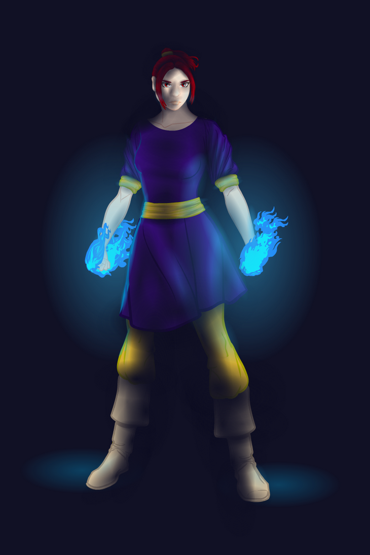
Abigaila V2

I will admit, I liked Abigaila’s previous design, but I felt like the posed picture I did of her, with her throwing a punch towards the camera, was a little out of character for her. Also, I wanted to practice shading with a dark-colored background some more 🙂
April 23, 2016 at 12:32 am #135257
JR19759KeymasterYay, you’re back!!!!!
We missed you.
Oh, and the shading is awesome btw.
April 23, 2016 at 11:55 am #135266
Mad JackParticipantBack with a bang, I see. Great lightning/shading! Glad you’re back … 🙂
April 26, 2016 at 1:45 pm #135336
Linea24ParticipantWell, it’s about time I posted this.
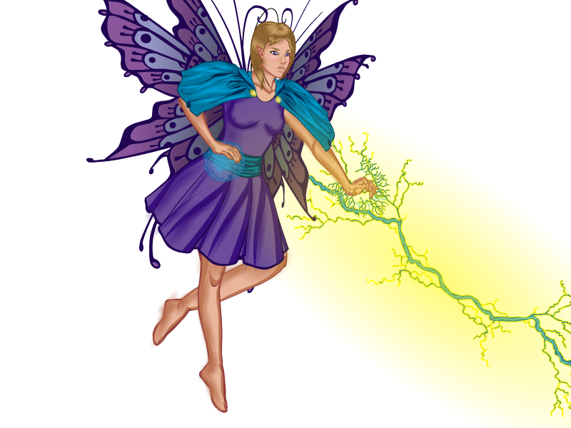
A while back, I decided to redo my first real attempt at shading:

This was the result:

Honestly, I really liked how it came out. Looking back, I realize that at the time, I didn’t really have a good grasp on how light sources worked, and don’t get me started on item usage. My posing has gotten much better, and my faces have become more varied in expression than just a default “meh” expression. I’ve also gotten better at using the lineart on the items like suggestions rather than set-in-stone barriers, and being able to create custom items. One thing I still need to really work on, though, is small details.
April 26, 2016 at 3:17 pm #135338
JR19759KeymasterThere’s only one critique I’d have with the new version, which is that the ring on her left index finger is rather large and looks a bit unwieldy. But other than that, the pose is better, the shading looks much more natural, changing the lightning and energy for a circle keeps the focus on the character rather than immediately drawing the attention away, which is good. I love the use of the cape as a skirt to match with the pose, I like the custom top and the broach looks really cool. I also agree on the face being much better, she looks much more serious and badass. My favourite bit, however, has to be the wings. The effect you’ve got on them doesn’t distract from the rest of the character, it’s very subtle, but when you do notice it, it keeps the attention. Great work.
-
AuthorPosts
You must be logged in to reply to this topic.


