Monthly Archives: October 2014

Character Of The Week: Zyp- Katana

I will apologise for the excessive amount of hyperbole and fanspazzing in this weeks post, however, if you look at the title of this post, look at the name, who it is that is being featured, I'm sure you'll understand.

Yes, that's right, after an extended absence, "the man after whom the technique of shading on heromachine is named after" has returned. Zyp is back. And he immediately makes everyone else look amateurish. Apparently this was meant to be an entry for the Going Japanese contest, but he missed the deadline, zypping probably. All I can say is, if this had been an entry, it probably would have been a much closer contest.

Anyway, onto the actual justification bit. And, although the picture its self should provide justification enough, I feel compelled to talk at length about it (so what else is new?). We'll kick of with the character. The pose just screams badass, she looks at the ready to slice and dice with that katana and the expression on the face would suggest that she couldn't care less who said katana slices and dices. It's such a wonderfully aggressive expression. It basically sets the scene for the picture, gives it the depth needed for the rest of the image to tell a story.

Next we have the composition of the picture, by which I mean the background elements, the angle of the focus and the colours. I love the fact that this picture is on a slant. It means that the focus of the picture is not centred, which draws your eyes around the image more than having a straight central focus would.  Your eyes are drawn from their default centred position to the right so you see the face, then you are drawn around the picture in a clockwise motion, down the body, around the floor and up the sword until you reach the sky, then back to the face. It's so easy to take in the entire picture just by following the elements that make it up. This is helped by the wonderful use of soft and warm colours. The pinks and yellows of the sky set of the greens and greys of the middle focus perfectly, and the two contrasting colour schemes are combined on the main focus, the character, in such a way that they don't clash or contrast but work together, making all three layers of the image fit together so naturally. I must also mention the fact that Zyp has changed the line colour of some items where he is including the reflection of the sunset on the character. I know I say this a lot on these posts, but it's such a simple idea that works so well. Attention to detail and a bit of extra creativity can turn a picture from a great one to a masterpiece.

And finally, the obvious thing that one has to talk about when critiquing a work by Zyp. Really what do you want me to say. He's Zyp, you expect me to trash talk his shading? Look at that freakin' sword. The subtleness of the colour differentiation on the clothes. The block shadows on the arms. That sky. And of course the aforementioned sunset reflections. *shakes head* What am I meant to say.

"We are not worthy" *throws self to floor Waynes World style*

Power User Profiles: Stulte

This weeks Power User is one of my favourites of the current crop of creators to have joined the community in the last few years and, much like Nug from 2 weeks ago, one of the forum members I enjoy interacting with the most. In terms of his art, he has created a wonderful world that mixes fantasy and steampunk and is served up with oft beautiful, sometimes blood-soaked, but always stunningly put together visuals. Plus he the mastermind behind one of my favourite contest entries of all time (his entry for the Steampunk contest, though I know he'll disagree with me on this) and certainly one of the best contest winners we've had this year, with his 7 Deadly Sins contest winning The Seven. So ladies, gentlemen, trolls and dwarves, please welcome Stulte.

Continue reading

Kaldath’s Caption Contest #49

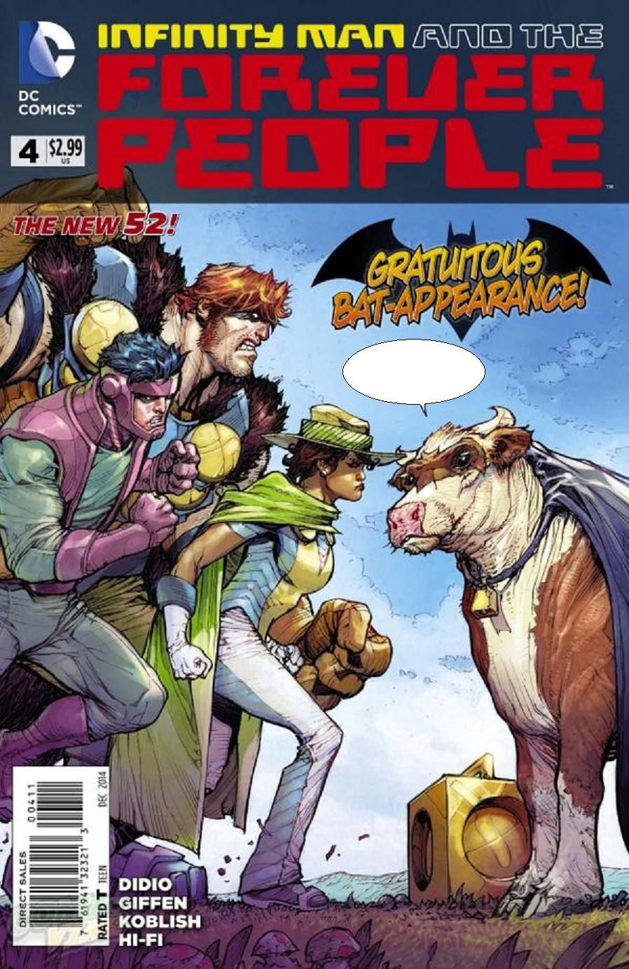
Ladies and Gentlemen gather round, for it is caption contest time! Since my selection for the contest last week as a bit of a flop it is my hope that you all are better inspired by this weeks selection! Your mission should you choose to accept it is to give me your best replacement dialogue for the following image:

Moo 1


The normal rules apply, which are: You are limited to Three (3) entries which are due by 1:00 PM Eastern Time on Tuesday November 4th.  Of course I as always expect you to keep your entries no worse then PG-13 in nature and that you follow all the normal rules of the forum when writing your caption for the above image. That being said I wish you all Good luck!


Kaldath’s Caption Contest #48: Results

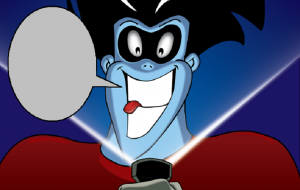
Last week I asked for your best dialogue for this image:

freakazoid-flashlight

Due to the small turn out for this contest there is no top 5 and I'm just going to announce your winner! Which is ..........................................

Continue reading

Anime Talk: Halloween Edition

Anime talk logo

Last year at this time I gave you a list of  Anime that I like to watch during the Halloween Season. This year I am going to give a similar list, a list of 8 anime series I want to watch this week leading up to the 31st.

Continue reading

Character Design Contest ♯96- Mad Scientists & Monsters

So, time for the annual Halloween contest and this year, instead of just asking you to design a monster, I thought I'd give y'all the opportunity to be a bit more creative. What I want from you is a duo in the vein of Frankenstien and his eponymous monster, a creature and its creator. The creature can be undead, mechanical or inhuman (e.g. werewolf, swamp creature) but you must include both characters in the same image, much like last weeks contest. However, unlike last weeks contest, no external editing, both characters must be done in the same export from heromachine.

Also, stay tuned for next weeks contest. It's going to be a VERY good one. 🙂

As per usual, no limits on entries this week and the contest will close at midnight Saturday (blog time). The winner gets to claim a custom made item from dblade to be put into heromachine, so long as the item conforms to his prize rules, which you can find here: http://www.heromachine.com/forum/the-heromachine-art-gallery/dblades-whiz-bang-item-dispenser/. Please read the contest rules before entering, have fun and good luck.

Rules for posts, contests, and challenges that I am hosting: Original characters only, no copyrighted characters, no characters based on copyrighted characters, no characters based on RPG’s or other games. The characters must be your own design and not based on any character that might be copyrighted in any way. I have the right to delete any post that I believe crosses this line without warnings. Only post pictures and images that you have either created for this contest specifically or you know for certain have never been entered to a contest before. If you aren’t certain, don’t enter it, because I’m not going to go back through all of the contests and check.

JReviews: Doctor Who Series 8 Episode 10- In The Forest Of The Night

Sorry this wasn't up on Saturday guys, I've had a rough couple of days with IRL stuff and I haven't had a chance to actually watch the episode until today.

Anyway, on with the review.

Continue reading

Character Design Contest ♯95 (Smells Like Team Spirit) Poll

[polldaddy poll="8401265"]

Character Design Contest ♯94 (Going Japanese)- Winner

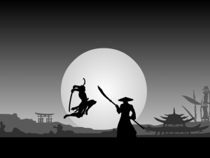
Well, that has to be the most decisive CDC win we've ever had. Overall there were  194 votes cast for this poll and our winner received 109 of them, which is a bit of Overkill actually 😉 and a bit unfair on the other contestants IMO, but y'all voted not me. I also believe its the first time anyone has achieved over 100 votes in a CDC poll, which is not bad going. So congratulations to Vectorman316 whose piece Samurai Fight Scene was this weeks steamroller. Make sure you speak to dblade about you prize.

94 vectorman316- fight_scene_ii__samurai

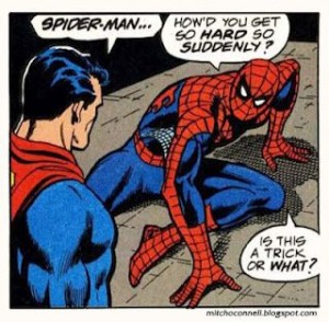
Nope, it’s Viagra.

c4243763ee650cedb3fbaba6d3d6c611