We had some excellent entries for our Animalia II contest! So without further ado, here are the ones that had a little something extra special about them.
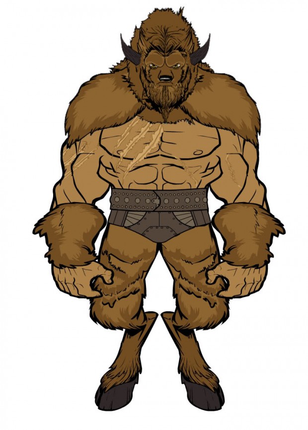
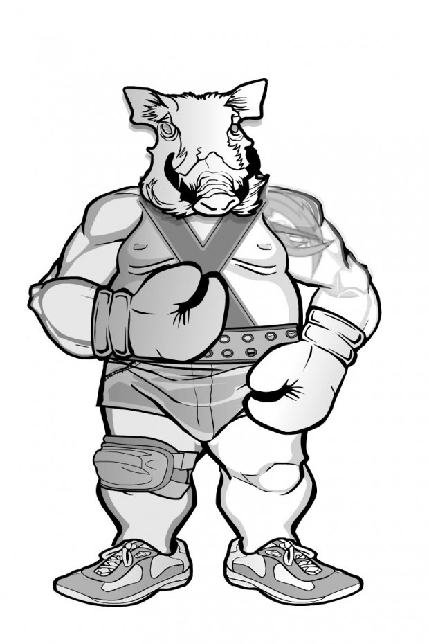
I liked the hulking menace of Albannach's "The Bison".
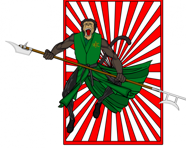
Despite Blaq Aries' inability to put his name on his image files, I thought "Kung Fu Chimp" was a ton of fun and had a ton of dynamism.
borntobealoser gave us a character that would look right at home in my World of Warcraft addiction, but I thought it was an inspired design and a really nice illustration.
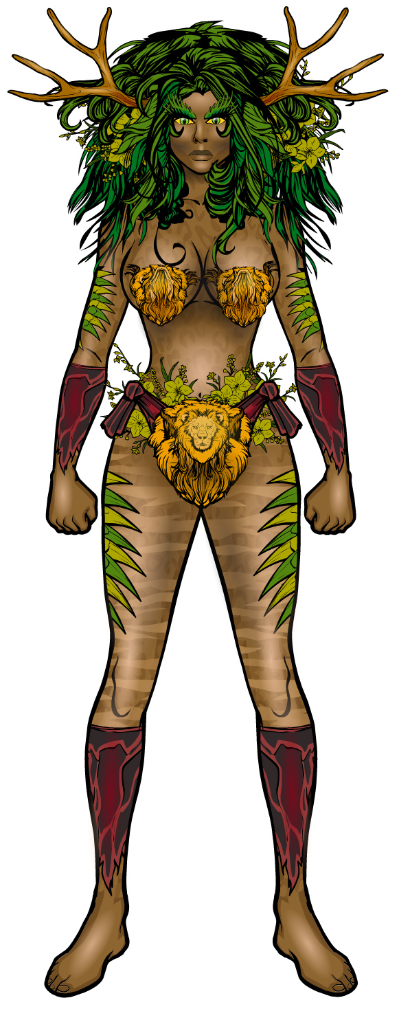
dblade's awesome, and so is "Beastmaster". The subtle striping on the legs, the brilliant highlighting on the face, the great belt/loincloth, and the crazy good boots and gloves are all super impressive.
I liked the setting and overall mood of Debochira's piece a lot.
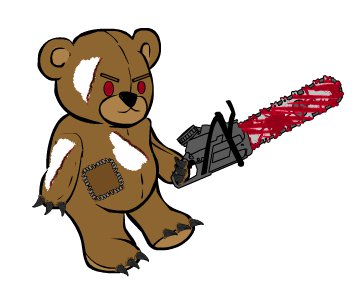
You have to admit, Demonhunter gave us something even more awesome than Chucky.
Gurong7's Babingepet makes great use of grayscale and clever item choices for a unique and cool looking image.
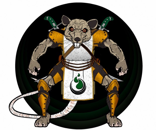
headlessgeneral's "Warrior Sewer Rat" looks totally ready to kick your butt.
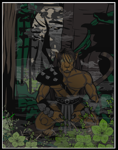
Kaldath's "Leo" has a lot of moody awesomeness to it, but what nails it for me is the use of the flowers in the foreground to really nail down the composition. Great job.
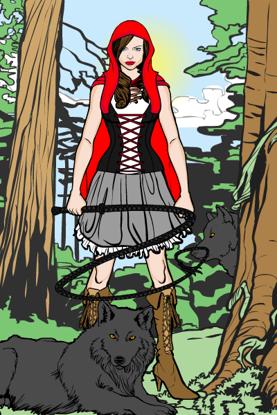
I think they should have gone with Kaylin88100's interpretation of Red Riding Hood for the recent movie adaptation instead:
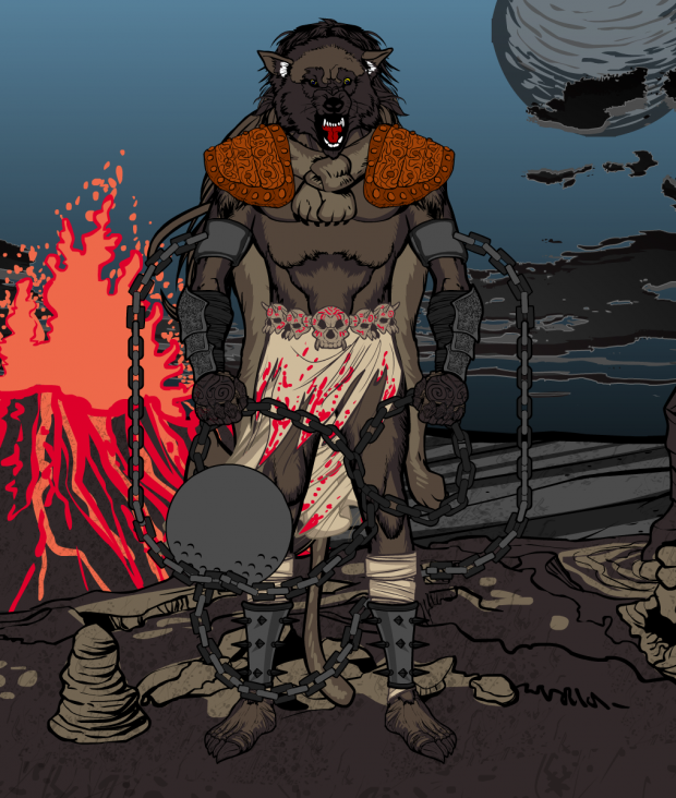
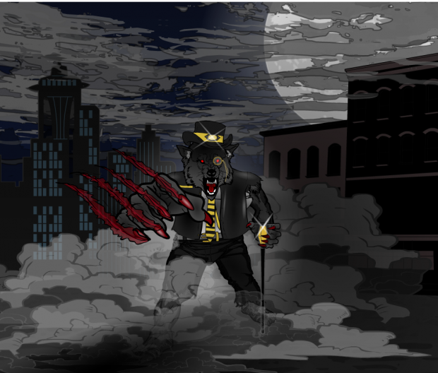
It took a lot of revisions to get there, but I think get there Keith Kanin's "Werewolf of London" (aaaawwoooooooo!) did. A nice bit of cityscaping and mood-setting.
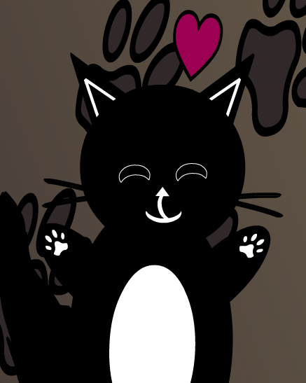
Go ahead, try not to feel like giving something a hug after seeing Luclucluc's "Kitty or something", I dare you!
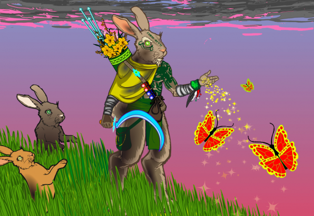
I love a lot of things about Meniukas' "Rabbit shaman". The concept in general is great, the execution is wonderful, and the effects are awesome. I like the little touch of the flowers in the quiver, and the grass is fantastic. Just a wonderful concept very well executed.
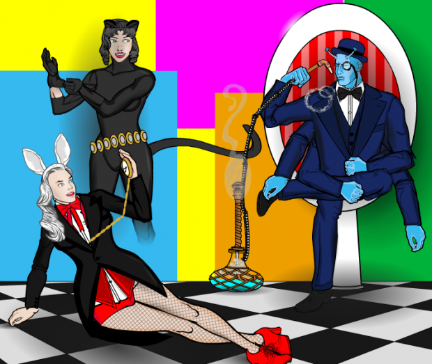
Myro's "Wonderland Agency" is another high-concept piece that I think came off pretty darn well. I like the mod color block background, but my favorite bit is probably the Cheshire Cat character.
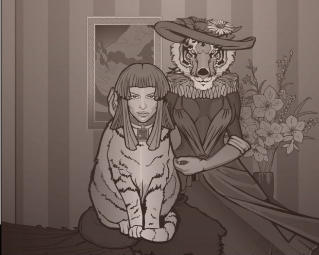
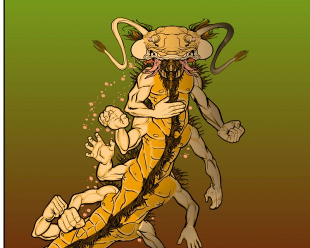
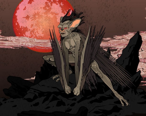
I'm going to put all three of PapaKrok's entries in a row without comment, because their awesomeness speaks for itself.
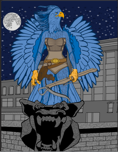
I liked Phatchick's "Kestral" for its classic super-hero roots, combined with a unique twist and an excellent composition.
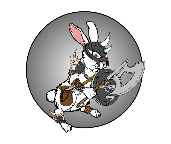
I'm pretty sure Rhinoman stole the early "Rabbit of Caerbannog" designs from "Monty Python and the Holy Grail" movie -- he'll rip your throat out with his sharp, pointy teeth! And axe.
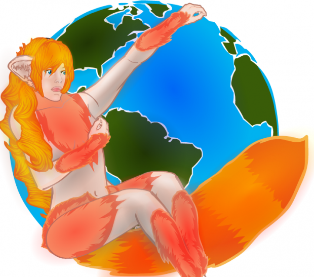
Tarkabarka gave us a brilliant take on the classic logo for "Firefox".
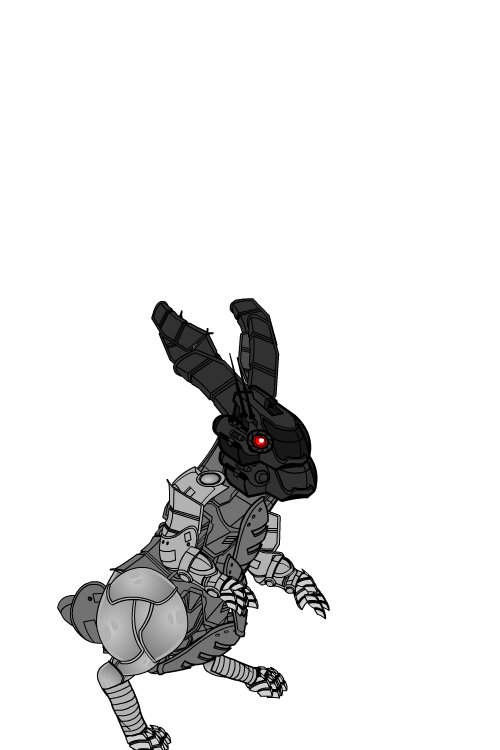
And finally, I have a soft spot for Trekkie's robot designs, and apparently I have rabbits on the brain this week as well. Here's Robot Rabbit.
As the overall winner, I had to go with dblade's "Beastmaster". When you look at that thing up close, it just boggles your mind with how it uses some very subtle complexity to build up an image that gets cooler and cooler the more you delve into it. It's a fantastic job and one of my favorite all-time HM images. Well done, sir!
Congratulations to all of our finalists, and many thanks again to everyone who took the time to share their creativity with us. It is very much appreciated!

