Many thanks to everyone who entered the difficult Character Design Contest 73: Virgo! We had some great submissions, and as usual I've picked out a few that I thought were exceptional for one reason or another to share with you. As usual, if you click on an image you can see it at the largest possible size (which in some cases is the same as what you see here, but most are bigger).
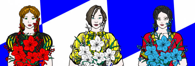
First up are two from Atomic Punk. I liked his Oktoberfest-inspired "Die Madchen" partly for the neat way he got three very different looking, yet still attractive, faces out of the program but also because Oktoberfest is awesome.
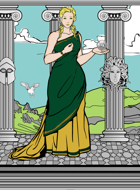
And his second is a more traditional "Virgo". I liked the shading on the columns and the solemn expression on her face.
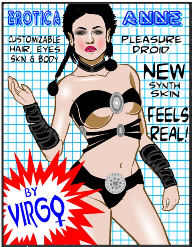
Next is Cliff's ... um, "PG-13" rated, I guess -- "Erotica Anne". This is a little racier than our usual HeroMachine fare, but I thought the face was outstanding and that in general it was a unique and fun take on the contest concept.
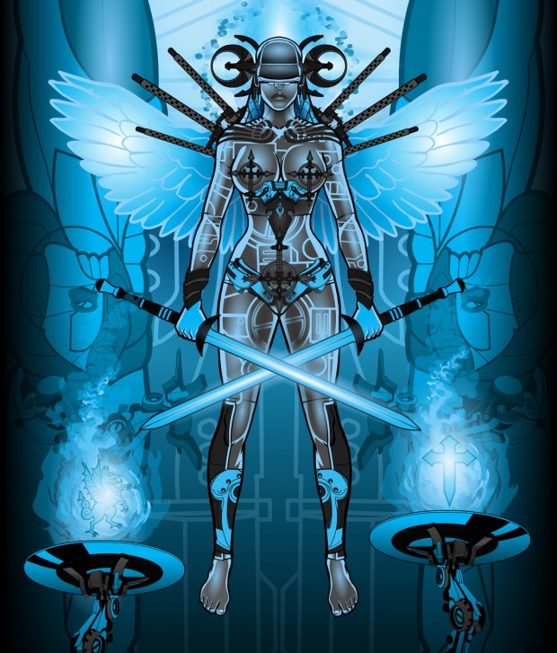
dblade once again brings the awesome sauce with his "Angel of Justice 3000". The lighting and coloring are, of course, incredible, but I also liked the basic design of the character with the cool samurai-inspired tech helmet, integrated "circuitry" layout, and the cool background elements. Outstanding as always!
I don't think we've seen Dimmortald entries before, and if so "Anwen" is an impressive debut. I liked the simple, elegant design that lets you focus on the character herself. The transparent wings are a nice touch, and I love the coloring of the clothing. Nice job!
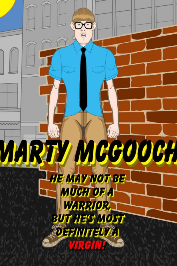
With entries like "Marty McGooch", you can see why we missed having Galactic Ketchup around for a while there!
I believe Gendonesia is another new participant 'round these parts, and again brings an impressive entry to the fray. I love the coloring on "Dewisri", along with the graceful pose and lovely setting.
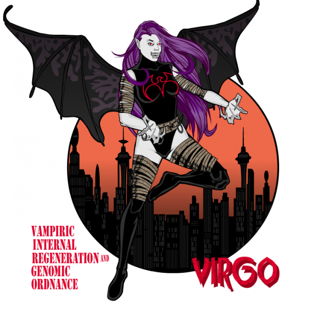
On the other hand, Imp's been around almost as long as I have, and yet he still creates visually impressive, creatively-rich illustrations. His "V.I.R.G.O." (Vampiric Internal Regeneration and Genomic Ordnance") is both funny and awesome, which is hard to do. I should know, as I am both as well. Ahem.
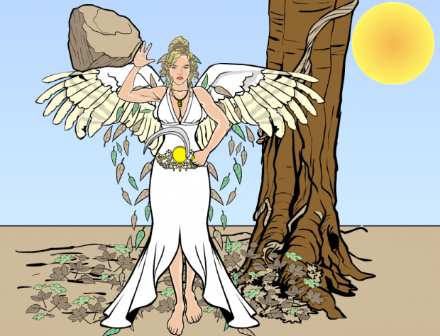
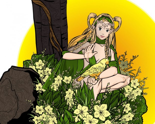
Jessica's "Demi" has a fresh, very appropriately clean feel to it. I liked her face very much and the overall design of the character is spot-on. If this were an "Open Critique Day" I'd gently point out that there are a couple of visually arresting "tangential" spots where the lines of one object tangent onto the lines of another object like between the rock and the wing, and then for the sun and the tree, but since it's not an OCD I'll just focus on the parts that are great!
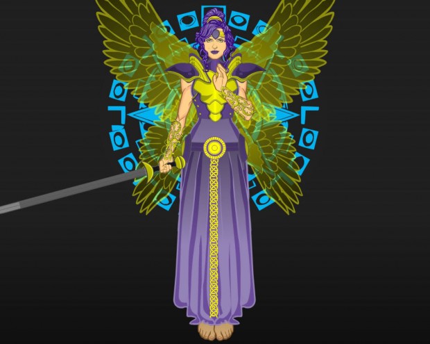
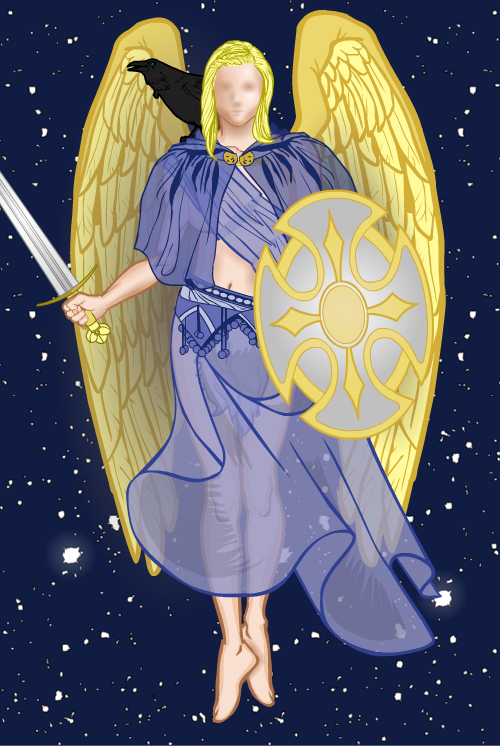
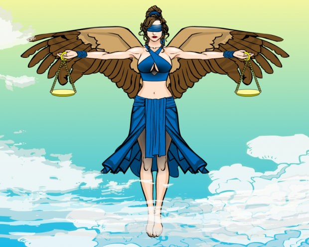
Kaylin88100 got a lot of deservedly great feedback on "Angel of Justice". I love the hazy face, the great use of transparency in the clothing, the jarring use of the raven's black against the blazing gold wings, and the very effective overall visual impression of the illustration. It's just enough to impress without having so much going on that you get confused. Nice job!
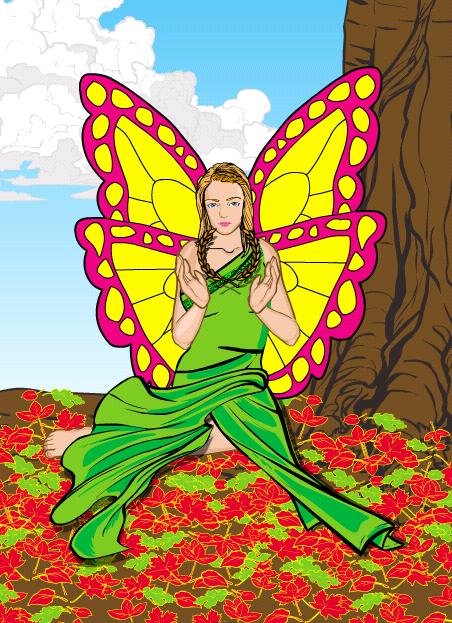
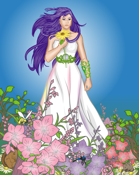
But that's not all from Kaylin88100 this go-around! If possible, I liked "Virgo" even more. The highlighting/gradient work is, again, just enough without being too much to make the image more multi-dimensional and impressive. What sealed the deal for me, though, is the great use of the various flowers and plants to create the foreground. I love that. The use of mostly pinks in that area contrasts nicely with the blues of the background as well, making it pop more.
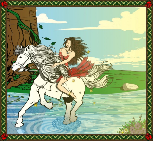
Krashnaak juuuuuust slipped in under the gun with this entry, and I'm glad for it. You get a great sense of movement and joy out of this composition.
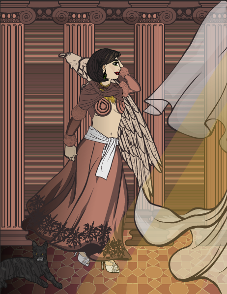
Our recent Power User Profilee, Kytana, has another excellent entry. What I like most about it is the setting, with the consistent use of similar tones to set a somber, effective environment. The soft light and the draperies add to that, making for a wonderful scene.
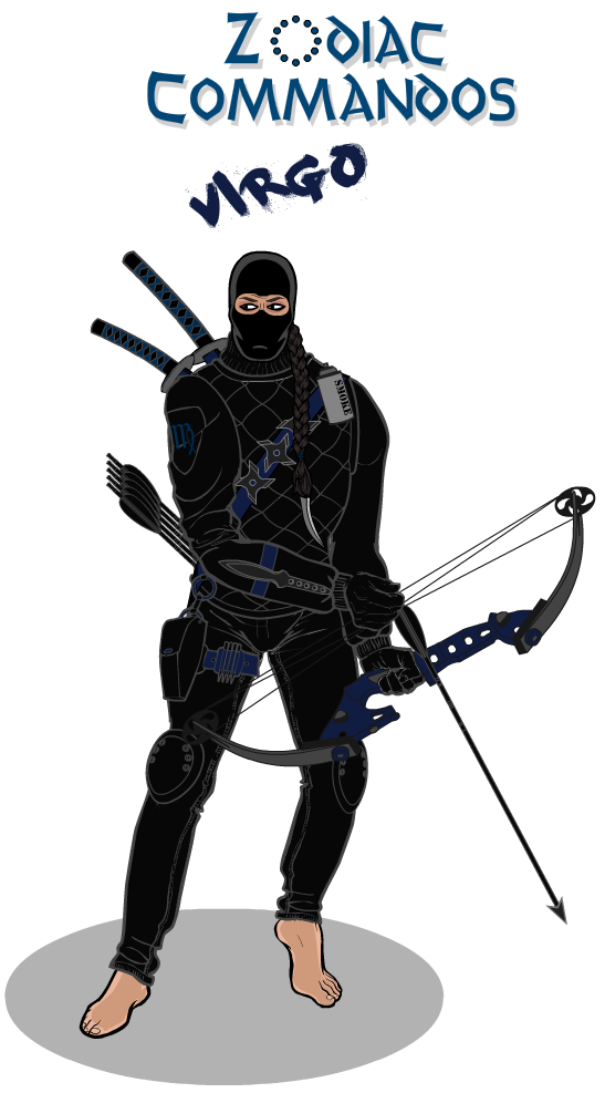
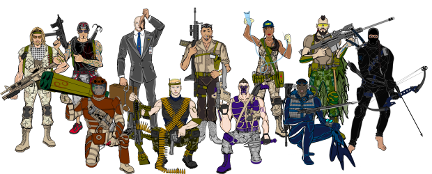
It wouldn't be a Zodiac contest without MLS' Zodiac Commandoes entry! We've got both Virgo and the updated group shot. I always look forward to these! You'll definitely want to click on the wide group shot to get a bigger view of it. They're definitely starting to give the G.I. Joes a run for their money!
PapaKrok never fails to impress, and this week is no exception. This "Virgo" is a masterpiece of composition and color. Love, love, love it.
Rapthama joins the multiple-Finalist club with two entries. The first is "Adria", which I liked for both the character design and the lovely environmental effects.
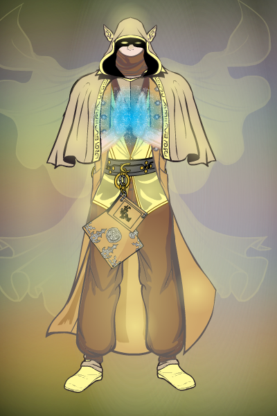
The second is titled "Valgus", and also features a great scene and character design. The ghostly flaring cloak is a wonderful touch as well.
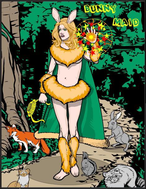
Skybandit's "Bunny Maid" is fun and funny, but what made me choose it was the great use of the 3/4 view face. This is one of the nicest uses of that effect I've seen yet.
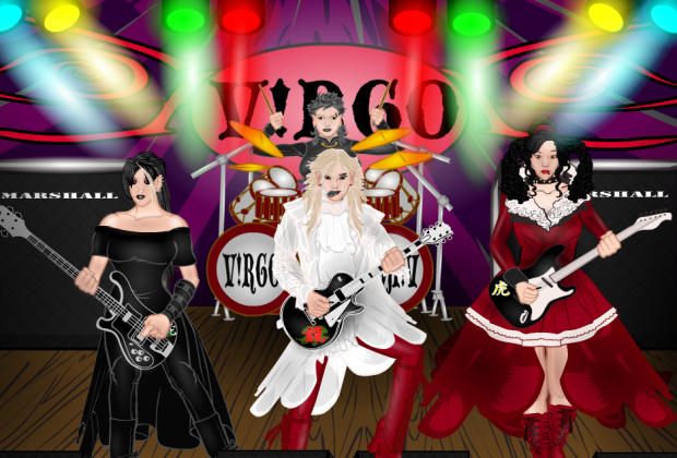
Tarkabarka had a fun and unique twist on the contest concept with this all-girl rock band.
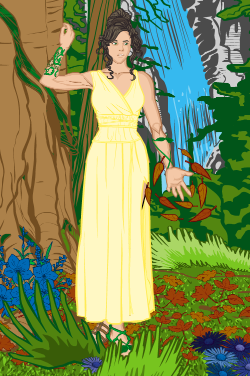
Trekkie's "Nature" is another great example of an effective, lovely environment that doesn't require all kinds of craziness to carry off. I like her expression in the image a lot, too.
Finally, Zaheelee has a lovely entry that features some exceptional work in the clothing area. I love that lower body wrap -- the shading and layering are perfect. The overall character design is really good as well, combining to make a very effective illustration. Great job!
So, looking back over all of those Finalists, ultimately I narrowed it down to four -- Kaylin88100's flower-power Virgo, PapaKrok, Cliff, and Imp. I loved dblade's, but it looks a lot like an earlier winner of his, so even though it's gorgeous, I decided to go with something different. Sorry, man.
Cliff's looks so realistic it's uncanny. It's a unique pose, as well, which is hard to do. However, as I said earlier it's a bit on the risque side for our usual fare.
Imp's is both fun and cool. If I were taking points off, I'd probably have to slightly ding the bands on the upper arm -- they don't quite match up and it's a little distracting.
Kaylin88100's features an awesome foreground and lovely central character.
And PapaKrok's is simply outstanding in every way, from the face to the pose to the composition of the plants against the sun.
Since there can be only one, I'm going to have to go with ... PapaKrok! I couldn't find anything about it I didn't absolutely love, both in terms of individual parts and overall composition. An outstanding illustration.
So, congratulations to PapaKrok, as well as to all of our Finalists! I appreciate all the hard work and creativity you all put into these and feel privileged that you are willing to share them with us.

