Greetings, HeroMachinists! Guest Judge John Hartwell here with the results for Character Contest 72 - The Power COSMIC! My thanks to Jeff for the opportunity to be a part of HeroMachine Nation in this capacity, and my thanks to everyone who took the time to submit your work for consideration. Kudos to all!
A quick housekeeping note: please know that if you A) did not name your file as directed in the contest rules, or B) did not provide a correct working link (some links downloaded a .php or .html file), then your submissions were unfortunately not reviewed (or, in some cases, seen).
Now, on to the best of show! (Edited to Add: most of these can be seen at a larger size just by clicking the image. -- Jeff)
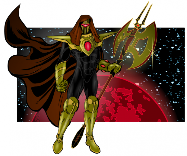
First up, AMS delivered not only a really nice character design, but a great use of compositional elements as well. I love the main figure himself – the restrained use of black, gold and red really help deliver a very tight design. Big ups for the great use of highlights and shadows as well. The rectangular background element is a great way to use the background as a part of the composition, not just “That Area Against Which My Character Must Stand.”
I’m so glad Tool did this one: Eon the Record Keeper is a great Kirby-esque character who feels like he’d be at home delivering soliloquies next to Galactus or The Watcher. Well done.
Martian Blue’s Binary the Living Galaxy represents something I was really hoping to see in this contest – concept! Again, very Kirby-esque. A great use of the HeroMachine elements to create something that is beyond the expected of what the program can do.
Wow, I really love Chfutzin’s Horizon. Great concept, and a great figure rendering! The concept is straight-up cosmic comic book, the design elements are spot on, the color palate is restrained, and the background element reinforces the overall idea. Very, very well done!
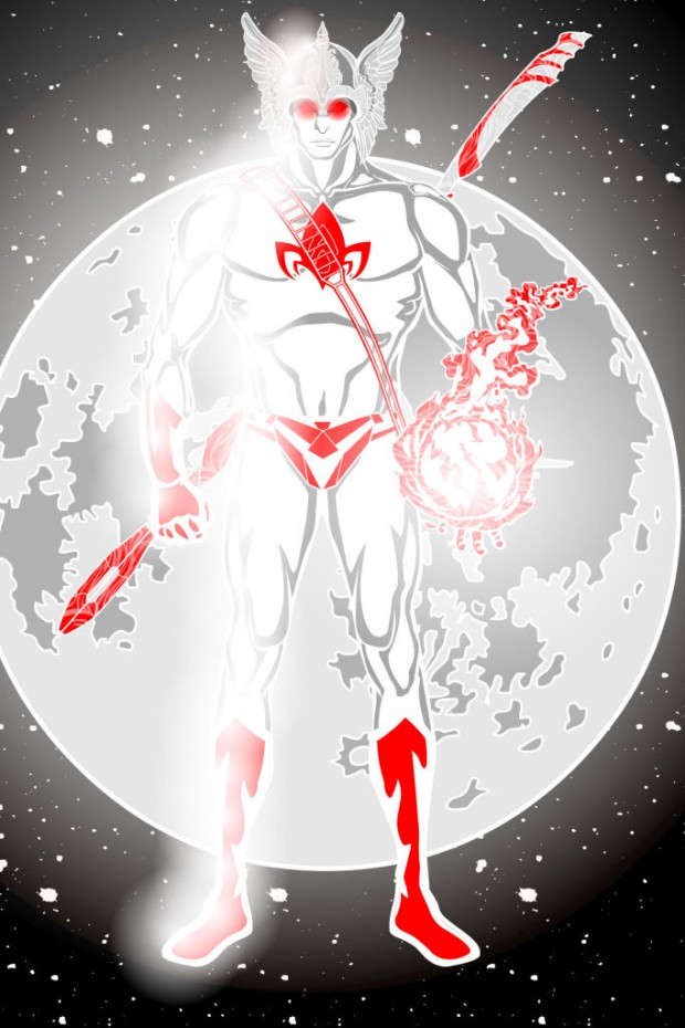
Kwnnos’ Polaris is a good example of simplicity with just the right amount of effect. The white “glow” against the white and red figure makes for a nice impression.
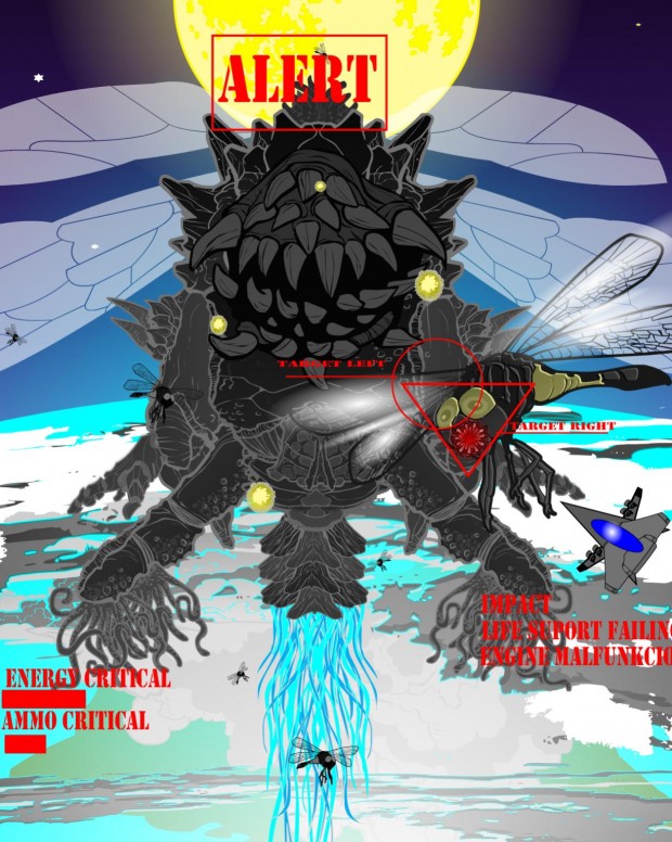
Props for Meniukas’ first-person shooter perspective in Space Hive. Made me laugh. Well done!
The next five represent my finalists. These went above and beyond in delivering the cosmic goods!
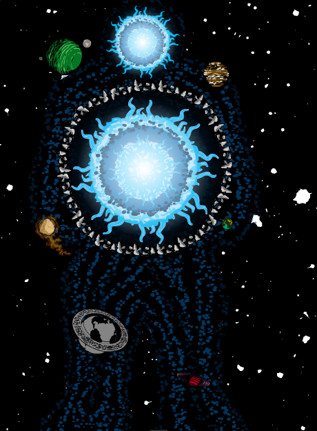
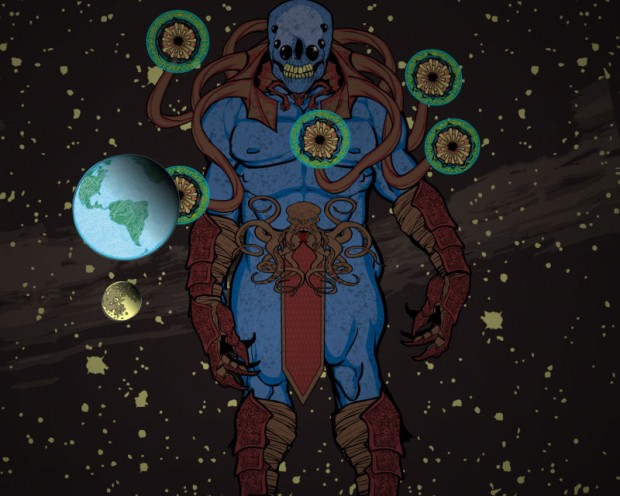
PapaKrok brought it with three strong entries. The first of two that I thought deserve special attention is his Watcher. Great concept, great character design and great use of scale to really tell the story of this character. Awesome job, sir!
(One thought, PapaKrok – let us see the Watcher figure from head to toe to help better reinforce the sense of scale. Cutting him off at mid-shin restrains the viewer’s field of vision and undercuts the “floating in space” idea, making him look like he’s attached to the image frame. It would also probably make the overall effect of the figure more ominous as well.)
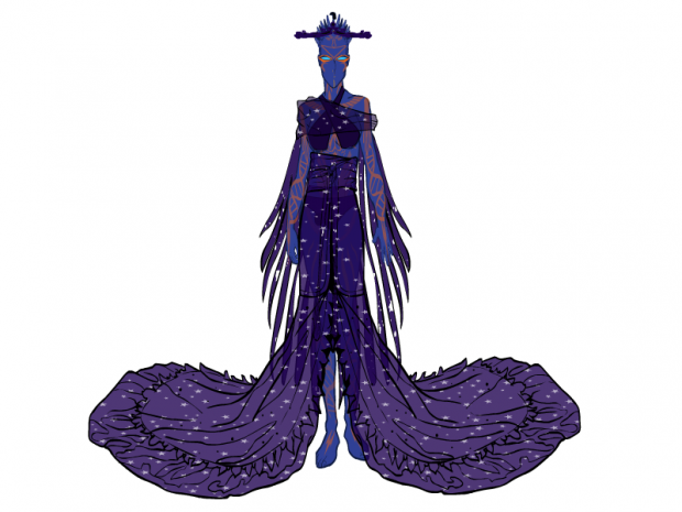
Man, is Sabulum’s Talahia a great character design, or what? I love the elongated alien form, the “feathers” elements reinforce the whole “alien” idea, and the star pattern throughout says “coooooo-smiiiiiiiiiiic.” Very nice!
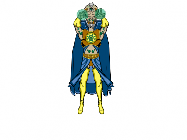
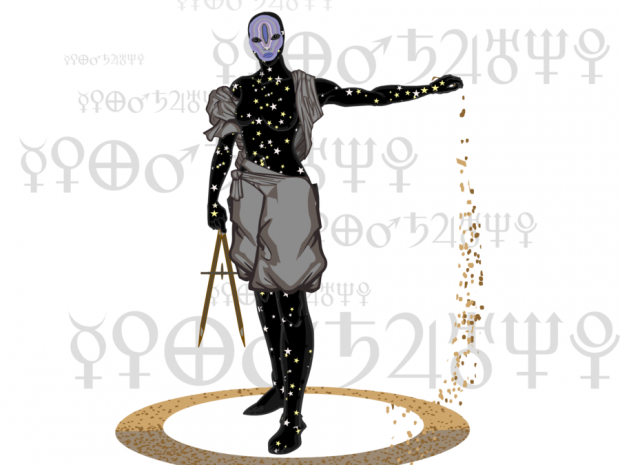
My love for Vadnik’s The Astrologist knows no bounds. This. Is. AWESOME! Vadnik knocked it out of the park with a great concept that is reinforced and completely sold by an outstanding character design. The nifty face design, the “star body,” the choice of clothing – all just perfect.
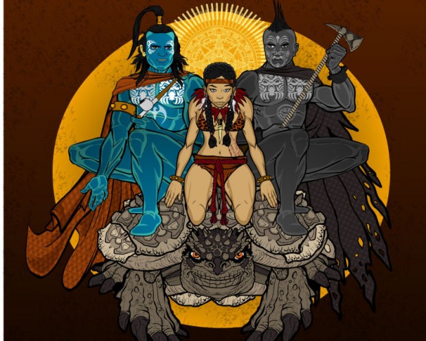
PapaKrok’s Creation is a wonder to behold. How much to I love this? Let me count the ways: 1) Conceptually, this is probably the most unique of all the entries. “Cosmic” in the sense of a creation story is a great spin on the concept. 2) There’s a story being told here, people! The three figures are all unique and well thought out. Love the tattoos and hair design on the two male figures. These are interesting characters about whom I’d like to know more. 3) Love the use of the Aztec calendar element as a halo/sunburst thingie. Well done. 4) Restrained, intentional color palate. Overall, the whole thing is a knockout, worthy of HeroMachine Hall of Fame consideration.
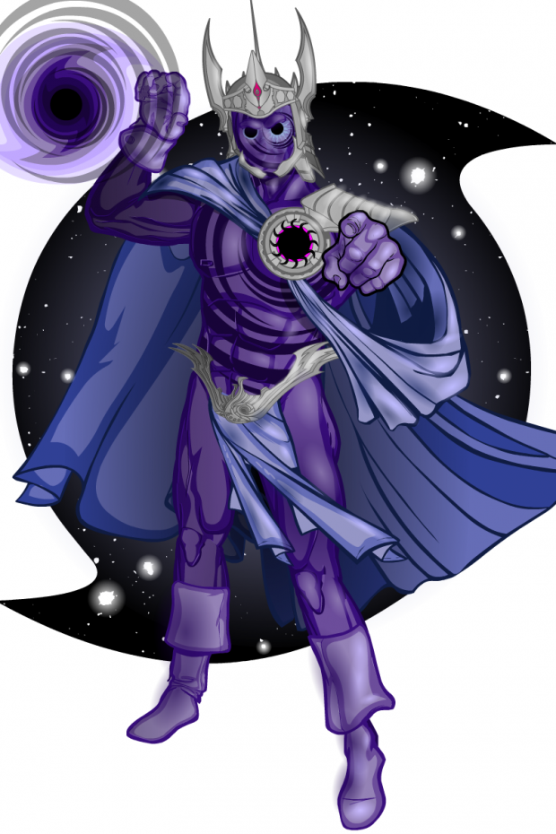
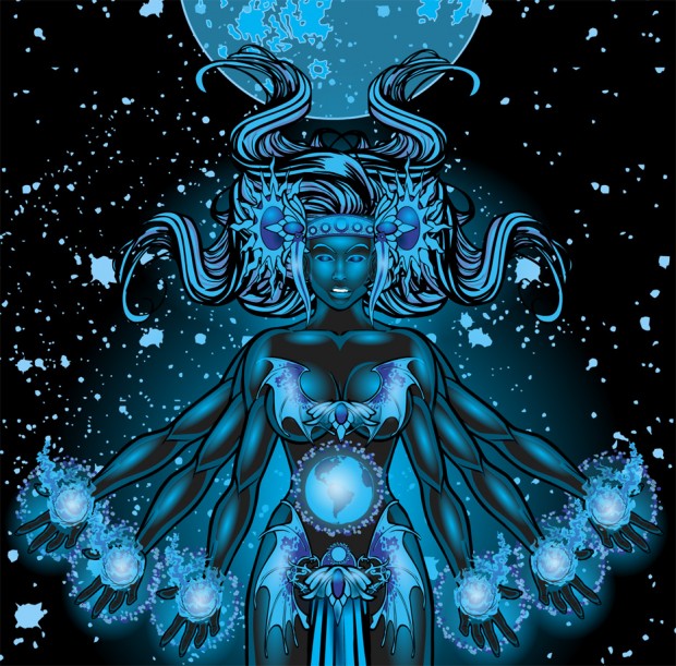
In the end, however (as opposed to the beginning – get it?) there can be only one. And that One for this week, HeroMachinists, is dblade’s Cosmic Birth. BOOM! What an awesome, awesome entry, hitting the right notes for concept and execution. Can there be any doubt that this being exists beyond the stars? The character design is evocative, creating what I think is an appropriate sense of awe. Mad, mad props for the very restrained color palate, and my congratulations for a very effective use of gradients to really sell a sense of dimensionality and otherworldliness. Congratulations, dblade, for an outstanding Grand Prize-winning entry!
My thanks again to HeroMachine Nation for the opportunity to judge this contest. Keep up the good work, folks!

