Many thanks to everyone who entered Character Contest 70! Apparently lions is popular, because there were a lot of entries.
Before getting to our Finalists, though, I've noticed a significant up-tick in the number of links that don't work properly for one reason or another. Some go to a jump page instead of just to the image, others have file names that don't include the artist's id or the name of the character, and some are bad links with bad names at the same time. Here are the folks who had something wrong with their entry or entries -- please look for your name, and if it's there, please try to do better next time as it makes it a lot easier (and faster!) for me to get the judging done.
File names should be in the format yourname-charactername.png (or .jpg). For instance, "Imp-Leo.png" is good. Had Imp just submitted "Leo.jpg", that would be noted below as "no name". Had he submitted "Imp.png" it would be noted as "no character name". Had he linked to the image improperly, it would be listed as "bad link".
You can find instructions on where to get the direct link for your image here.
- Asder : no name
- Brambles : no name
- dazed_and_confused : bad link, no name
- DeFesh : name
- extraordinaree : no user name
- fysaga : no user name, no character file name Photobucket
- Hairwhip : name
- headlessgeneral : no name
- jojo_n_friendz : bad link
- knight1192a : no direct link (ImageShack)
- kyle : no name, no character name (always saved as undo-6 or something)
- Kytana : bad link (ImageShack), no user name
- leadmetal : no name
- maniacmick : no name
- MarquisSamedi : no name
- McKnight57 : proper PicasaWeb linkage
- mrmatt220 : bad link, no name, no filename
- Oquies : no name, no file name, no character name, no names at all
- Rapthama : no name
- skullcraze : no user name, no character file name Photobucket
- Skybandit : bad link
- Sutter_Kaine : no name
- thebigm1993 : bad link (ImageShack)
- TOOL : no user name
- Trekkie : no name (always has hm3- beta in front of file name, too)
- Vanja : no user name
- Zyp(!) : no name
Now on to the more pleasant task of identifying our Finalists! Oh, and note also that most of these are now clickable. The sizes are getting so big that now I'm just making that the default, so I'm doing away with the "click to embiggen" text.
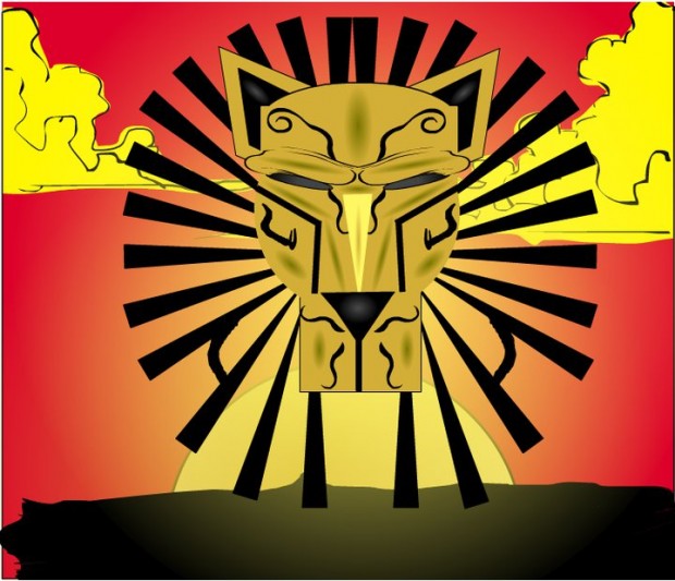
AJW's "Lion King" inspired African-flavored entry is stylish and graphical and I like it.
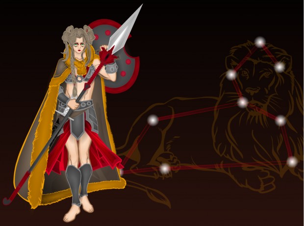
Asder has a cool combination of character and constellation.
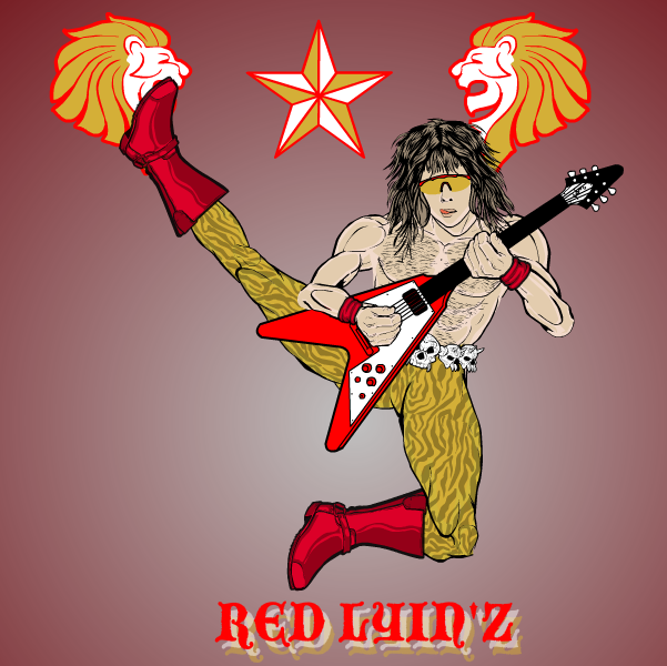
Atomic Punk's Eighties Hair Band homage made me laugh.
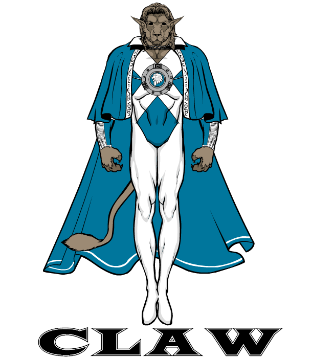
Blue Blazer's simple but elegant "Claw" has a great, clean, super-hero vibe to it.
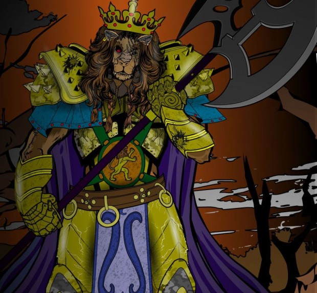
Chasca's really burst onto the scene in a big way, winning previously and coming again with a strong effort this week. "King Leon" has a great dynamic, gritty, awesome feel to it.
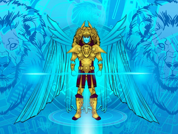
dblade once again shows why he's one of the best in the business with "Lion Guard", a great study in contrasting colors and high concept. Just a beautiful image.
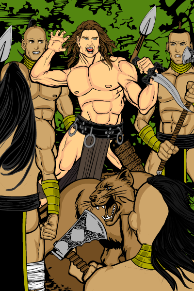
Erin's scene of a warrior surrounded with just his feline companion for support has a great composition and feeling to it.
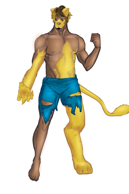
I liked the technique extraordinaree Trekkie used to show a transforming lycanthrope.
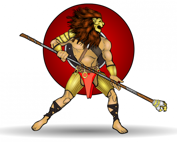
headlessgeneral's "Leo Gladiator" also has a dynamic quality to it despite the simple costume elements and background. This is a great example of how you can get a cool looking image by focusing on only the most important pieces.
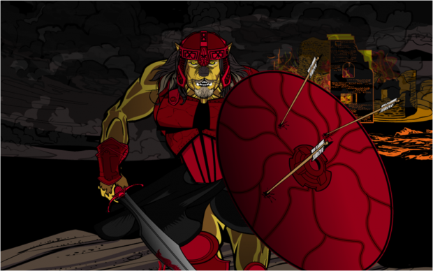
I don't know where Fallen Apprentice came from, but I'm sure glad they decided to start posting here! "Nemean Wrath" is a great scene and main character.
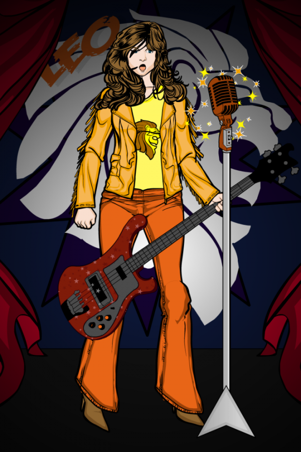
Despite the heart-rending limitation of only five entries, I think this was probably Kaylin88100's best week. See, editing works, people! My favorite was this musical character. The background lion element and drapes work great -- she really looks like she's onstage rocking it out.
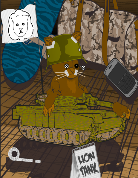
Kytana's "Tank" is one of hte cutest damn things I've ever seen. I love it.
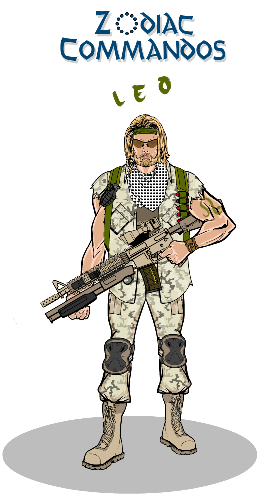
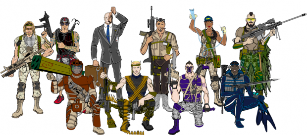
Of course, no Zodiac contest would be complete without MLS' ongoing "Zodiac Commandos" series!
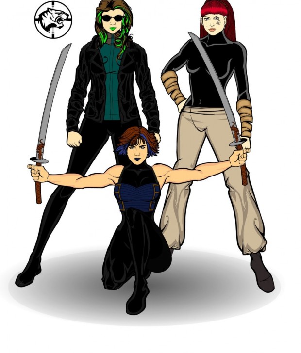
MScat's "WildCATs" group shot is awesome. I love the differing orientations of the three protagonists and their overall cool look.
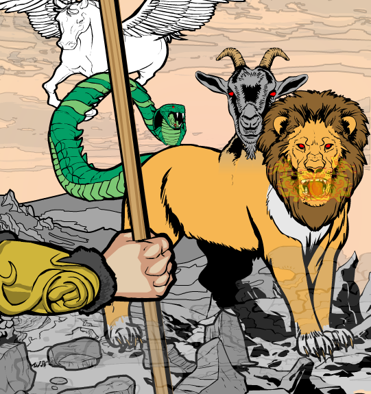
Myro gave us an illustration of Perseus' fight with the Chimera from the hero's view, and it's totally awesome. I love Pegasus sneaking in from behind, I love the composition overall, and the Chimera came out great.
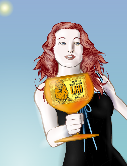
Sean David Ross is a master. There, I said it. This "Sign of the Lion" has great lighting, a great angle, a great face, and a great concept.
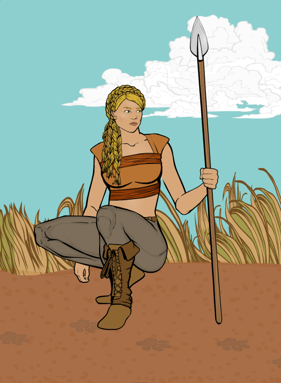
SpellCheckingQuill's "Huntress" shows great restraint, providing a simple but very convincing scene of a hunt in progress. I like the simple, clean lines of the character, the elegant setting, and the way it sets us up for whatever's happening in the next panel.
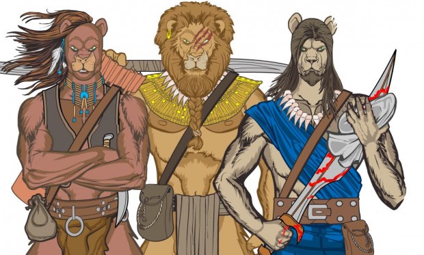
Sutter_Kaine has three lion-themed dudes, each more awesome than the last. That's quite a feat. Also, take a look at the great color design. Putting three figures shoulder-to-shoulder like this can be a real challenge to color in such a way that they don't tread all over each other visually. But everyone is nicely separated and distinguishable, while still creating an overall feeling of harmony. Brilliantly done, sir.
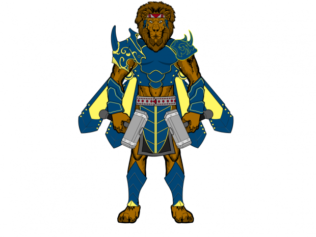
Tool's twin-hammer-wielding "Lion Warrior" has a great old-school super-hero feel to it that I really like.
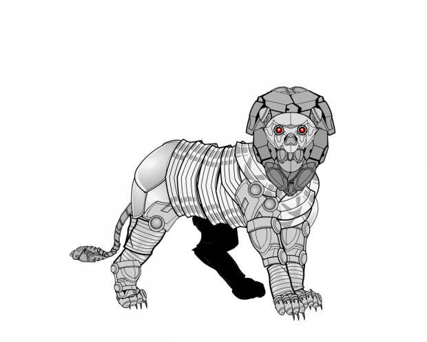
I can't get enough of Trekkie's robot creations. I think they're fantastic.
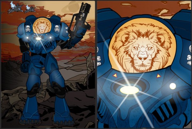
Unstable's "Space Marine" is one of the best mech-like constructs I've seen to date. I love the color design, with the blue armor contrasting beautifully against the warm golds and reds of the sky. The holographic-like lion head in the helmet works great, too. Just a wonderful all-around illustration.
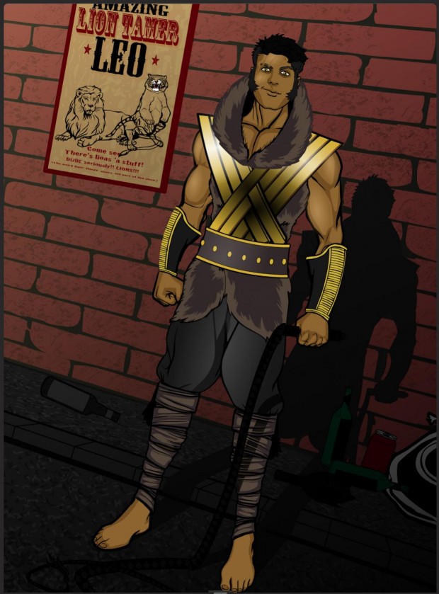
Finally, we have Zyp's "Leo the Lion Tamer". I think this pretty much speaks for itself, so I'll just say it blows me away with the level of detail and overall impression. Pure, 100%, unadulterated quality here, people. I mean, just the poster on the wall is so good it could probably win all on its own! And it's just a tiny piece!
I kind of hate to do it, because this is his third Zodiac win (and there's only been ten total so far!) but I just can't see any way around it -- our winner this week once again is Zyp! It's a gorgeously composed, immaculately colored, fantastically designed, flawlessly executed illustration that hits all the right notes. I love it. It could really be a comic book cover, it's that good.
Congratulations to Zyp and to all our Finalists! Thanks as well to everyone who entered and better luck next time!

