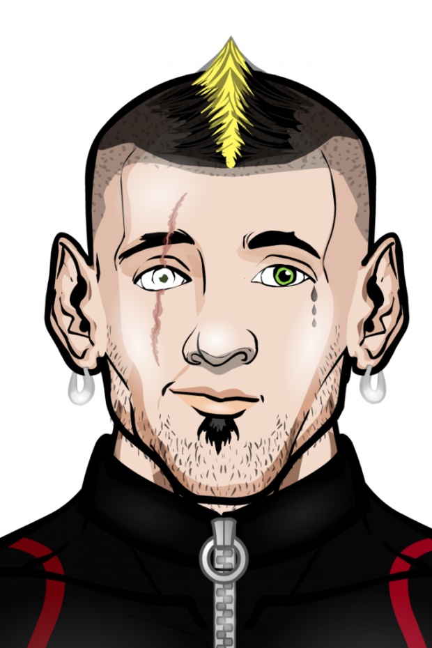
We had an overwhelming response to Character Contest 69. I sincerely appreciate your willingness to share your creations with everyone. Even if you're not one of the Finalists below, I hope you don't let that discourage you -- the entries were uniformly great, so you should take pride in what you've accomplished. Really, thank you very, very much!
As usual, I'll now post all the submissions I thought were especially noteworthy for one reason or another, and then announce the overall winner at the end. I tried to pick ones that looked like actual individuals to me, faces that seemed as if I could run into them on the street. Well, if that street were in a super-heroic, demon-infested, magical sci-fi universe, that is.
Almost all of these are clickable to see at a larger size.
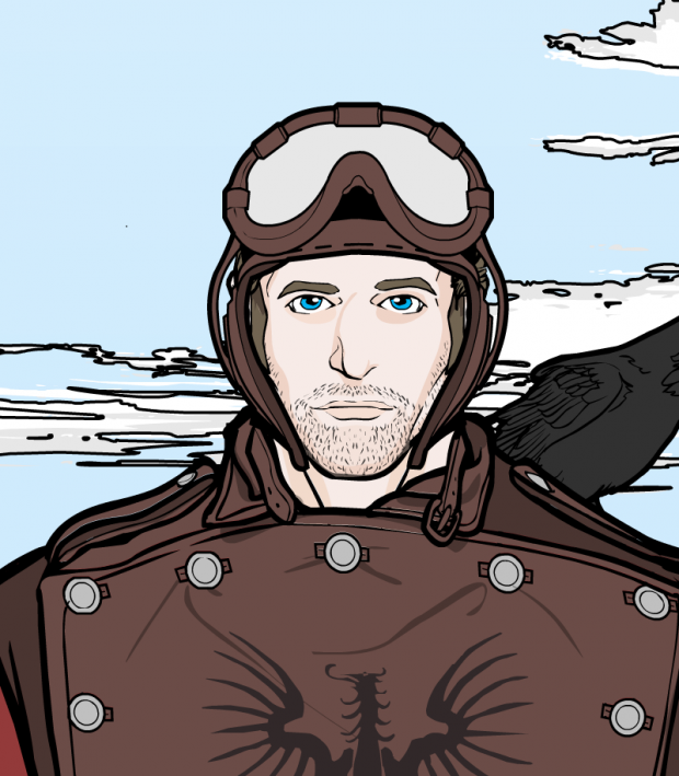
First up is Captain Brass, whose "Sky Pirate" is just a solid-looking, realistic, fairly distinctive fellow. Nothing fancy, but she or he got the concept of the contest down very well.
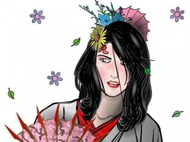
Chasca's "Blushing" is lovely. The hair, the flowers, the fans, all support the image very well. But what makes this great for this contest in particular is that she looks like an actual individual having an actual emotion. Exceptionally well done, Chasca!
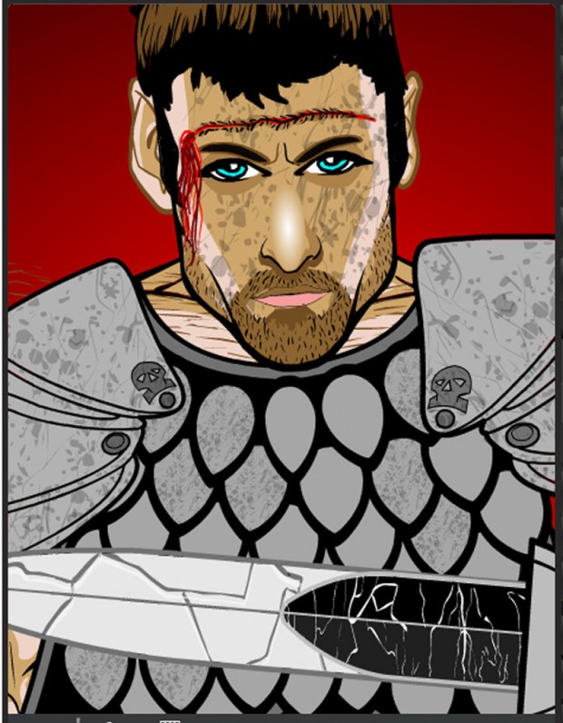
Cliff's "Gladiator" also has a wonderful feeling of individuality and personality. You get the sense this is a real person, caught in a desperate real-life situation. The grim determination and weariness almost drip from his face.
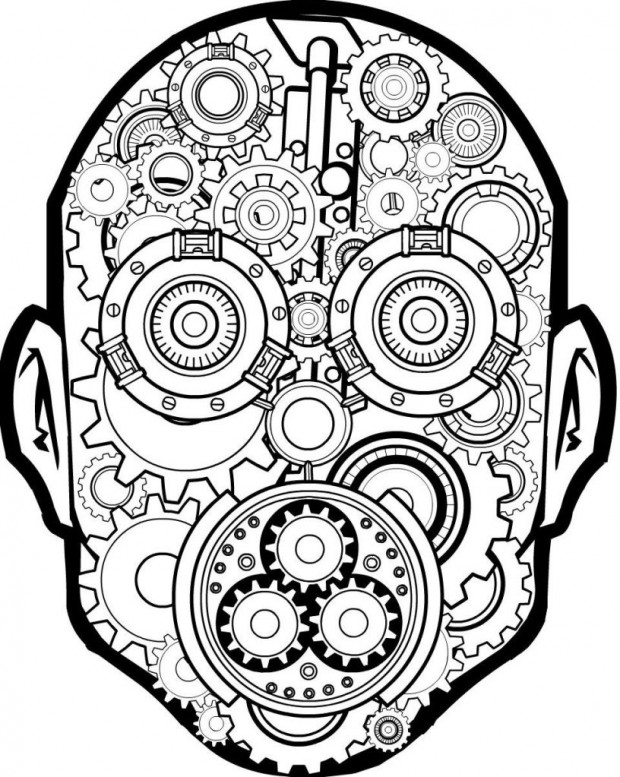
Clownprince put together a face using no actual facial parts, reminiscent of Trekkie's all-robotic assemblages of the last few weeks.
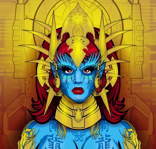
dblade's "Galactic Princess" is stunning. The gorgeous background and headpiece frame the blue body and face perfectly.
DiCicatriz's aptly-named "Cicatriz" also looks like an individual, which again was part of the point of the contest.
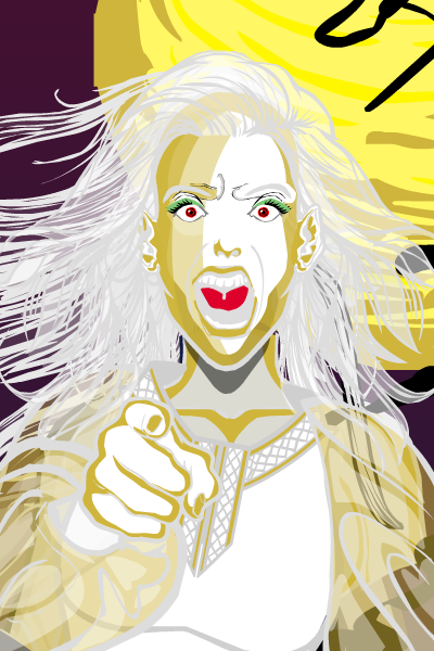
Erin's "Banshee" practically screams with personality. See what I did there?! Ahem.
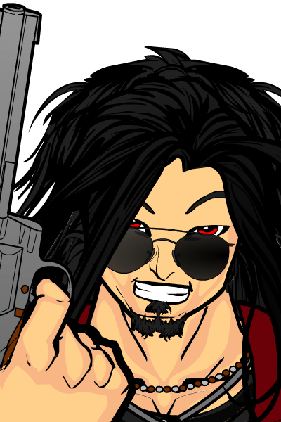
Extraordinaree has a cool take on the concept, with a nifty "over-the-glasses" thing going on.
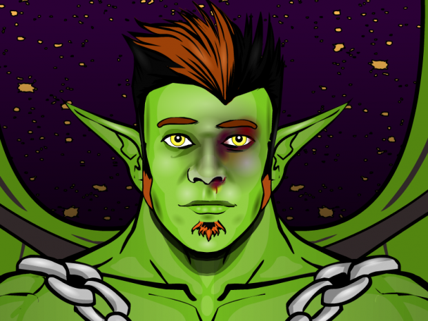
I love that headlessgeneral named this "Green" because, and I quote, "I call him Green because I’m too tired to think up a real name." That's awesome. Especially since this looks like a real guy, if guys were green with giant elf ears and wings.
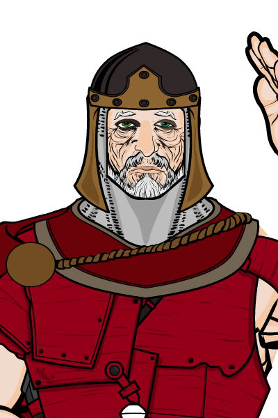
Kyle's "OId Knight" (or "undo1" as the file was named) has a lot of pathos. I like the vibe I get of a guy past his prime, who nonetheless puts on the armor and prepares to do battle.
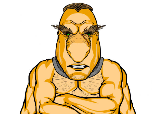
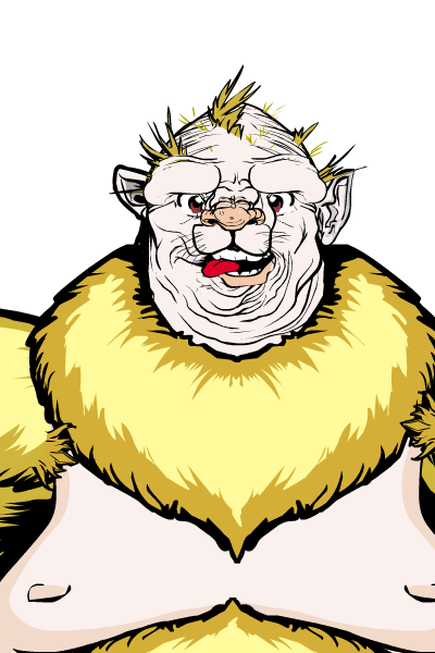
I flat out just love the look of "Trollguy" by Leadmetal. Very cool looking and unusual dude.
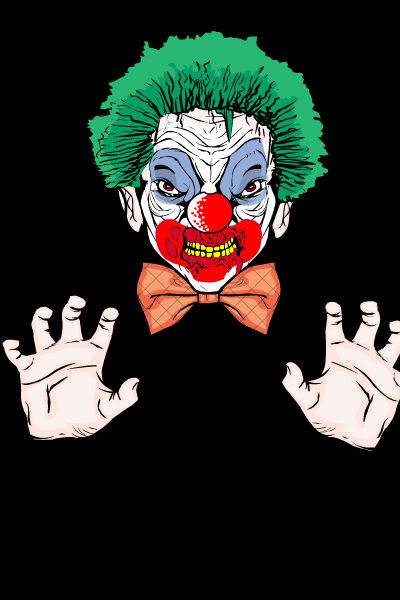
I don't know that I've seen Marquis Samedi enter a contest before, but I hope we see a lot more. He or she had two that I thought were outstanding this week, "Bald Joe" and "Closetclown". I'll let you figure out which is which.
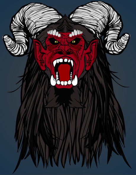
Moognation did some interesting things with teeth and hair to trick out the baboon base in "Demon Face" that worked out well.
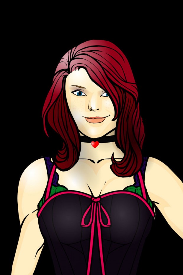
MSCat modeled this on an actual girl, and I think it shows. A very nice, believable construction.
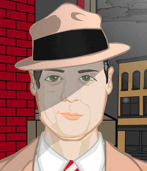
Myro seized the central concept of the contest in his pseudo-homage to Humphrey Bogart. This, again, is a distinctive, individualized face.
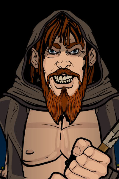
Papakrok brings his usual slightly demented twist to the contest with "Executioner Head".
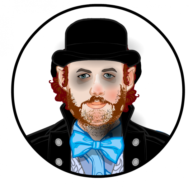
Pesky brought two excellent entries this week. The first is a portrait named "Sullivan" and has a gritty, steampunky type of feel to it. I keep beating this horse, but again, this looks like an individual and not some kind of generic icon.
Pesky's second entry is titled "Moody" and has an ethereal quality to it that really works. the eyes and mouth -- the FACE, people! -- totally pops. Like in the first one, I think he was very clever to crop everything into a circle, so you focus on just what he wants you to focus on. Very smart, and effective.
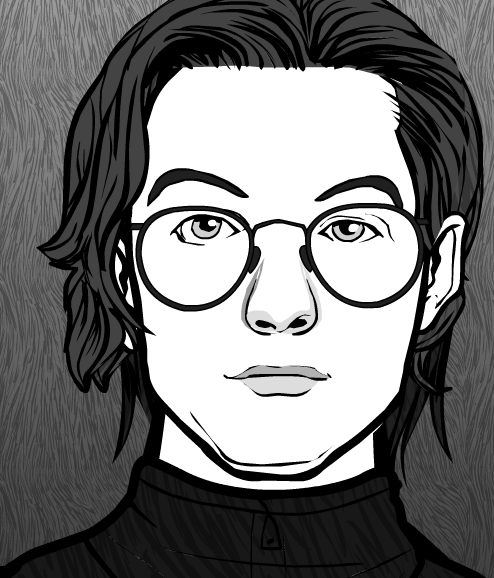
SeanDavidRoss hits it out of the park every week, it seems like, and this time is no exception. His first entry is a black and white study named "Elijah Blue" and folks, this looks like an illustration of a real human being. Nothing crazy fancy, just very effective choices well assembled.
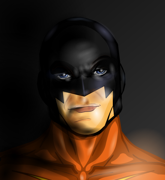
SeanDavidRoss' other entry is the unbelievable "Nimble Jack". I say unbelievable literally, because for the longest time I could not believe this had been done in HeroMachine. It's simply stunning. I can't even imagine how long the gradient work alone took.
Trekkie always does something unexpected, and this week it's the creation of a convincing alien face with some unusual items.
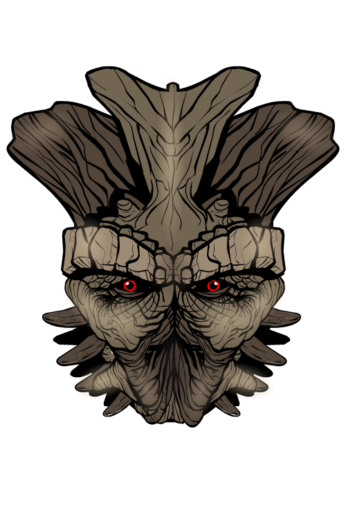
Vampyrist doesn't do anything extreme with "Griffin", but what he does do is create someone with a sense of personality and charm. I like the emphasis on the eye, the pleasing arrangement and spacing of features, and the wry grin.
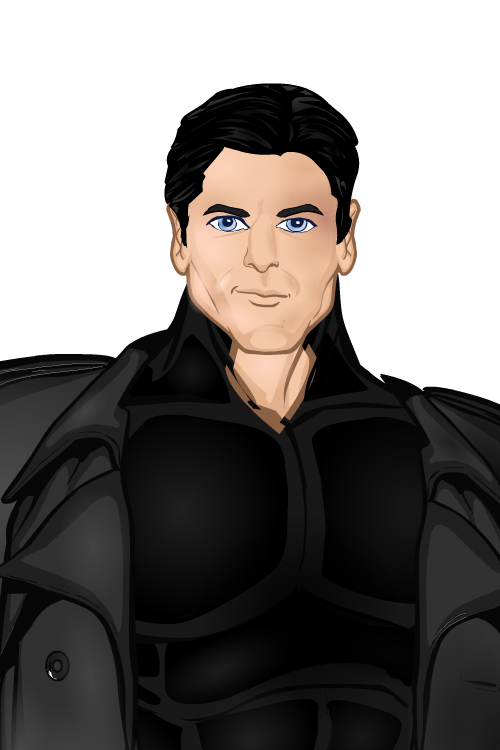
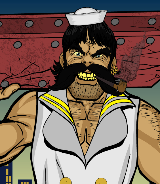
Finally, we have Zyp's whacky, cool, funny, and intimidating "Johnny Boy", who you'd better hope you never meet in an actual sailor bar.
That brings us to our overall winner, which is a truly difficult decision. As you can see, there are a lot of stellar options. I think probably on an initial pass, the two favorites were SeanDavidRoss' "Nimble Jack" and dblade's "Galactic Princess". I love them both, but I'm not going with either of them, and largely for the same reason -- the extra stuff going on in the one and the big cowl on the other make it too hard to see the face itself.
There are several others that were also in that upper echelon, but ultimately the decision for me came down to Chasca's "Blushing" and both of Pesky's finalists. I think they all exemplified the challenge of creating a convincing, individualized face that looks like it has a real personality behind it.
And after reviewing them all again, I ultimately had to choose ... Chasca's "Blushing". It was the most realistic, had the most personality, and was the best overall illustration, in my opinion. Congratulations! Let me know in the comments to this post or via email (afdfstudios@gmail.com) what you'd like for your prize.
Thanks again to everyone who entered; congratulations to all our finalists; and stay tuned later today for the next Caption Contest!

