Many thanks to everyone who submitted an entry for the Taurus contest. I appreciate both your creativity and your willingness to share it.
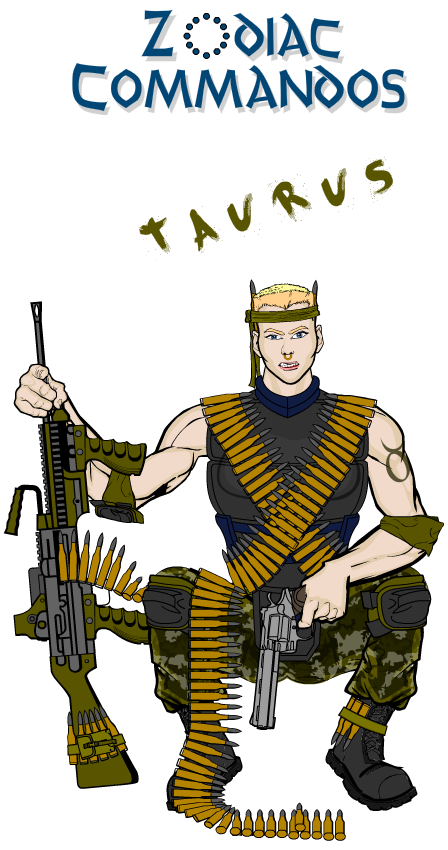
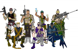
I've selected a few illustrations that for various reasons caught my eye. I wanted to start with an update of Mark's GI-Joe ripoff team, the "Zodiac Commandos" with their newest member and the latest group shot since they're sort of the inspiration for the whole Zodiac Contest campaign:
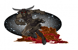
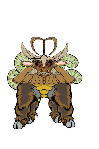
AJW's "Taurabat" was so cute I couldn't resist including him. OK, maybe "cute" isn't exactly the right adjective, but you see what I mean. If you had to choose just one demon-eyed abomination to run you down, this is the one you'd pick, no question.
AMS always comes up with outstanding poses in astounding settings, and this week is no exception. I love the kinetic dynamism of the composition and the way you really get the sense this guy is running around. The space and smoke backgrounds work both as pure design elements and as scene-setters. Really nice job here, sir.
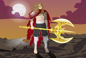
I think we've seen this pose and big-axe general look from Asder before, but it still works well. Very nice use of colors and subtle bull touches to convey the idea of a somewhat unconventional minotaur-esque character.
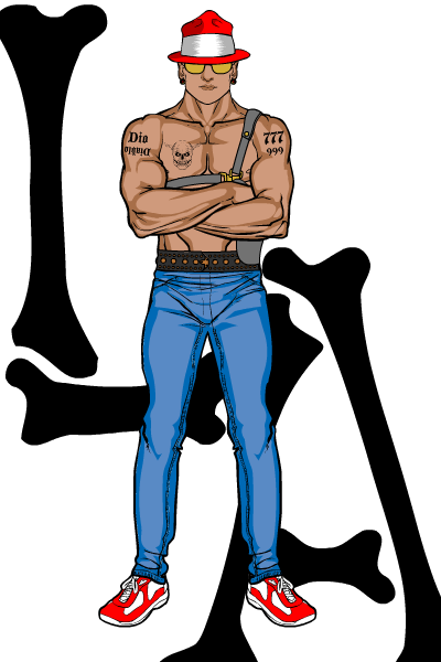
Atomic Punk's "El Toro" L.A. gang member is pure and simple, and works for exactly that reason. Each element is essential, and just enough are present to nail the concept without cluttering it up. The black bones used as a background design element both frame the illustration nicely and reinforce the concept of a bad-ass street guy. Love the hat, the tats, the gold sunglasses, the earrings, everything.
I wanted to highlight D's "Minotaur Paladin" for the really nice environment he's put together. The walls in particular, thanks to some smart coloring and patterning, work great. I love the way he's managed to put together a very convincing labyrinth.
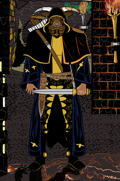
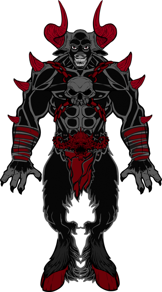
dblade managed to find time to put together a clean yet impressive submission he titles "I Am the Bull God" despite his active pace putting together custom items for us all to enjoy. I love the use of colors and tones. The whole figure works, making for a scary looking minotaur indeed. The horns in particular look almost as if they were hand-drawn to fit. Hey, wait ...
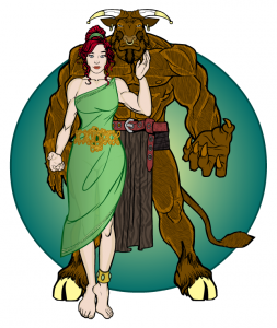
Imp might have been uninspired, but it didn't show in his entry "Beauty and the Beast" in my opinion. It's a classic but very well-executed concept. I like the use of the Brickish torso for the bull and the overall color scheme a lot.
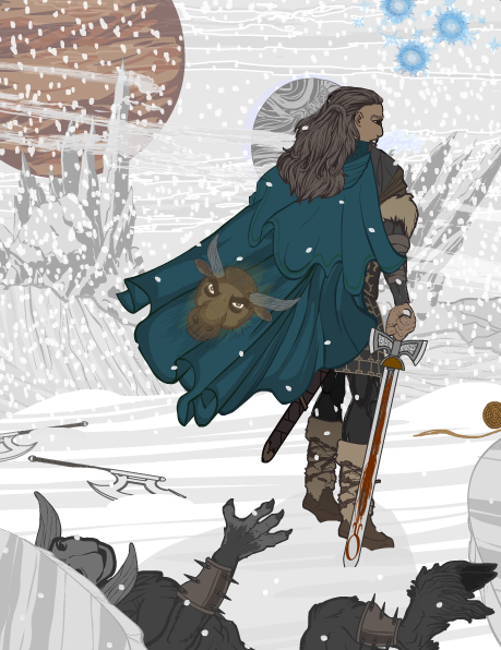
Kytana's wintery scene is really effective. I feel like this guy's just walking off the "Thor" set. All of the environmental elements work and you definitely get the sense of a story being told.
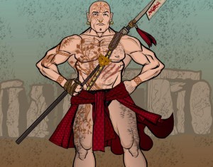
PapaKrok's simple sand-blurred background perfectly sets off the hirsute, grizzled warrior in this wonderful illustration.
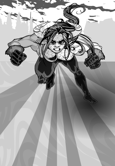
Sean David Ross decided to go black and white for this contest, which I think was a brilliant choice. In fact, I'm considering that for a future contest theme -- whatever you want, but done in black and white. As you can see here, a good design can be extremely effective when rendered that way. This one features another great SDR-designed pose, which I think you can actually get in the UGO Forums, proving once again he's not only talented, but generous. Thanks SDR!
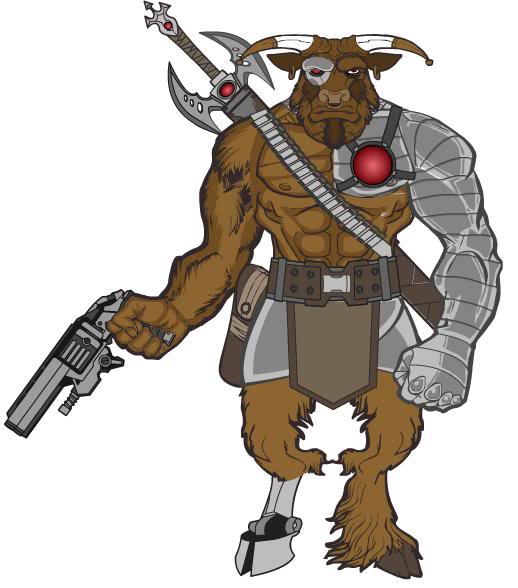
I love Sutter Kaine's cyborg Taurus. It's one of those clean-and-simple designs I've talked about already, where every element has its place in telling the story of the character, all of which come together to make a very convincing illustration. I love the one metallic pectoral melding into the robot arm, the nice masking of the lower leg to allow the hoofed extension, and the combination of sword and gun. I do wish he'd used the finger-out trigger hand instead of the closed one, but that's a pretty minor consideration. Really cool looking dude here, Sutter Kaine!
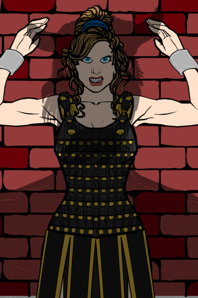
Speaking of telling a story, Zaheelee's "Captured by the Minotaur" definitely does. I love the expression on her face and the menacing shadow that gives you a real moment in time. The revisions you maded helped a lot, too, Zaheelee, version 2 was much stronger than version 1. I might've liked to have seen some actual chains on the manacles since it's not immediately clear that she's bolted to the wall, and also some eyebrows. But it's a great scene that's very well done, thank you!
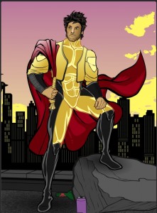
Zyp done brought it again with his "El Matadore Toros". I love the coloring on this one, and it features one of the best custom poses I've yet seen. The background is great as well, with the contrasting yellow and pinkish-purple sky and skyline. Along with the head area, the cape is what really sells this one for me. It totally reflects the concept of an updated, super-hero matador. I love that it serves as both a traditional bullfighting cape and as a super-hero accessory. That's a brilliant idea and it's carried off exceptionally well here. Just a great design and illustration all the way around.
There you have them, folks, the best of the best for the Taurus contest. I had a hard time settling on one winner from the set, but ultimately I felt I had to go with the one that made me say "wow" when I first opened it. And that one is ... Zyp's "El Matadore Toros!" Zyp's been on fire since coming back, and I think this is one of his strongest yet. That cape element along with the great pose are just outstanding.
Congratulations, Zyp on the win, and to all our Finalists for putting together such wonderful illustrations!

