Many thanks to everyone who entered Character Contest 59 - Pisces, there were some great submissions. I've gathered together some of the ones I found particularly noteworthy as our slate of Finalists; I hope you enjoy them!
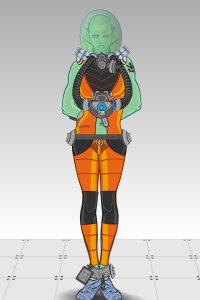
First up is BClouser's "Prison Fish", showing an interstellar criminal finally brought to justice. I really liked the whole helmet apparatus, along with the nifty prison-orange-uniform-in-SPAAAAAAACE concept.
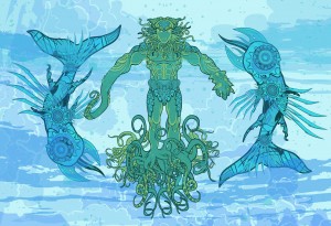
DBlade's "Aqueous" (the non-Photoshopped version) was one of the best "classic" Pisces arrangements, with two very cool looking biomechanical "fish" surrounding a central figure. The surrounding ocean environment is great, too, particularly the clever use of some of the cloud elements colored and positioned to look like water.
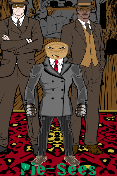
Frevoli's clever "Pie-Sees" pun totally puts me in mind of a Dick Tracy villain, complete with the bizarre head and glowering henchmen. I love the masks on those guys, they look perfect.
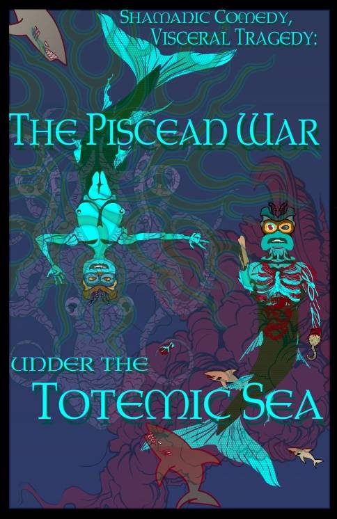
I thought GamerMage did a great job putting together an entire poster, complete with great copy, cool images, and a really nice layout.
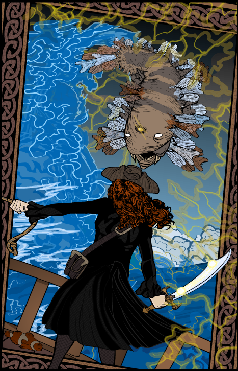
Kytana's "Pisces" really blew me away. Amazing setting, awesome fish, fantastic pose, and the off-kilter frame adding to the drama all combine for a truly epic feel. Just amazing.
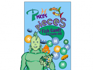
LogosGal also put together a really neat poster, this time for that childhood favorite candy, "Pisces Pieces". A very clever idea done extremely well. Glad you found the blog here eventually, LogosGal, welcome aboard!
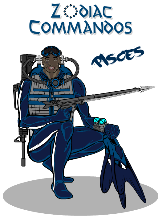
MLS continues his "Zodiac Commandos" series, which he describes as a "Cheap GI Joe knockoff" but which you and I know is actually cool all on its own. You can see the entire set here if you're of a mind.
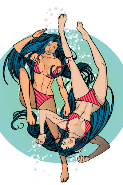
PapaKroc continues his outstanding run of well-conceived and well-executed images with his "Pisces". The figures themselves are posed very well, the hair is quite convincing in the way it seems to flow in the water, the bubbles breaking the plane of the background circle, all contribute to an outstanding "classic" interpretation.
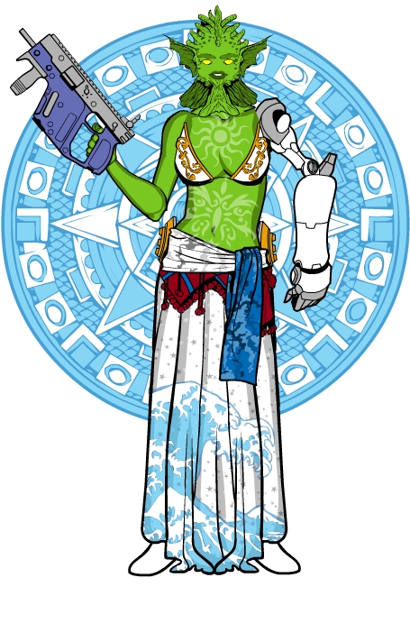
I loved Pesky's use of colors and patterns (particularly in the skirt and the tattoos) on "Atta". She's got a real attitude, though I would encourage Pesky to check out the "How to put an item in your character's hand" link at the top of the HM3 window 🙂
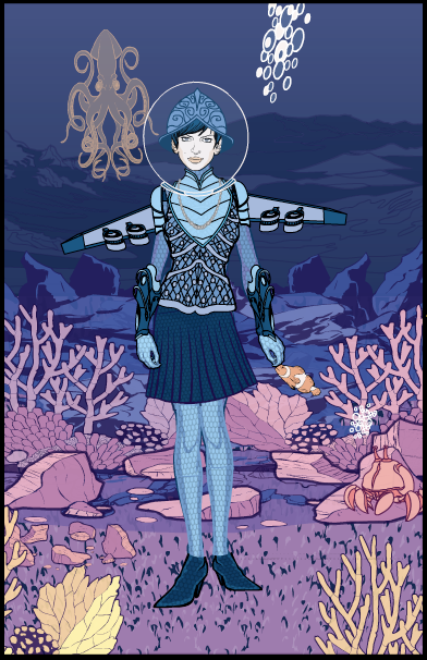
I've commented before on how much I like the way Sean David Ross assembles backgrounds, and this entry is a great example of what I'm talking about. You've got a real progression of levels here, reinforced by both the positioning of the elements themselves and the colors used. You get a fantastic sense of depth and space, so the figure feels rooted in her reality.
Sutter Kaine must have channeled Robert Palmer's "Simply Irresistible" video for this one!
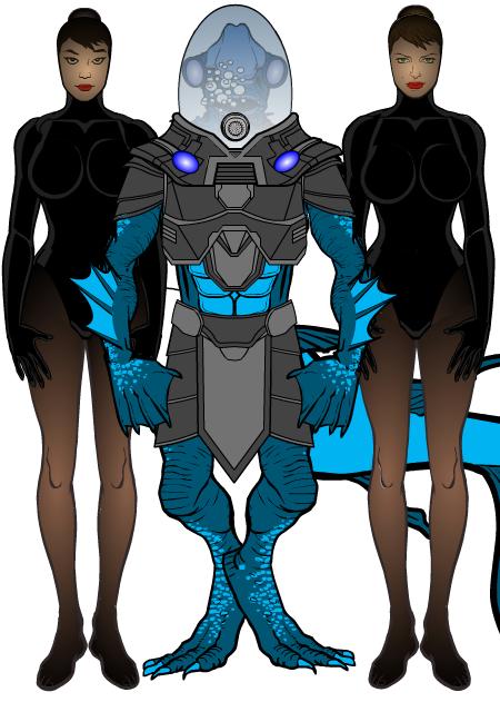
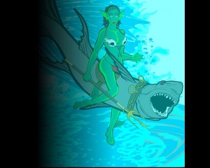
I've included Tarkabarka's "Fish Lady" entry mostly for the awesome shark and shark-riding gear. That's a great idea and really cool. I do wish we didn't have the big black gradient over on the left side, or what I suspect is a mostly-transparent white overlay washing out the details, because I'd like to see it all framed and clear. But that shark harness is awesome.
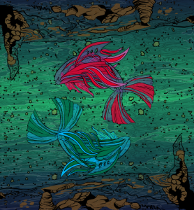
UnknownBlackPaper's "Another Time" is just lovely. A beautiful composition, innovative use of non-traditional elements to create the fish, and an almost lyrical sensibility. Just beautiful.
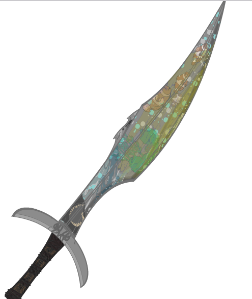
I love it when people think outside the box, as Zarae did with this great blade given to a young mermaid. The concept is great and the execution here rocks. Really nice job!
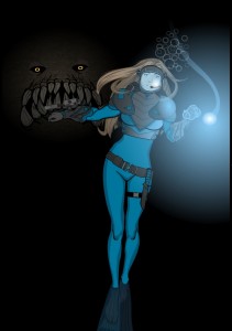
Finally, Zyp's "Deep Blue" evokes a wonderful sense of impending horror.
Sometimes these contests involve a lot of agonizing as I go back and forth between a number of entries, unsure which to choose as the winner and why. I even have called my wife in to help decide a time or two, and it's not unusual for buddy John to get a call asking him to weigh in.
Then you have contests like this one, where a single entry just leaps off the screen, grabs me by the throat, and chokes me till I can call it the winner. And that entry this week belongs to Kytana! I thought it had drama, action, great composition, an awesome fish, a very convincing pose seen from behind, and an innovative layout, all of which combined to draw a gasp from me when I first saw it. Simply an outstanding illustration, thanks so much for sharing it Kytana! Let me know what you'd like for your prize either in the comments below or via the "Contact Us" link at the top of the right column.
Congratulations as well not only to all our Finalists, but everyone who was willing to share their work with us by submitting an entry. Well done everyone!

