Many thanks to everyone who submitted an illustration for Character Contest 58: Simply Your Best. It was a real treat getting to see the pieces you feel the best about, and in my book your'e all winners already!
So while I'm obliged to pick out just a relative handful (and only one winner) from all of those submitted, I really think you all deserve a big round of applause. There was hardly a bad one in the entire bunch.
And now, on to the images!
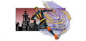
First up is ams with "Rush 2", first seen in one of the Open Critique Days. The pose on this one is spectacular, a really convincing classic speedster. The orientation of the face, hands, and legs all sell the idea really well. The color choices are spot-on, I like the framing mechanism of the rectangular cityscape, and the speed swoosh behind the figure is great. Just an all-around fun and convincing image.
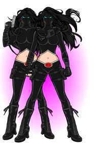
Anarchangel's "Doubletake 2" features two of the hottest assassins that'll ever be the last thing you see. I like the simple designs of the costumes, the spot red color of the belt buckles, and the elegant glow behind them that perfectly sets off their black outfits without being intrusive.
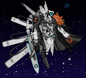
We also saw B. Clouser's "Warm Messer" in an Open Critique Day, and it remains one of my all-time favorite mech illustrations from HeroMachine. I love the big ol' fins, the simple but effective space setting, the great use of warmer colors to break up the cool blues and whites, and just the general look of the figure.
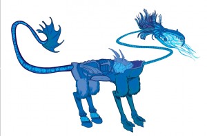
I thought Brad's "Ice Dragon" was a nice example of how you can make non-human characters with a little ingenuity.
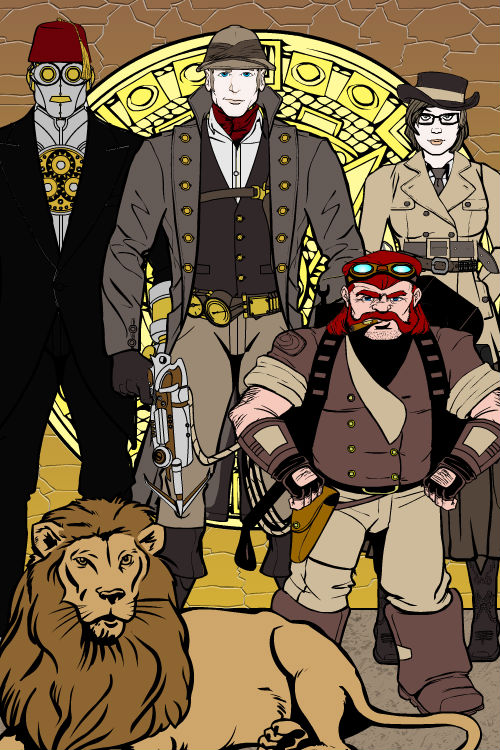
Captain Brass' "Brass Family" portrait has three custom characters mixed in with two pre-drawn characters and they all look great together. I would totally want to read more about this group, kind of a "Family of Extraordinary Gentlemen" thing. The colors and costumes are all just great. I think he made excellent use of black areas as well to frame and support the overall composition. A really nice illustration, Captain Brass!
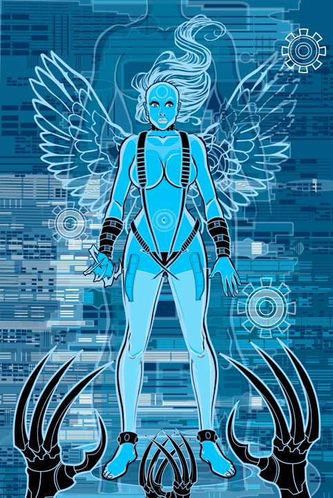
dblade's "Seductrix" was the first one that I said "Wow!" about when I opened it. I'm glad TheRandomHERO and Worf figured out that the background effect was achieved using multiple cleverly colored skylines, because I never would have known otherwise. The "ghost in the machine" figure behind the main one, the white hair and wings, the cleverly placed insignia here and there, and the great black claws with blue line color in the foreground make this one of the most striking illustrations to come out of the HeroMachine I've seen yet. Really nice job!
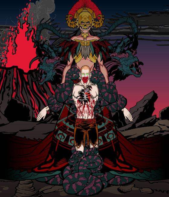
DiCicatriz' "Kid Chaos Possessed" has a lot going on, but it all still works pretty well. I have to confess this isn't entirely fair to DiCicatriz, but I've actually liked some of his other illustrations better, but they aren't eligible because they'd already won! Still, this one is darn good.
Felipe S. Card's "Amazons of Fate" are all three outstanding fantasy character designs, and they all look great together. There's nothing crazy or super complicated about any of it, he just concentrated on getting all the details right in putting together high-quality, believable, and interesting character designs. I don't think there's a false note anywhere, which is pretty astounding.
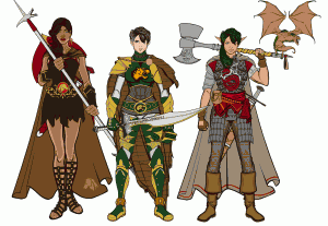
(Click to embiggen.)>
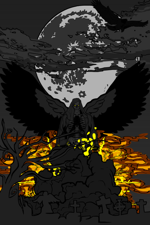
Hammerknight gives us "Death's Fiery Escape", a really cool concept executed very well. I like the grayscale tone of the majority of the piece, highlighted and framed with the flaming smoke behind the death figure. Really nice work. The clouds over the moon work great too.
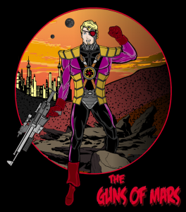
As was the case with DiCicatriz, I feel a little bad for Imp because he has other illustrations I like better than this one, but they either won or were Finalists and thus weren't eligible. However, I do think the landscape he's assembled here (and nicely placed within the circle, with the figure stepping out of it) is excellent and the overall concept is neat.
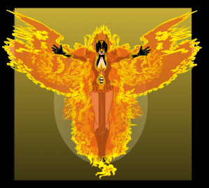
Kaldath's "Firebird" may, as one commenter said, look like a "What If Hawkgirl Hosted the Phoenix Force" but I would totally buy that comic based on this illustration! The layering and transformation of the flames to make the phoenix aura is awesome. I love the way some of the flames are over the figure's limbs, reinforcing the idea that she is surrounded within them. Just a very powerful and great-looking piece.
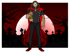
This is a bit more gory than I usually go for, but what really catches my eye about Me, Myself, and I's "There Will be Blood ... I Insist" is the background. I love the combination of graveyard and trees in silhouette to make a great backdrop. Combined with the nice glow effect in the moon and the blood-red sky gradient, the whole piece ties together nicely and makes for an interesting composition. I'm just pretending like the severed head doesn't exist, or is a prop or something.
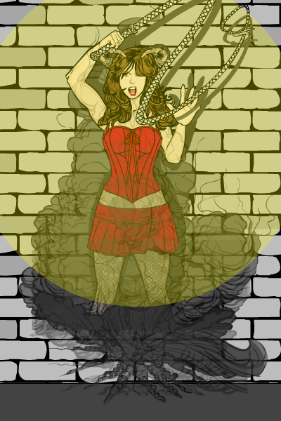
Myro's "Succubus Teleport" has a lot of spirit (ha ha!) and pizzazz about it. I like her expression, the way the hair hangs over one eye, the positioning of the bullwhip, the drop shadows (note how the whip shadow is OVER the hand, that's a nice touch) and the way she does look as if she's BAMFing into or out of a cloud.
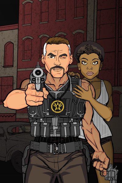
PapaKrok's "Marshall X" features his usual creativity and attention to detail. Look at that gun! I'd totally buy that it was a pre-generated item, it just looks great. Both of the faces have real personality, too, which is often overlooked.
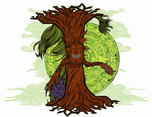
Pesky's "Evil Tree" is another non-human character that nonetheless really has character. It's a really clever effect, set off perfectly by the green fog and Aztec calendar backdrop.
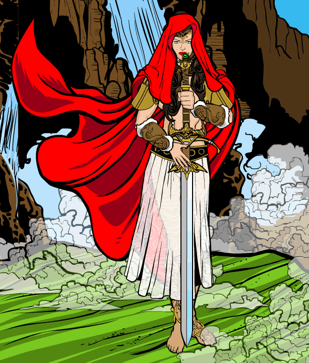
Spidercow2010's combination of Snow White and Red Riding Hood works on a lot of levels. The striking bold red hood and cape frame the whole thing very well, allowing for more delicate colors elsewhere like in her diaphanous dress. The simple but strong pose works great too. And note how the lines of the waterfall by her head lead you down into the lines of green ground, making for a powerful dynamic sweep that draws your eye in and keeps it focused on the figure. A really nice character design and exceptionally good layout.
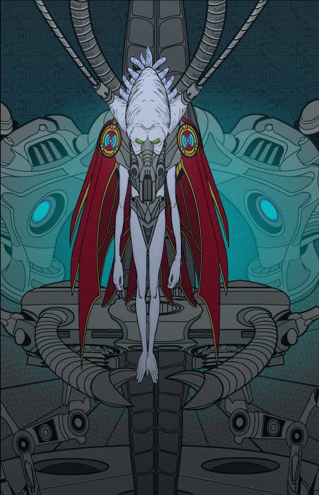
Tango's "Lord Talvar" also drew a "wow" from me this week. I love the clever use of various Mech parts to make a convincing high-tech ship or lab setting, especially the glowing blue pieces in the background. The tubes leading into the creepy figure and its hand-feet all come together for a disturbing, intriguing, and highly effective piece. Great job, Tango!
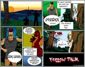
UnknownBlackPaper went the extra mile and actually put together a full-on two-page comic book spread!
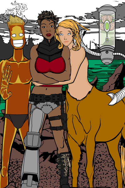
Violet's "Travelers" features four interesting characters in a good setting, but what really caught my eye was the genuine affection you see between the centaur and the cyborg. I think getting an emotional reaction from the viewer is essentially what art comes down to, and Violet's definitely pulled that off here.
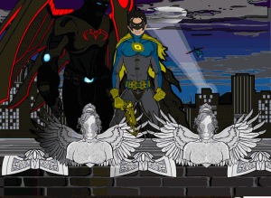
Watson Bradshaw's "Kid Turbine and Knight Bird" mostly makes it for the great setting (those statues are awesome!) and the background. The figures are nice, don't get me wrong, but it's the environment that sold this one for me.
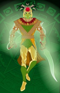
Finally, we have Zyp's "Power Aztec", which is just a really solid, interesting super-character.
As you can see, picking just one overall winner from this group is even tougher than it was to pick the Finalists out of the general group of submissions. But hey, that's why they pay me the big* bucks.
Ultimately I narrowed it down to B. Clouser, Kaldath, dblade, Tango, and Felipe S. Card. From there I had to just go with my gut, and pick the one that genuinely made me go "Wow!" when I opened it.
And thus the winner is ... dblade, for "Seductrix"! The color palette, the composition, the subject, all of it just works perfectly. The capper was the simple but innovative use of the cityscape background to get that digital patterning, I really love that.
Congratulations to dblade, who wins his or her choice of either any item or portrait to be included in HeroMachine 3, or picking a "Sketch of the Day" theme which I'll then draw however I like.
Thanks again to everyone who entered, to our illustrious group of Finalists, and to dblade!
(*For very very tiny values of "big".)

