Many thanks to everyone who entered Character Contest 57: Aquarius! I've picked out some of the best of them (in my personal opinion, of course) below, and at the end I'll announce which of them is the overall winner.
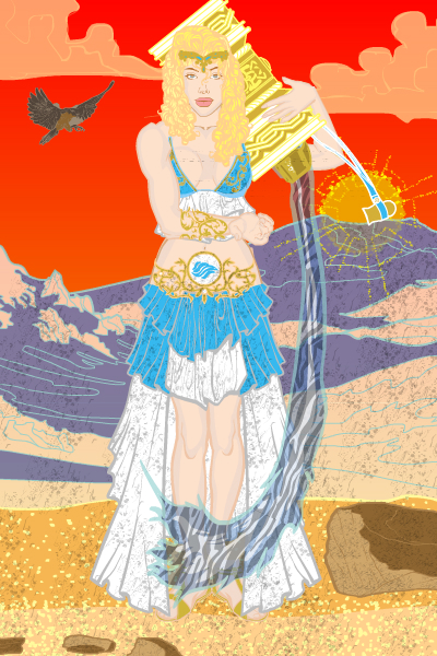
First up is Amaranth's "Aquaria". We had quite a few "classic" illustrations in this vein, with the female figure holding a container of water, but I thought Amaranth's version had a lot of nice vibrant color and a pleasing composition.
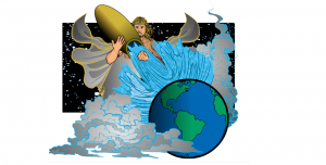
I've recently been browsing AMS' UGO Forums archive, and the dude has some serious skills putting together dynamic illustrations. His "Aquarius" is a good example. I really like the Earth being nestled in the clouds, the big splash, the nice framing device of the rectangular star field, and the positioning of the figure.
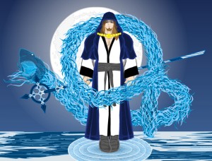
Asder had two really good ones this week, but I chose "Akua Priest" over "Aquarius" because Water Spell Shark Head will EAT YOUR FACE!
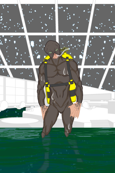
BornToBeALoser belies his (or her) name by providing a Finalist in the form of the Aquarius Space Project. I liked the guy's head, hands, and the way he's depicted as standing in a flooded control room. Nothing too fancy, but it works.
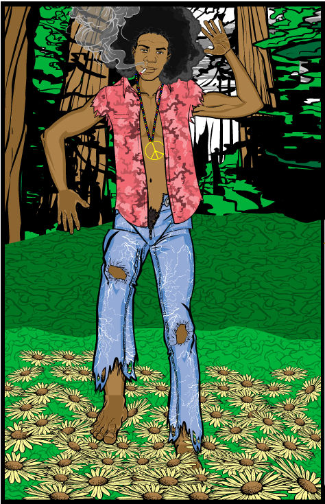
I was hoping someone would do an "Age of Aquarius" hippie thing, and was very happy Cliff obliged me with this fun and funky drawing.
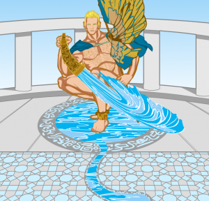
DiCicatriz's "Ganymede" features a couple of really nice effects I wanted to highlight. First, I really like the way the "pool" is filling the runic ground element there. Second, the stream coming from that pool is integrated well and looks entirely believable. And finally, I really like the joining of that tessellated floor element with the planks of the balcony. It makes for a very convincing setting.
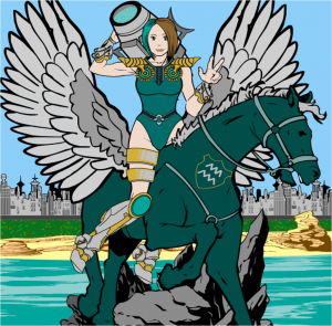
Frevoli combined the "air" aspect of the sign of Aquarius with the water-bearer very nicely. I particularly like the water cannon / urn, that thing looks like it would be hella fun to bring into a melee.
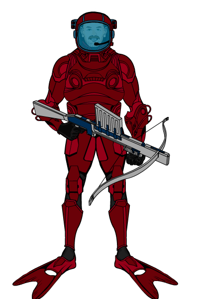
Kyle's simply named "Steve" is one of the best aquatic suited humans I've seen. There's nothing startling or revolutionary about it, but the simple color scheme and spot-on selection of items combine to make a very convincing, solid, believable, and interesting guy. The blue-tinted helmet is one of those little, but absolutely key, touches that really help "sell" a concept. I do, however, yearn for the day Kyle starts naming his character images with something besides "hmbeta".
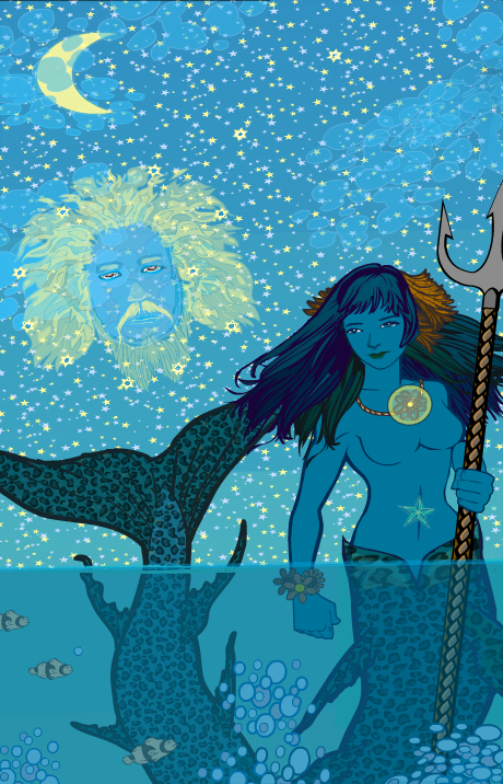
Kytana's "Aquarius" has a whimsical, almost illustrated-book feel to it. I love the colors (almost entirely shades of blue and yellow), the way the Zeus face constellation comes across, and the simple but effective rendering of the clouds. A really fun image with a very distinctive style to it.
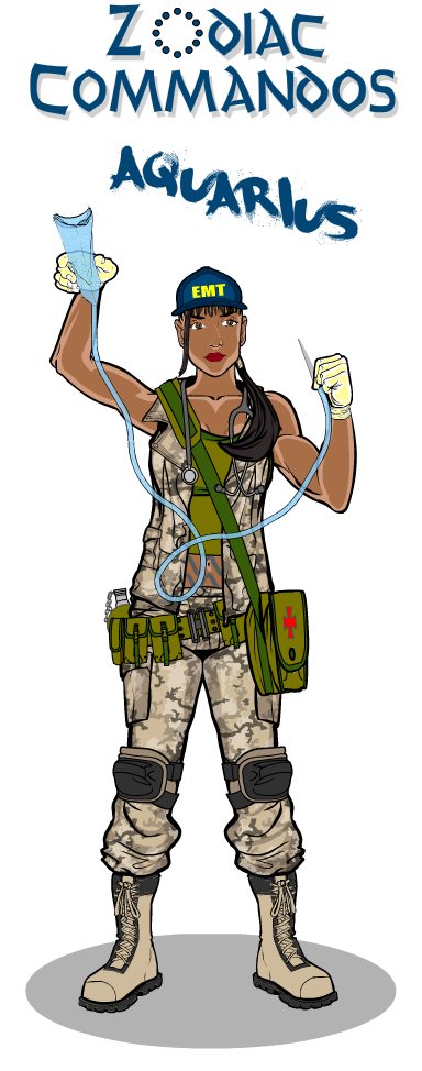
MLS continues his "Zodiac Comandos" series with the medic, Aquarius. You all realize he's the main reason I keep doing these, right? His commitment to the process demands that I honor it, too!
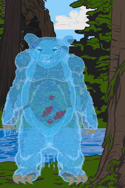
Nakiato has one of my favorite characters ever with "Aquarius the Water Bear". Just look at that guy! You want to run up and hug him, playing with the cute fish in his tummy, and then he rips your head off with his big nasty claws. What's not to love?! He reminds me a lot of Jason Howard and Ryan Ottley's insanely fun "Sea Bear and Grizzly Shark" comic.
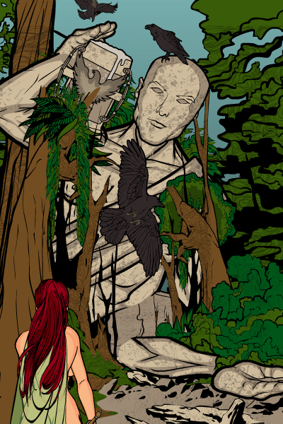
When PapaKrok gets on a roll, it's like nothing you've seen. He can just crank out fantastic image after fantastic image. This week he had four I liked enough to include as Finalists -- "Aquarius1", "Secret of the Water Bearer" (which you have GOT to look at, it's just hilarious), the motorcycle-riding and mildly NSFW "Spirit of Aquarius", and the following "Secret of the Ancients":
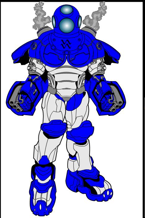
Sutter Kaine layered shoulder pads onto some of the Mech pieces to make a very distinctive and cool looking robot-Aquarius. I think with a little more tone variation in the upper body (just a slightly darker blue for the shadows) and some sort of background element to support the legs (white on the white background makes them a little hard to make out), this one might have won.
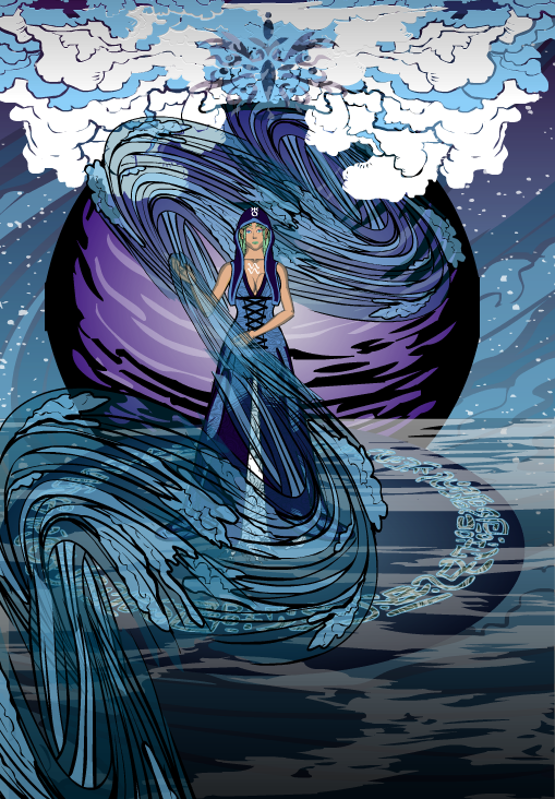
UnknownBlackPaper also had a couple of outstanding entries, with "Water and Sky" and the following "Lady of Water". I love the whole setting here, it's a very effective combination of elements and colors.
Finally, Zforce is back with us again, and provided a heckuva cool image with the female version of "Aqua". I like the colors, and the aura really works well.
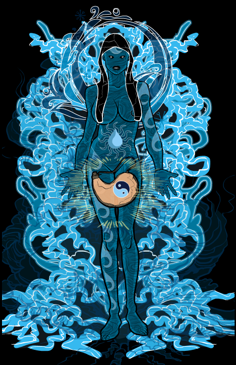
I can only choose one winner, even though as you can see there were many outstanding entries. So I ultimately decided to go with ... PapaKrok! All four of the ones I mentioned were worthy of a win, and I can't ignore that kind of high-quality volume.
I thought "Secret of the Ancients" was simply the best composition and had a very unusual concept. Rather than taking a literal approach, he thought outside the box a bit and gave us something very distinctive. Congratulations, PapaKrok, let me know what you'd like for your prize!

