Having slowly dug out of the big snow storm that hit Durango on Move Day, and having stolen my wife's laptop and USB cellular internet doohickey pending the delayed installation of the permanent Internet hardware, I am happy to finally present the best of the entries for Character Contest 53! I'll list all the Finalists in alphabetical order, before announcing which of them is the overall winner.
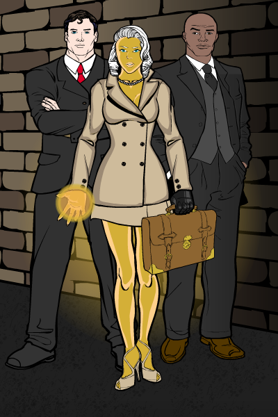
I like a lot of things about Anarchangel's "Gold Digger". The play on words is great, with the gold skin and the professional outfit. The thugs flanking her are great, too. The simple slanted brick wall with the shadow gradient works really well to set the scene without being obtrusive. Plus, no blood and guts, while still being evil!
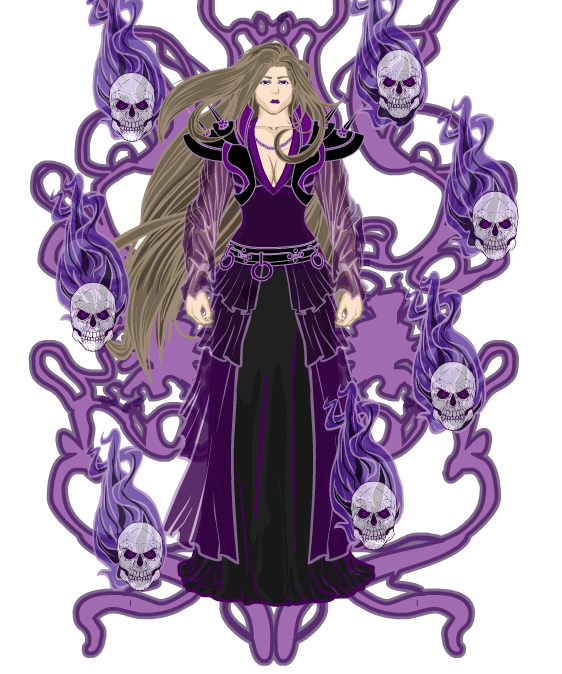
Asder's "Copia DeSiluz" (hope I got that right) features a strong, consistent color scheme and outstanding surrounding elements. I love the ethereal, menacing feeling the composition evokes.
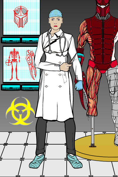
Atomic Punk's "Dr. Menudo" was one of the better "scene" submissions. While the character herself isn't terribly menacing, the surrounding environment most definitely is. I particularly liked the medical charts and the partially vivisected soldier in the background.
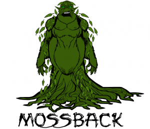
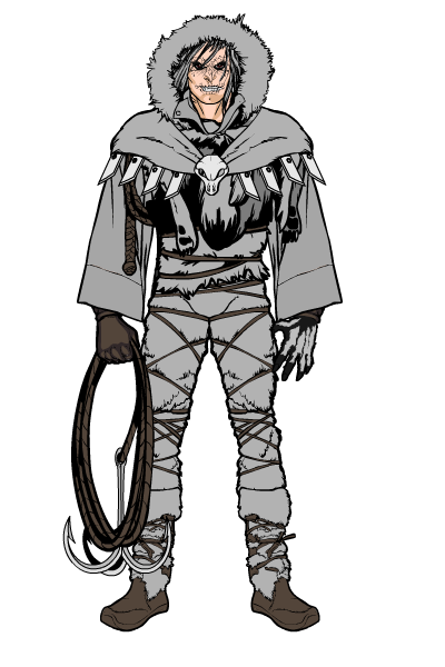
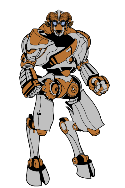
I love Blue Blazer's "Mossback". It reminds me a lot of a Godzilla-like sketch I did for HERO Games a few years ago, with an appealing yet monstrous vibe. The consistent colors, the choice of items, and the teeth hidden in the shadows of the face are all outstanding. This is a character that jumps off the page and demands you find out more about him. Points off for the use of non-HM fonts for the name, but that's forgivable with such a nice concept and execution.
Captain Kicktar's "Pharaos" shows how good an image you can get when you have a very clear and focused idea of what kind of character you want to build. There's not a lot of extraneous gimgawery (I literally just made that word up) cluttering up the visuals; you get exactly what this guy is all about with a glance. I particularly love the face, I think that's really well done.
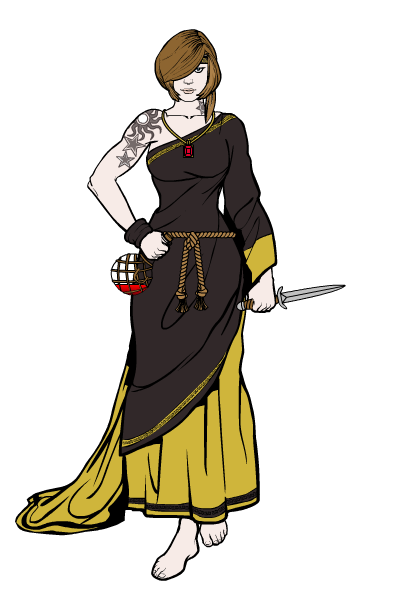
Dawn's "Acolyte" drew me in partly due to the nice use of consistent item selection, but mostly for the way she really looks like she's taking a step. That's not terribly easy to do, but that skirt in particular meshes with the one raised leg to make the effect work.
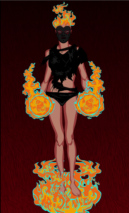
DiCicatriz did his usual outstanding job this time around, and I highly recommend you check out all of his "insane asylum" inmates. I chose "Sear" to represent the collection, as I particularly loved her design and the use of the flame effects. They're all really good, though.
Doomed Pixel's "Spectre" is a great example of how to create a convincing spirit character. I like the red eyes and the way the tattered cloak shows through the body. My only minor quibble would be to wonder where his right arm is, but it's a neat image.
I admit, I like Haxxx's "Satyr" mostly for the head and mouth. Sue me.
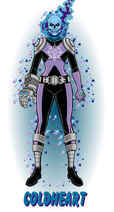
I've said a number of times before that Imp and I share a design brain (as well as a disturbing physical similarity), but I confess that his "Coldheart" is not a character I could have come up with. I love it, perhaps because of that. Excellent fundamental character design, great use of colors and effects, and a fantastic name all combine to make a killer image.
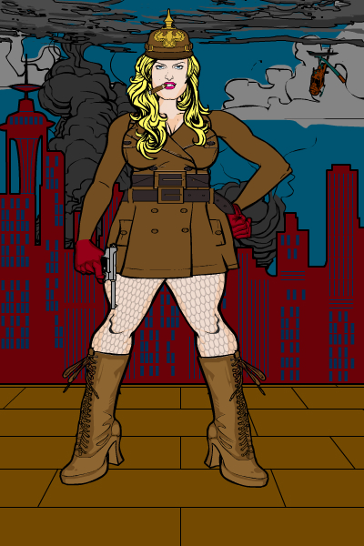
You don't have to work very hard to sell me on a full-figured gal, but Kyle worked hard on his "Bertha" anyway. A really nice concept well-executed.
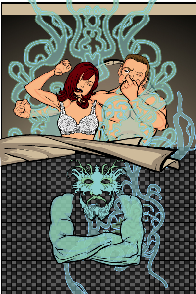
I think Papa Krok's "Aire Bizkit" pretty much speaks for itself, its evil seeping from the page to virtually tickle your nose. Let's just say I've wrestled with this foul demon a time or two myself, so I can definitely vouch for the fact that he's to be avoided at all costs. All of Papa Krok's entries this week were outstanding, I highly recommend you check them all out as soon as you can, you won't regret it.
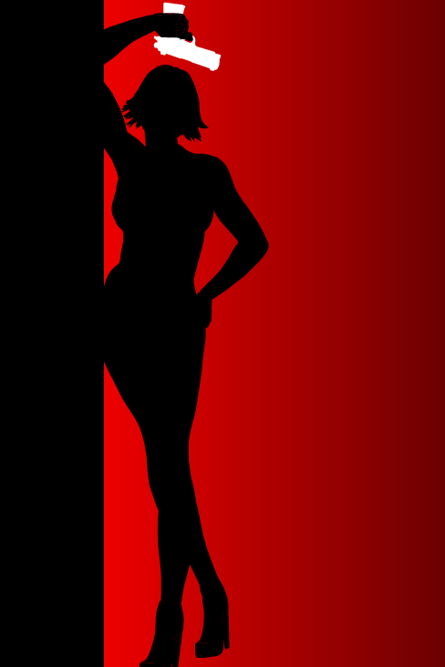
SpellChgeckingQuill's entry reminded me of a Bond film poster, and is one of the strongest images this week, in a design sense. Very cool.
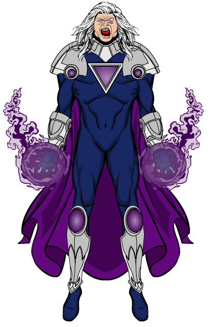
Sutter Kaine's "Lord Wrath" is a great old-school type super villain, complete with nifty tortured scream. I love the outfit and the effects both. Great job, SK.
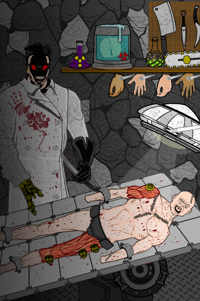
Watson Bradshaw's "The Phantom Doctor", despite struggling with its creator's unwillingness to name his files correctly (ahem), is a stellar example of setting a scene. The use of that floor piece as a table to force perspective is downright inspired. Everything works together to create a convincing atmosphere of evil, including the sinister doctor himself. Really well done, Mr. Bradshaw.
Finally, this week saw the triumphant return of Zyp, who for my money is one of the truly gifted creators regularly using the HeroMachine software. The images he gets out of this thing routinely leave me stunned, and his design sense is impeccable. Looking at his stuff makes you really appreciate that "design sense" is a real thing, and he's got it in spades. Check out all of his entries, they all show at least one thing that make you stare at the screen in amazement.
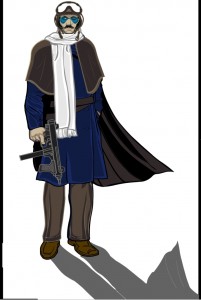
The one I chose to highlight, though, is "The Pilot". That drop shadow is outstanding, totally reinforcing the sort of world-weary sense you get from the rest of the character design. I love the use of colored lines, the stark white scarf almost bifurcating the figure, and the slightly shabby look of his clothing. A great submission, Zyp, I'm so delighted to have you back!
I hope you have enjoyed reviewing these Finalists as much as I did. Truly outstanding work, one and all, I thank you for sharing them with us.
Of course, there can be only one overall winner, and with so many great submissions to try and choose from, I had a really hard time. I finally decided to go with the character that most tugged at my heart strings, as it were, because if there's one thing that makes for a truly great "bad guy", it's the ability to make the audience sympathize with him (or her or it) despite the evil on display.
And the person who I thought did the best job of exemplifying that is the often-nominated, and always outstanding, Blue Blazer for his "Mossback". Something about that character just really appealed to me.
But everyone did an outstanding job, I am humbled at the creativity and imagination you all (and that means everyone, not just the handful of Finalists I had to go with) display each and every time out. Thank you, from the bottom of my heart, and I hope you enjoy letting your creative juices flow as much as I enjoy seeing the fruits of your labor.

