We had a ton of great entries for "Character Contest 47: Weather, weather, everywhere" that really blew my socks off, so thank you all for your creativity! Also, practically everyone got the direct-link url stuff right, which given how aggravating my Internet connection has been was a huge deal. So thanks for that, too!
And now, without further ado, let's get to your Finalists and overall Winner.
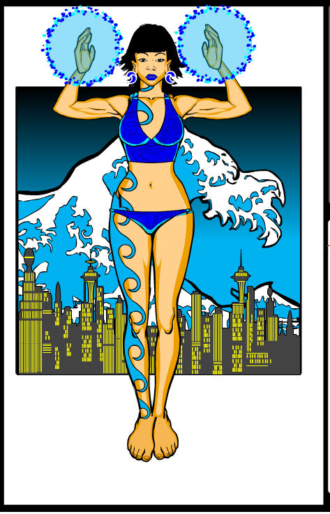
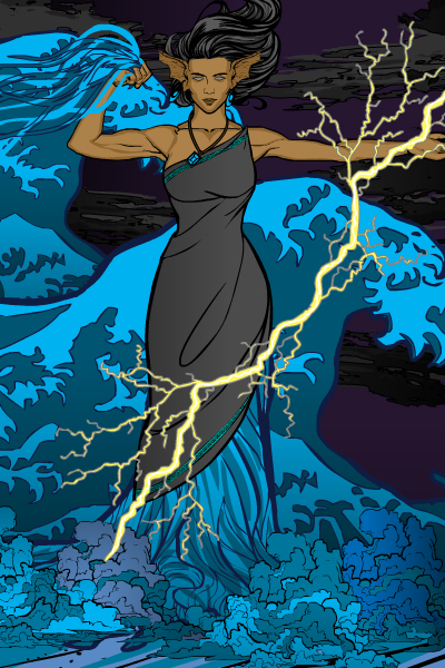
Cliff's "Sue Nami" was my wife's favorite, and I like it a lot too. The use of the city and tsuanmi in a box behind the figure is a great graphic design element, that helps set off the whole thing. A simple, but effective character.
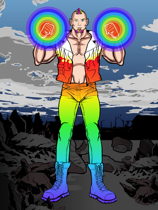
I wanted to show DiCicatriz's "Arc" mostly for the great color blending effect he's gotten with the new two-color gradient. I also love the background he's put together, it's very convincing.
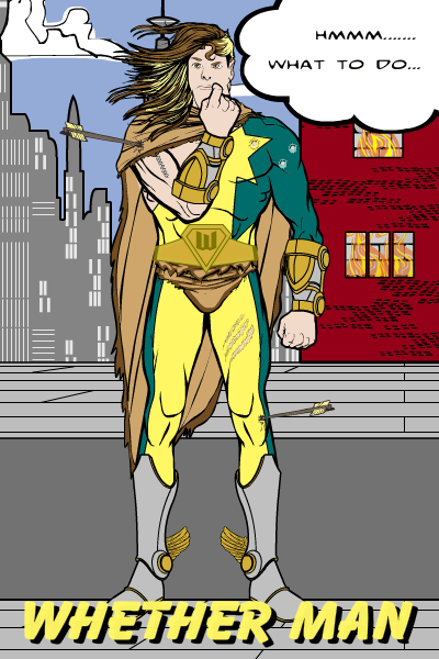
Frevoli's "Whether Man" made me laugh.
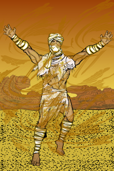
Gargoyle323's "Sandstorm" has fantastic atmospheric effects, particularly in the sky. That looks awesome.
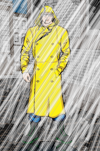
Jack's "Rain Coat" has one of the best straight rain effects of the bunch. My wife loved this one.
I apologize for the bottom of this one getting cut off, I'm not sure how that happened. But I thought Kyle's "Mother Nature" was outstanding, probably one of the best he's produced. The split-background look works really well here. The hand with the rose in it is a bit awkward, but otherwise a really nice image.

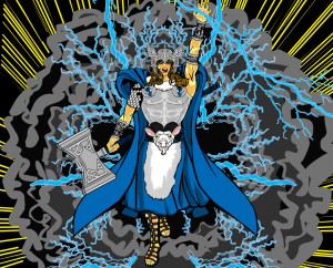
Martian Blue's "Thor" has a lot of great Norsitude to it (that's Norse-style attitude). The only thing that kind of throws it for me is the goat head man-region.
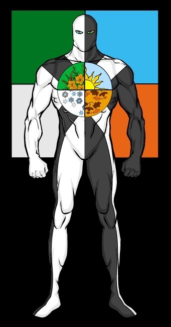
Me Myself and I has a great four-quadrant seasonal logo going on in "All Seasons".
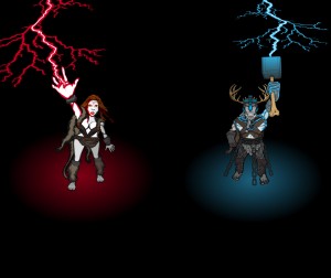
Morzan's "Rodiin and Crimson Thunder" composition is pretty neat, particularly the glowing spotlights and imaginative characters.
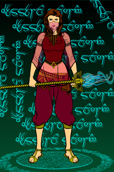
MScat's "Desert Storm" works on a lot of levels, from the outfit to the color choices to the cool background. A nice, solid image.
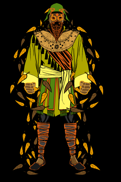
Samurai Pineapple got his image hosting woes ironed out, thankfully, and we're rewarded for his persistence with his "Leaf Conductor". What I liked about it was the great use of negative space in the black line and shading, giving it a sort of black-light look you don't often see. A cool effect.
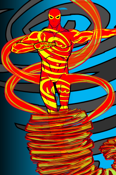
I was surprised last week when Blue Blazer sighed about always being the bridesmaid, as I was sure he'd won a character contest before, but I checked and sure enough, he hasn't. But he IS one of the most-cited Finalists because his images are always both imaginative and very well put-together. This week is no exception, as his "Doctor Tornado" shows. Keep it up, Blue, I am sure a win is in the cards soon!
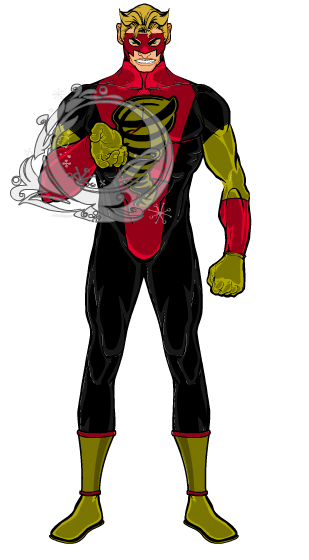
Asder said he had an idea for an Eagle-Weather sword, so he came up with "Ventoso". Wherever the idea came from, I like it! The sword effects are really cool.
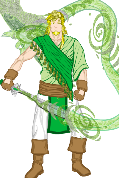
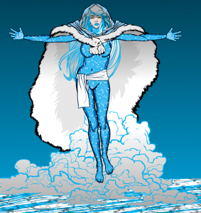
I try to limit these Finalist recognitions to just one per person, but again SpiderCow2010 has thwarted me by putting in three separate submissions I just couldn't set aside. First up is "Winter Queen", which I love for its simplicity and effectiveness. The fur cloak in particular is great, along with the blue hair silhouetted against it.
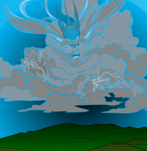
His second was the extremely imaginative "Storm King". We've seen this general sort of idea before, but usually with sand storms a la "The Mummy". Doing it with clouds is more difficult, I think, and in any event it just looks fantastic. I think with a better ground element, this one might have won.
Finally, I really liked his "Scarlet Cyclone", which beats the socks off similarly-themed characters who shall remain nameless. Again, I think a more ambitious background treatment could have made this one the winner as well.
At the end of the day, there were four entries that I thought were all great, and possibly deserving of the win. I couldn't decide, so I corralled my wife and best friend John to help adjudicate. Those four were:
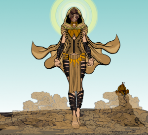
"Arida", by DiCicatriz, just a phenomenally efficient, clean, and effective illustration. the straps, the sun, the dirt pattern on the clouds to make dust, the facial effects, all are completely top-notch.
"PuaUa" by Jenna, which I thought showed a lot of creativity and hard work. Ultimately we all thought it probably had a little too much going on, particulary in the clouds, and would have benefited from a little more editing, but a really fun and cool looking image.
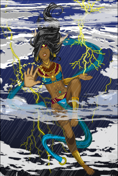
ChrisN's "Agathe" works in a lot of ways, particularly in the innovative use of the clouds as sea foam, rushing into the tree-as-waterspout lower body. That whole section is awesome. I also loved the way she has water leashes pulling the tsunami forward. Ultimately, all three of us felt the ears were the least successful part, and kind of threw the whole figure off a bit. The dress was also a bit plain. But an outstanding use of traditional elements in a non-traditional fashion to make an unexpected and kick-ass effect!
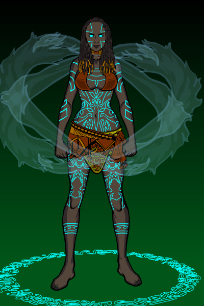
The final one of the four, and the one we all felt most deserved the overall win, was MScat's "Oya". John put it best, that every element was just right, with neither too many nor too few effects. It's a great example of the perfect economy of design. For instance, the blue of the eyes, tattoos, and floor pattern help tie the whole thing together. Overall a great, simple, very powerful character and illustration. Nice job MScat!
And that brings another contest to a close. Congratulations to all the Finalists, to MScat for the win, and to everyone who submitted a design. The entries were all outstanding this week, I cannot express enough how impressed all three of us were at what you are able to achieve.

