Without further ado, I present first the Finalists, then the overall winner, of Caption Contest 43 - Laborer!
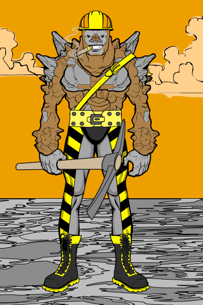
Alan Bates has done something quite difficult with "Hard Work", managing to integrate a "normal" looking human face onto a creature torso. The blending is just great, and the design overall very tight.
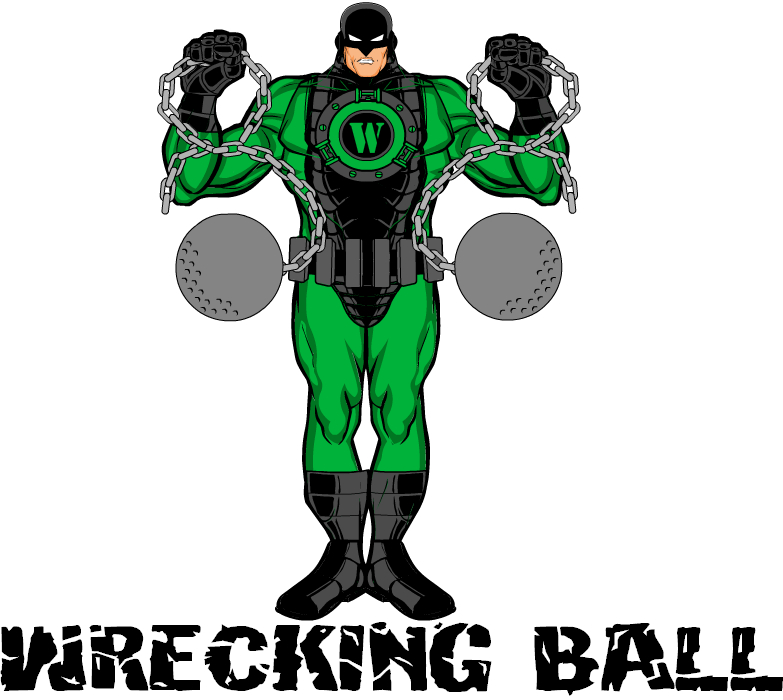
Blue Blazer had a nice team of construction-themed characters, all of which were good but I thought "Wrecking Ball" stood out the most. I like the integration of the boots, which I know isn't easy to accomplish.
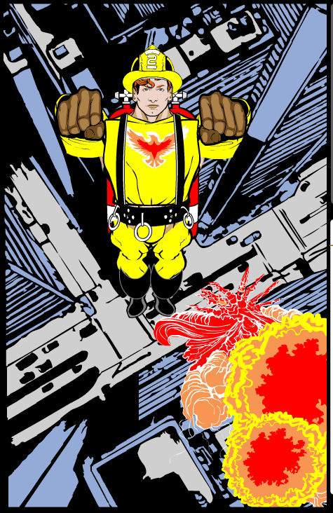
Cliff did a great job in "Firebird" with perspective, both with the figure and with the fireball explosion in the buildings. A very creative use of items there.
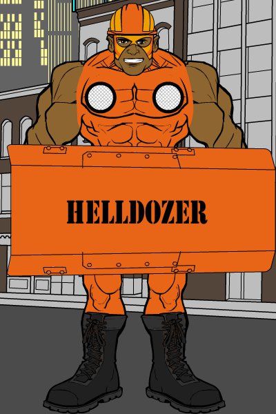
Danny Beaty had one of the cleverest names with his tough-guy "Helldozer":
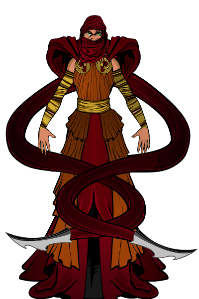
DiCicatriz's "Seamstress" was exceptional both in concept and execution. I love the idea of a cloth-powered character, especially with those razor-tipped shawl edges. All the clothing choices are great and the coloring is right-on as well.
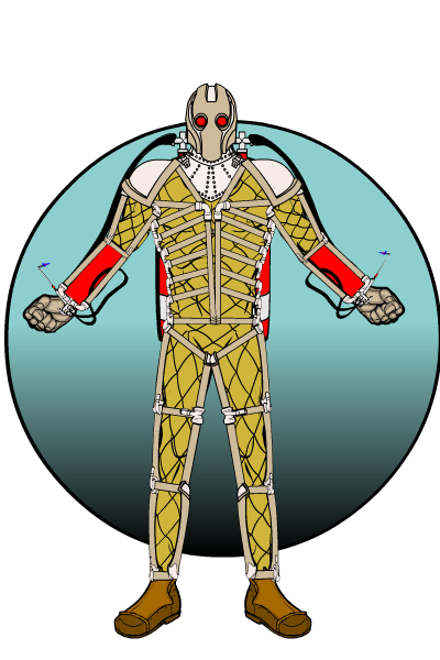
I love the retro-pulp vibe of Gargoyle323's "The Welder", from the painstakingly-created harness to the nifty mask choice.
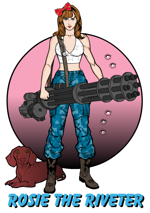
Imp shows with "Rosie the Riveter" that you don't have to go super fancy to get a great-looking character. The item choices and coloring are all simple and clean, but they work perfectly. The bullet holes in the trademarked Imp circle gradient background are a great touch as well. The dog looks a little traumatized, but you can't really blame it.
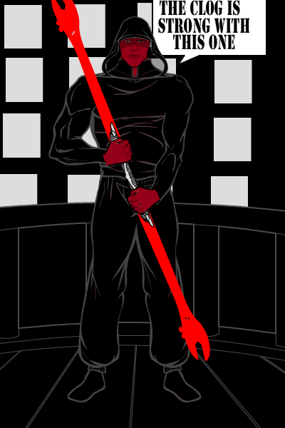
OK, Joe's "Darth Fixit" is just hilarious. I think a lightsaber wrench should definitely be in the next Star Wars franchise.
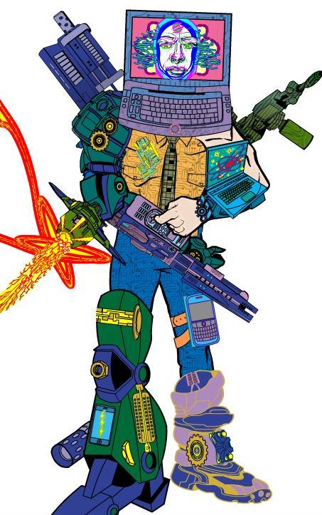
I'm generally not a fan of glomming together a ton of items, but King Slaughter really pulls it off with his "Computer Analyst". I think the face sells it best, looking like a totally cool and funky "Max Headroom" type of thing. A really different, fun illustration.
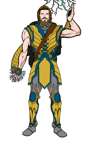
I love Kyle's concept of Zeus as an electrician. That is really cool and funny. The outfit and design are great as well, a very tight and well-conceived character.
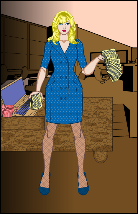
I don't know if the name "Kopy Kat" has ever been used for an actual published character, but it should be -- Phatchick did a great job with it and I think the concept is perfect.
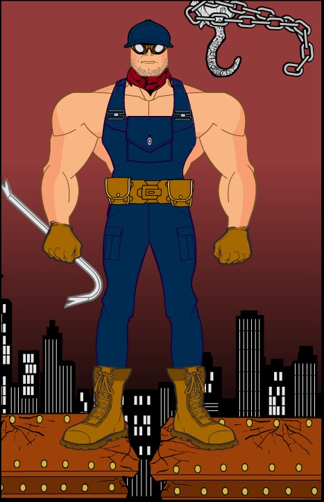
Rancid has one of the best alternative-toon-body characters I've seen yet, with "Blue Basher".
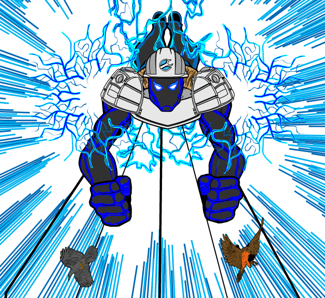
SpiderCow2010 put together a fantastic composition with "The Lineman". I love the electric lines running into the center vanishing point, the birds flying off, and the layout of the figure. Such a cool illustration!
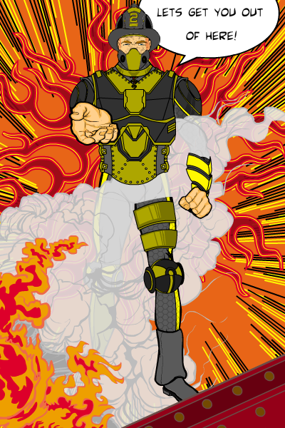
Another great composition is seen in Watson Bradshaw's "Firechief". I love the leg poking out from the smoke, the outreached hand, and the dialog.
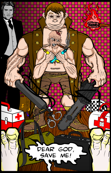
Which brings us, at last, to our winner this week. VonMalcolm put a lot of work into this composition and back story, and the result is as nifty as it is disturbing. Ladies and gentlemen, the winner of this week's option of any item he likes, or a portrait, either of which will be included in the final HeroMachine 3 version, is "Mr. FixIt"!
Thanks to everyone who entered. Tune in next week for the next HeroMachine character design contest!

