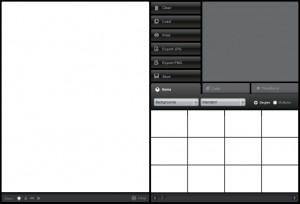
Out of the blue, I got a fantastic set of potential layouts for the HeroMachine 3 interface from all around awesome UI Guy Jim Marcus. You can see some of his other stuff at LiquidCrack.com. Here's what he had to say about this redesign:
What I was trying to do was to keep the interface professional and recessive, so that the characters would pop. I wanted to try and make it feel very much like an application that might run on the desktop. I also think that the comic loving community is savvy and might enjoy a nice dark interface.
Here's the basic page (click to embiggen all of the screen shots):
I think it has a very clean look to it, and everything seems to be organized rationally. The space is used well, and everything seems to fit. I especially love the various "View" options below the character canvas, that's awesome. The space for the ad in the upper right corner is perfect and I don't feel like it's intrusive any more than it has to be.
If you can't tell, I like this proposed treatment a lot. I definitely want to hear what you all think, though, and after the jump I'll post the remainder of the screen shots. I'm going to put them in as a gallery, so just click on any one to see it at the larger size. And please, let me know in the comments what you think, what you like, what you'd change, and so on.


