Many thanks to everyone who entered "Character Contest 36 - Superman Villain", I enjoyed looking at your illustrations and reading your stories. As always, your creativity and willingness to share it astounds me.
I have chosen the entries that I thought were particularly outstanding and am presenting them below as the Finalists. At the end I'll announce the overall winner, who receives any item they like, or a portrait of themselves, to be included in HeroMachine 3.
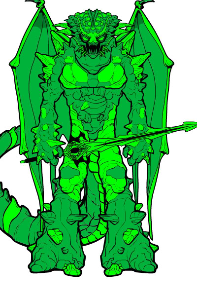
We had a number of "Big Scary Monster" types of entries, but something about this one from Alexander G caught my eye. It's almost too much, but I like it.
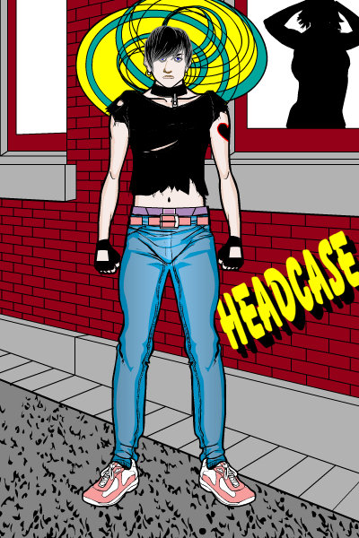
Cliff gave an angsty Goth teen with mental powers, which I think is a pretty fun idea for a Superman villain. I like to think "Headcase" would have him storming off in a huff, weeping for no reason, and changing out his blue tights for black.
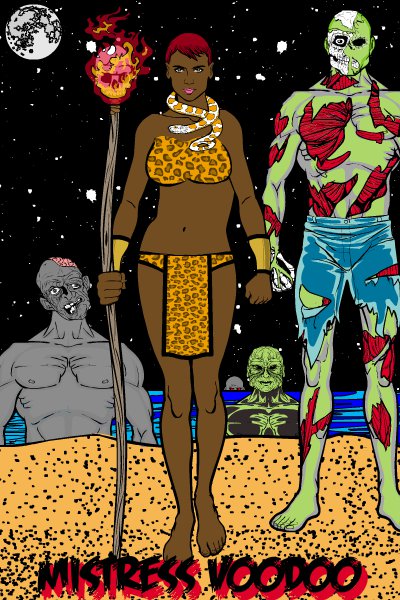
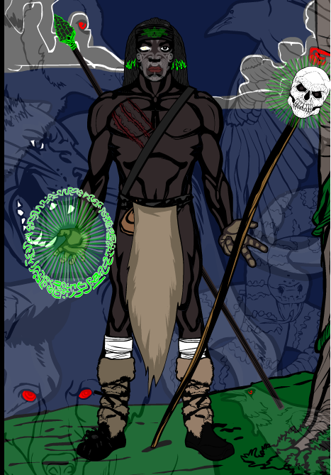
The thing I like best about Danny Beaty's "Mistress Voodoo" is the glowing flame effect on the skull staff. That's cool.
DeColda's "Krypto" is another in the Big Scary Monster series, and I like the way he's put together. The pattern in the arms and legs also looks great.
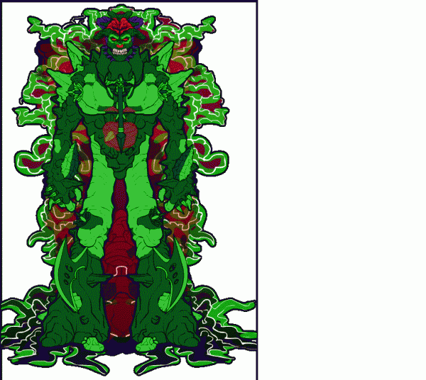
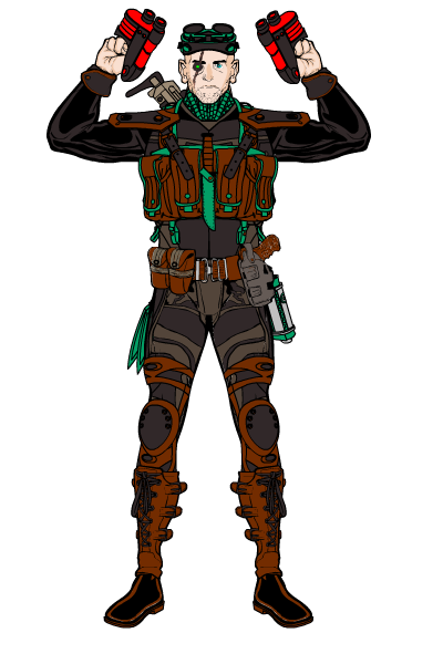
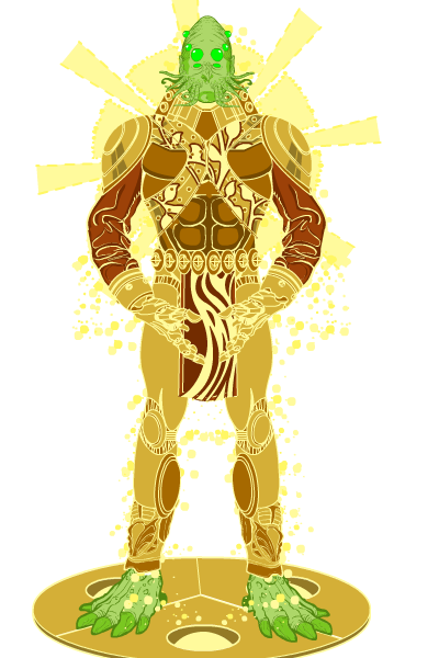
I actually liked all three of DiCicatriz' entries so much, I put them all in! So without further fanfare, I present Iliakos, M2, and Solarium. They're all great designs.
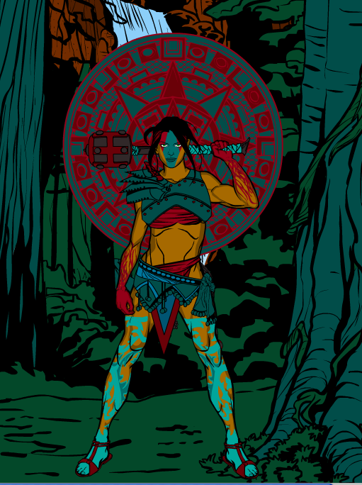
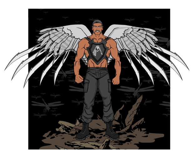
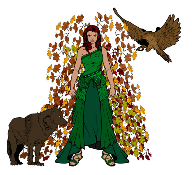
Me, Myself, & I also has multiple Finalists, with "Angel of Death" and "Gaia". I really like how in the Angel illustration he limits the size of the background so the wings break its boundaries, that's a nice effect. Contrast that with the way there's really no background at all with Gaia, and yet that works just as well. I also think both character designs are excellent.
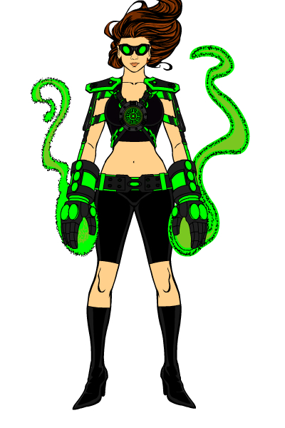
MScat's alternate reality "Lana Luthor" was one of a number of kryptonite-themed characters, which makes sense when you're trying to figure out someone who can go up against Superman. I like this design's simplicity, the use of the two honkin'-big gloves with the glowing kryptonite energy, and the flyaway hair.
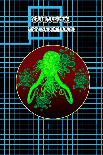
Rancid had one of the most unusual, and thus effective, entries of all with Zyphoriom. I'm pretty sure a glowing green tentacle brain floating in liquid is bad news for Big Blue.
Rico's voodoo-themed "Mowjo" has one of the best faces I've seen in any entry to date. Really nice job on that.
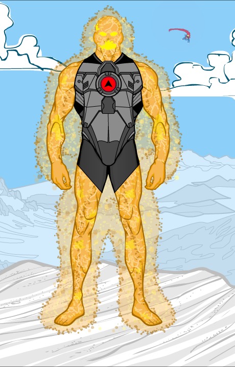
I think Tango did everything well in this illustration of "Solarite". I love the line coloring and effects on the "fleshy" parts of the body, especially as contrasted with the hard metallics of the containment suit. The mouth looks like real fire, too. The background being washed out works great, and of course the little detail of the streak in the sky rocks. Great job all around, Tango!
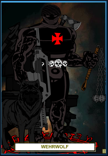
Finally, I wanted to include VonMalcolm's "Wehrwolf" as a reminder that you can still get a great-looking character out of HeroMachine 2!
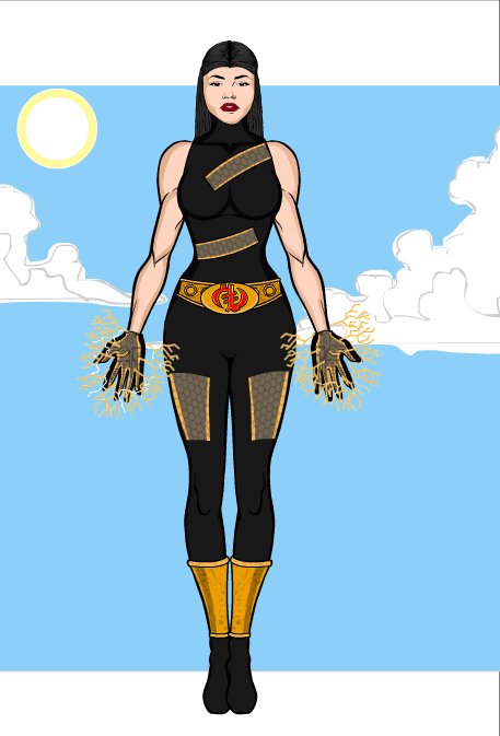
Which brings us at last to our winner, which shows that you don't necessarily have to throw everything and the kitchen sink into your illustration to make it effective. I love the simple, clean lines of the costume, the DCAU-style cutouts with chainmail showing through, even the way the hair blends into the top. You also see the same close-crapping of the sky as in the "Angel of Death" above, so that the background becomes not just part of the image, but a framing device for it.
Great job on "Kes Nal", Jack Zegler, and congratulations on your win!
Thanks again everyone, and if you didn't win or place this time, never fear -- another contest started earlier today, so take a crack at designing a Golden Age Heroine!

