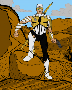
Many thanks to everyone who took on the admittedly difficult challenge posed by Character Contest 34 - Adventure, which called on you to design the look of a proposed character named "Cavalier". I've picked the ones I thought hit the mark exceptionally well, and then at the end the one I thought was the overall winner.
First, a quick word about how I chose these. I tried to look at the entries from the point of view of an editor, who's trying to put together the most effective possible book. He's already got the basic story, but he needs to make sure the artist's version meshes well with it. So some people submitted really neat illustrations, but that didn't really fit the overall concept terribly well, or that wouldn't have wide appeal.
Having said that, here are the ones I thought were both good drawings and that fit the book's concept particularly well!
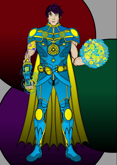
ChrisN's version features a nifty blue and yellow color scheme and a very effective repetition of circles in the outfit itself. I could see this kind of look coming from a culture that watched a lot of "Dr. Who" movies, or the more science-fictional adventure films.
DannyBeaty took a more humorous and fun tack with his design, and I like it very much. My original concept of the character was actually as a goofy, fun-loving, anything-goes guy just out to have the best time possible while crushing evil doers, and I think out of all the Finalists, this one comes closest to that conception. This one has a very "Errol Flynn" kind of vibe to it, very Zorro with some flash thrown in.
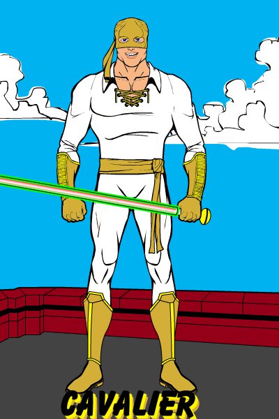
If the home dimension got multiple copies of "Demolition Man" I could definitely see Fyzza's take. It's very French Foreign Legion by way of the Space Cadets.
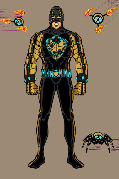
I like Gargoyle323's more tech-y angle as well, particularly the following eyebots to make sure every move gets documented. The spider one in particular is kind of cool looking.
Matt had two versions of his attempt, and they're both pretty neat.
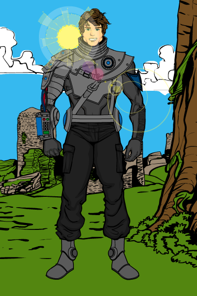
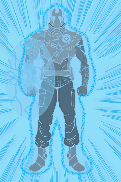
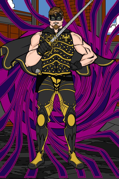
The "First Runner Up", the one I was really close to choosing as the winner before going with a different one, is from BNE. I like how this mixes the more traditional idea of a cavalier with more up to date styling, while retaining a devil-may-care sensibility about the expression and overall character.
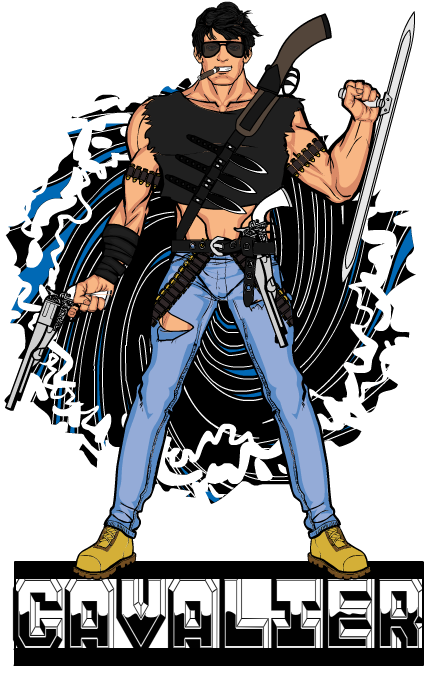
Which leaves us with this week's winner, from a guy who really dedicates himself to getting all the details right. I fell in love with the simple but highly effective background, and ultimately the almost perfect synthesis of all those Sylvester Stallone and Arnold Schwarzenegger action film leads. I could totally see this guy blowing in from the portal, looking for hot action movie violence, and getting blank looks from the mall kiosk attendants. So congratulations to this week's winner, MartianBlue!
Thanks again not only to these outstanding Finalists, but to everyone who entered.

