Many thanks to all the great entries for Character Contest 29 - Armorium! I've picked a handful of illustrations I thought were exceptionally good to serve as Honorable Mentions and whet your appetite before getting to the big winner.
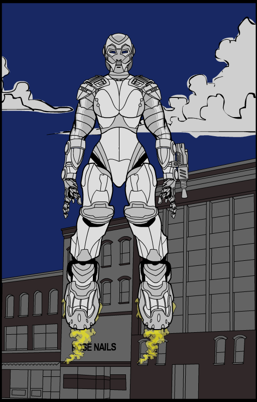
RoboGirl by Brons
I liked how Brons was able to keep a sense of femininity in this armored-up character. The wrist-mounted gun and boot flames were also cool
(Click to embiggen.)
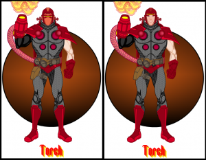
Torch by Crinold
I liked this ensemble, with the red bits nicely offset by the gray underarmor. The use of the robo-tentacle as a tube conduit for the flamethrower was also well done. And I like the side-by-side view showing him both with and without his mask. I didn't ultimately feel like this was really an Iron Man style armored design, but I did think it looked great.
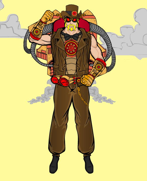
Captain Steam by Demented The Clown
I almost picked this one as the overall winner, both because of the super cool gear gloves and the overall nifty steampunk vibe. The design carries through the entire figure very well, I like this one a lot. But, like with Crinold's, I didn't think it was really a fully-armored design. Well done, though!
(Click to embiggen.)
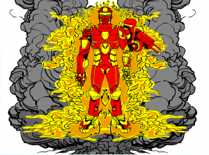
First Responder by Hammerknight
I picked this one as an Honorable Mention because I thought it was the strongest characterization out of all the entries. The name and the auras make this a definitive hero, a guy with a mission and a reason for being. The design is good too, but it's all in service to the concept, which is hugely important.
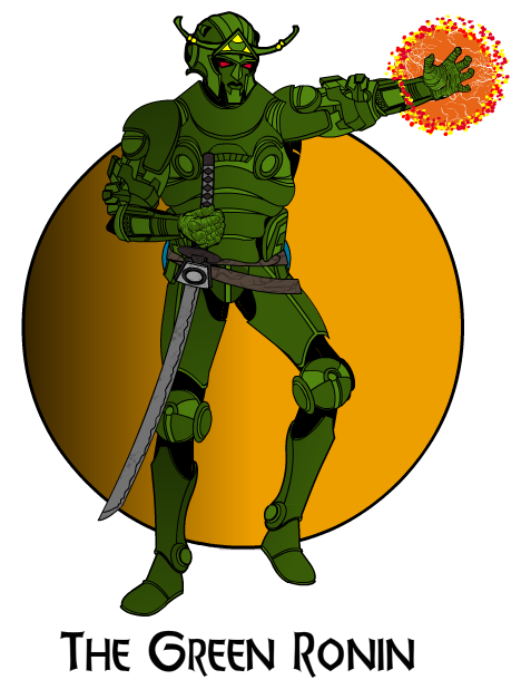
Green Ronin by Imp
Green Ronin also has a strong sense of identity, which I like. The addition of the antennae to the robot head also help jazz it up, and the pose overall has a lot of life in it.
Which brings us to our overall winner for this week. I'm glad he's bringing home the gold (and a prize of whatever item he wants, or a portrait of himself, to appear in the final HeroMachine 3 version), because every time out he's working hard and putting together strong submissions. So let's hear it for the winner of Character Contest 29, Kyle!
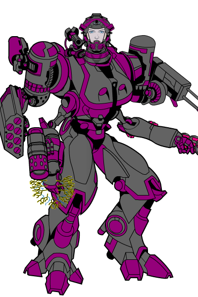
Three things brought home this entry as the winner, rescuing it from the fate of being too generic by dint of the matching pieces that I more or less drew to match on purpose. First, I like that the face of the character shows through the helmet. Tweaking the alpha on the actual face is a nice touch too, making it look like she's behind glass. Second, I love the extra set of limbs mid-body. That's just neat. And why not, she's in a huge robot suit, it ought to have as many limbs as needed. And finally, the simple color scheme is very effective in tying the whole design together.
Great job Kyle and everyone who entered, thank you all very much!

