Thanks to everyone who entered Character Contest 24: Super Enemies! Before I get into the Honorable Mentions and then the overall winner, I wanted to say a quick word to recap how I go about judging these things.
- On Tuesday morning, I save all the image files that were entered into a folder, renaming them with the entrant's name and the character name. This can take quite a while.
- Eat lunch, because come on, right-clicking and typing is hard.
- Scroll through the entries one at a time and if an image piques my interest, move it into a new folder called "Finalists". This is mostly a gut-reaction kind of thing. Characters that show a solid sense of design and that make good illustrations are what I go for. Sometimes it might be one particular element or effect that has been done very well that makes me save it, other times it's just an overall impression.
- Once the Finalists are all ready, I go through those one at a time more carefully. Some will get moved back to the general folder at this point for a variety of reasons, whether it be there were too many other ones like it (one of which maybe was better), or because it just doesn't hit me the same way, or because I just have too many Finalists and so the weaker ones don't make the cut.
- Start writing the post. I usually haven't yet decided a Winner yet at this point -- something about the process of writing the summary of each one, along with why I liked it, helps crystallize the decision for me. Of course, other times one just jumps out at me right from the get-go and there's no doubt it's going to be the winner. But not usually.
- Pick the winner and finish the post.
Note that the main criteria is "How good an illustration is this", with "How well does it fit the contest theme" coming in second. The point is to make a good picture, of a cool character.
I struggle sometimes with how arbitrary it all is, and how it's really just my own personal opinion, but there's not much I can do about that and still have a timely event. And hey, it's my site, so I get to be judge and jury, I reckon. That's one reason I was keen on Friday Night Fights, it gives someone besides me the chance to decide what looks good.
Anyway, on to the results for this week!
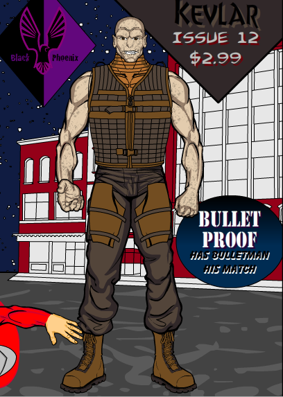
I liked Vampyrist's whole idea. Kevlar would be a great enemy for Bulletman, and the cover he put together is nice as well.
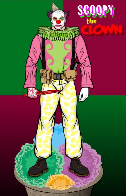
Another fun and effective "High concept" was Tang's "Scoopy the Clown", which practically deserves a Mention just for the name. Luckily the graphic is good too, with a great use of the checkerboard background, color scheme, and Dark Knight-esque grim killer clown motif. I also appreciated the subtle touch of the blood spatter only on the right-hand sleeve, that's a nice detail. Batman and the Joker had better watch out ...
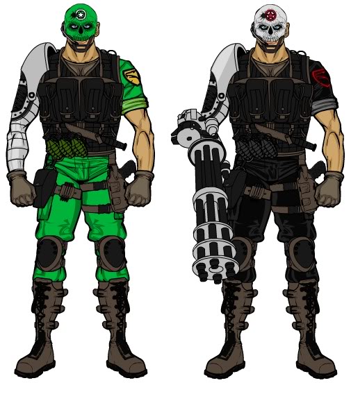
Two of MartianBlue's submissions really caught my eye. The first was this Captain America villain, Major Havok. I liked the helmet and the attention to detail in the uniforming as well as the simple but effective layering of the chain gun to make it look like his arm in the right-hand figure.
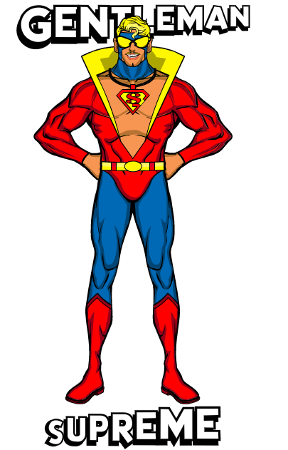
His second noteworthy entry was Superman opponent "Gentleman Supreme", which I include partly for the funny facial expression and partly for the really nice pop-collar effect he has going on there.
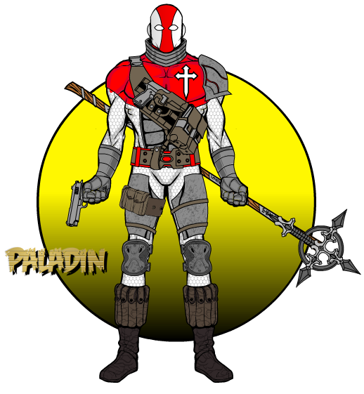
My Imp-crush continues this week with his great Punisher villain, "Paladin", which as I understand it is based on the Ennis-created concept of a priest who's also a serial killer. Pretty cool. And the character design is great, too, particularly the polearm assembly with the new Kaldath-inspired bladed cross and the nifty axe handle. Great colors and overall concept.
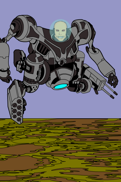
Hero of Wu put forth an Iron Man character, called "The Commander". I really liked the way the legs of the robotic chassis have been replaced by arm guns and the dude's just a floating, bodiless cyborg head. Because that's cool.
Also cool in a "This will give me nightmares" kind of way was Hammerknight's new proposed Spider-Man nemesis, Hybrid. Like Wu, this is a character with no legs, but still manages to be handy in a fight.
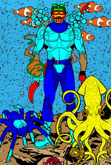
Gene's son was the only one to submit an Aquaman villain, and let's be honest: Aquaman needs all the help he can get to make an interesting comic book. Particularly of note in this composition is the use of the squiggly energy Pattern to make the background look like water, and the ocean-going tarantula. I don't care who you are, or what undersea kingdom you head up, if you see a big aquatic spider swimming towards you, you are going to freak.
The final Honorable Mention of the week goes to DJ, partly for making a nice graphic and partly for the great back story he gave "Alisa Clause" and her quest to hunt down Lobo, the guy who killed her Dad, Santa Claus. Good stuff!
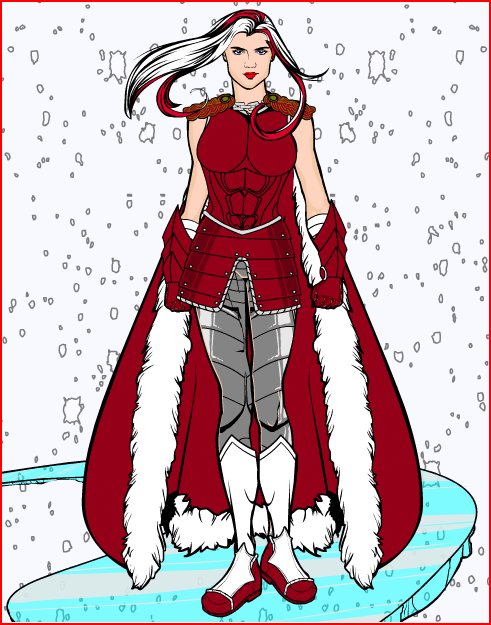
And now, our winner! I am happy to announce that we have a first-time victor on our hands (unless my incredibly high-tech tracking system -- i.e. TextEdit -- is wrong). By far the largest percentage of submissions were enemies for Captain America. There's just something so thoroughly nasty about a Nazi bad guy, it must be irresistible. Of course, next was Iron Man, so I am not sure what to make of that. BUT, I thought the best of the Captain America submissions was MercWithoutAMouth's "Iron Cross", part of a team of German warriors opposing the Star Spangled Super.
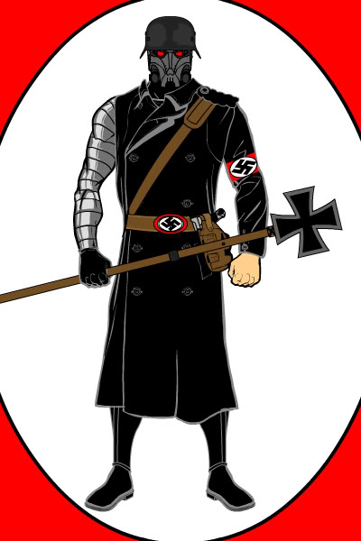
Granted, this particular illustration isn't ground-breaking or freakishly inventive, but it is a very well-thought-out and executed composition. I like how he's kept it simple, so that every element has to be just right to carry it off. Note, for example, the way he's used the red border color as a spot-highlight in the eyes and belt and armband. That really helps tie it together and makes the character pop given the general black and white palette otherwise. I also really appreciated his putting the sleeve on only one side of the trench coat, letting the metallic arm show through. And finally, the helmet and mask combo, along with the hand-crafted staff weapon, really work.
As the overall winner this week, MercWithoutAMouth will get to choose either a caricature of his face or any item he likes to be included in the HeroMachine 3 final version. Congratulations!
And thanks once again to everyone who entered, it was a lot of fun looking through your ideas for new opponents for some of our favorite characters (all of whom are under the copyright of their respective owners, of course).

