The "Greek Mythology" character contest produced a lot of fantastic entries, so thanks to everyone who took the time to participate! I've selected a handful as Honorable Mentions, and of course one overall winner (who receives either a portrait or any one item of their choice for inclusion in the final HeroMachine 3 version) for your viewing pleasure.
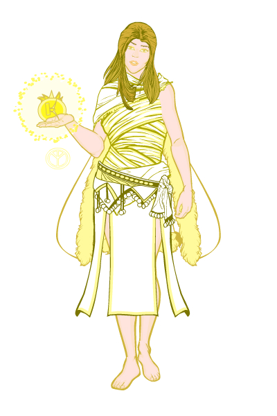
I'm going to go more or less in alphabetical order this time out, because I'm nothing if not alphanumeric. That gives us our first entry, "Eris" by Ahserian, which I liked because of it's nice inner glow effect and the innovative use of wraps as a pseudo-toga:
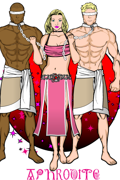
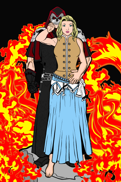
I chose two entries from Anarchangel, both of which show excellent mult-figure compositions. The Aphrodite one in particular looks great, but I like "Hades and Persephone" quite a bit as well.
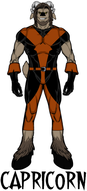
"Capricorn" by Blue Blazer is just a very strong and simple super-hero character design. There's nothing super fancy or flashy about it, but all the colors and elements work together to give a very strong sense of someone you'd want to know more about.
Crinold's "Avatar of Zeus" I liked, although it borders just on the edge of "too busy". Still, it's a very creative use of the application and has a lot to recommend it:
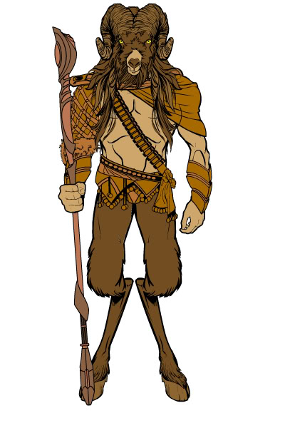
Like Blue Blazer's entry, Dennis' "Satyr" is very simple but effective. You don't have to throw a thousand items and use advanced tricks to put together a good character so long as the separate elements work well together and the color scheme is well thought out.
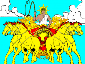
We've all enjoyed Hammerknight's creative uses of the application and helpful guides to reproducing some of his techniques. This week he put it all together in this great "Apollo", using flipped and duplicated horses to great effect and essentially building his own sun chariot from scratch. I wish I'd put a better sky to serve as a background because the character design deserves a better setting.
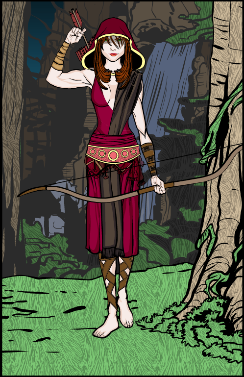
Iago Valentine always manages to infuse his compositions with an almost other-worldy sensibility, and his "Hunter" is no exception. I love the colors and the way the background uses a dark gray line color instead of black to make it look like it's more in the distance. It's a subtle but very effective trick. I also liked the way he used multiple background elements to make a whole new scene.
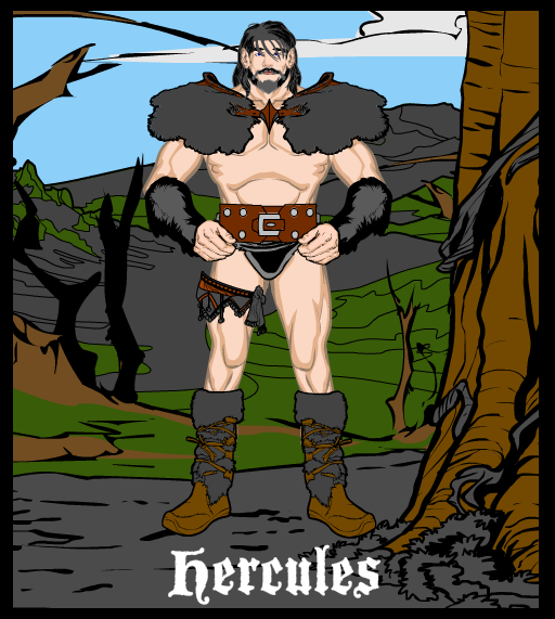
Several different versions of Hercules were submitted, but I liked Kaldath's the best overall. I think he stretched the shoulders out under cover of the furry shoulder pads, which makes him look more muscular and demi-god-like.
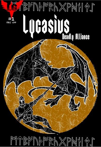
I cannot encourage you enough to check out Lawrence's frankly staggering HeroMachine-assembled comic book. I can't imagine what a pain this must have been to put together, and I heartily applaud how far he was able to push this thing. It's pretty darn amazing, thank you Lawrence! Here's the cover image to hook your interest, which is a great image just on its own. I love the use of the lightning pattern to suggest an ancient Greek urn.
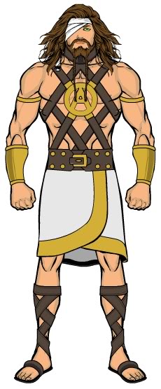
Martian Blue's "Atlas" is a good design, but what I love most is the chest harness. That big metallic "A" chest buckle just rocks. Plus, it was his idea for the contest in the first place, you gotta love that!
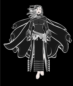
Superfan1's "Nyx" is a great use of black and white to achieve a really fun and impressive effect. I like the multiple capes and the cool sleeve ends, too.
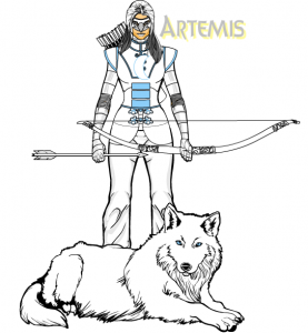
Vampyrist's "Artemis" was one of the better modern reinterpretations of a Greek mytho, with a strong color scheme and concept. I should take points off for her holding the bow palm-out like in that Liefeld Babewatch poster, but putting a wolf in the picture will absolve a lot of sins.
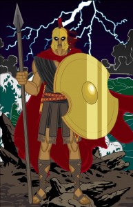
Finally, our last Honorable Mention goes to Zyp for his outstanding use of color and composition in his "Achilles or Something" illustration:
All of which brings us to this week's overall winner. After making so many great contributions to the community, I am pleased as punch to give you a winner at last for none other than our Thursday Recipe Man, Hammerknight!
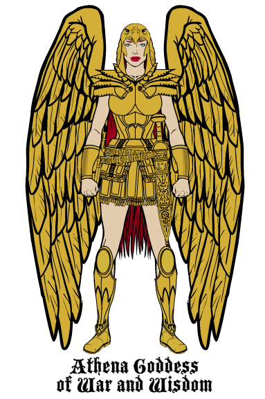
I'll grant you that many of those pieces were more or less designed to work together, but the coloring and overall conception elevate this above a simple cut and paste job. The real clincher, though, is that helmet. Yes, yes I know Artemis actually had an owl as her bird companion, but that's a wicked cool helmet and you know it! Plus I can't figure out how he did it which is always a big bonus. I liked the overall tight design and effect she has, and am delighted that this one came out on top.
Well done, HK, and all our Honorable Mentions!

