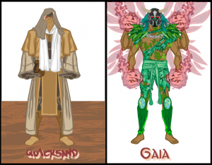
The character contest challenge this week was to take a common phrase of two words (or three if you could swing it) and turn that into a super-powered pair of characters, like "Hawk and Dove" or "Love and War" or "Cloak and Dagger". A lot of the entries were very good, but the featured pair weren't really a phrase like that. For instance, I think Crinold's "Gaia and Quicksand" are marvelous illustrations, but "Gaia and Quicksand" isn't a saying:
Having said that, I thought the following submissions were great examples of good illustrations that also fit the contest concept. Well done all!
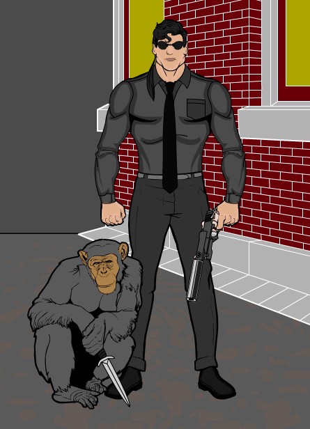
First up are a couple of entries that I thought were very clever or which made me laugh. Gene's "Monkey Business" was a very clever idea of a detective duo with that name where one of them is actually a chimp:
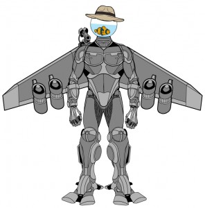
In a similar vein, Mr. Vampire's "Fish & Chips" features a singularly unlikely duo that I thought was very funny:
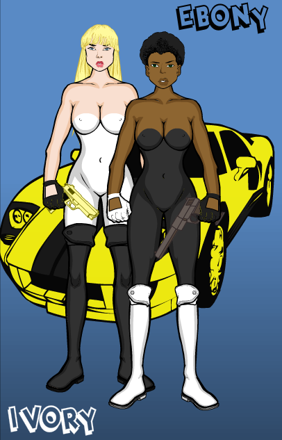
SongBird's "Ebony and Ivory" was sort of a cross-over for me in that it's funny, but I also think it's a good idea. I know I'd much rather see this pairing than McCartney and Jackson. Plus, bonus points for use of the car. I can totally see this as a "Starskey and Hutch" remake.
Imp turned in his usual strong effort, which might have won if the word pairing were more of a phrase. I think the actual character designs are stellar, with a lot of great detail and personality.
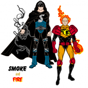
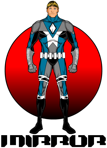
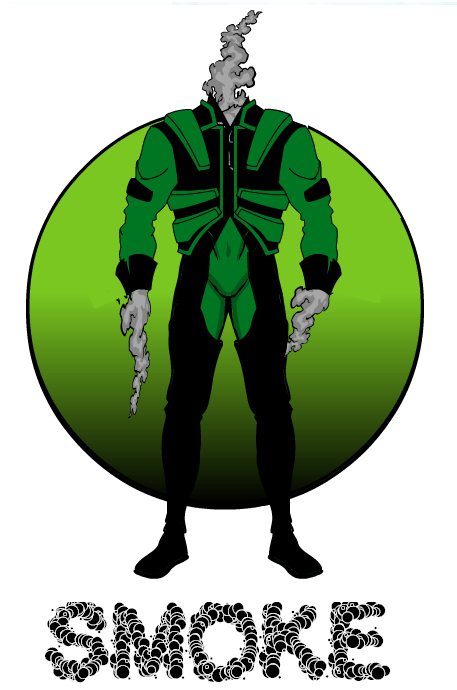
BlueBlazer also turned in two very strong character designs, and their pairing was more what I had in mind, featuring "Smoke and Mirror", a more common phrase rather than two words which are often used together. I especially liked the effect of Smoke's body snaking out of his uniform, that's cool.
KingMonkey turned in "Shock and Awe", which I thought was a good pairing. What nailed it though was the background on Shock, which I think is one of the best I've seen yet.
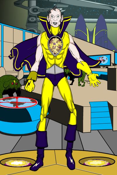
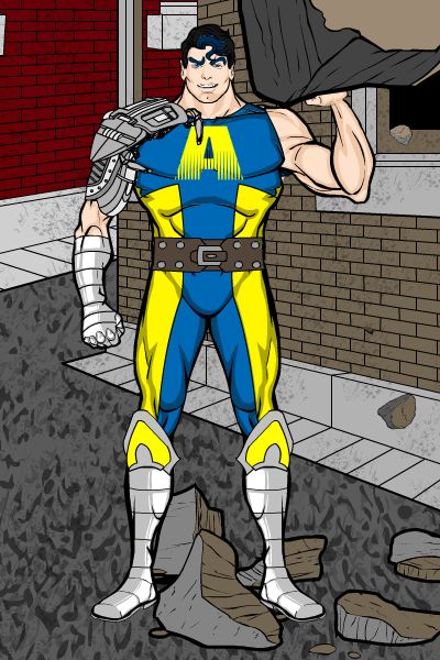
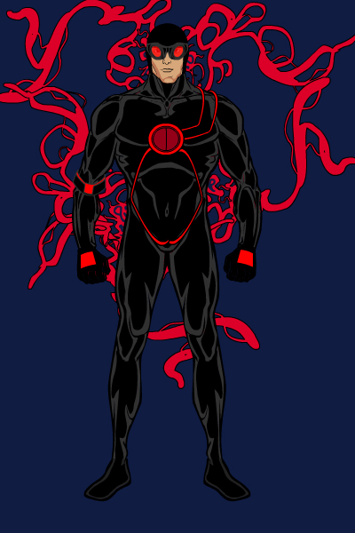
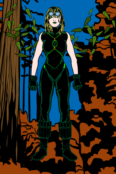
Rancid won the last multiple-character contest, and he came darn close again this time around, with "Crimson and Clover". Their uniform designs are outstanding, particularly the use of the colored piping that is similar for both of them while still being distinctive on each. I also liked the energy effects behind Crimson, it gives the illustration a lot of interest and depth. Very well done, Rancid, on both!
Finally, our winner. I really liked this illustration's "mood", which is a difficult thing to achieve. Everything works well, from the improvised clarinet to the characters' distinctive personalities to the background colors and font choices. Drummergirl's "Rhythm & Blues" really hit the mark of the contest concept, and is a fun and original composition to boot. Well done, Drummergirl!
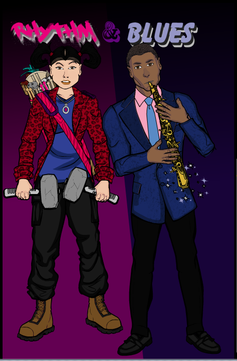
As the overall winner, Drummergirl will get to choose either one item or a caricature of her face to be included in the HeroMachine 3 final version. Congratulations!
Thanks as well to everyone who entered, there were some great drawings and I really appreciate your time and talent being shared with us.

