You all submitted some great, creative, fun, interesting, and well-thought-out entries for last week's contest, and I wanted to say right off how much I appreciate the work and care you obviously put into these images. I built HeroMachine mostly because I knew there were an awful lot of very creative people out there with visual stories they wanted to tell, but who just lacked the tools to put their imaginations on paper. You continue to show how true that is week in and week out, so thank you for sharing your characters with all of us.
Now, having said that, I had to go through all the darn things and try to limit myself to just a handful to post here as Honorable Mentions, and believe me, it wasn't easy. I gave it my best shot, though, and I hope you enjoy seeing the "Best Of" gallery below.
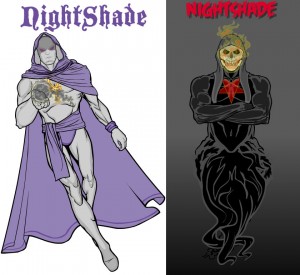
First out of the gate, I thought Brons' two Nightshades complemented each other well. Both are strong designs and they look great next to each other.
Chase gave us "Blue Hurricane" and "Evil Hurricane", and while I thought the good version was pretty good, it's the bad iteration that really sells the whole project when put side-by-side with his alt. The color changes are striking, even though the basic character designs are so similar.
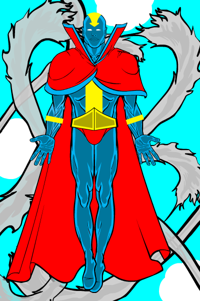
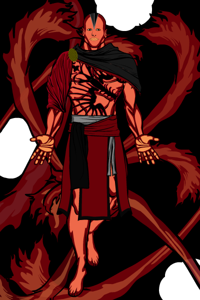
Another good example of effective color design is from Dazed and Confused, including a nice change of background. What struck me about both of these images is how strong they both are in their overall use of consistent, effective color.
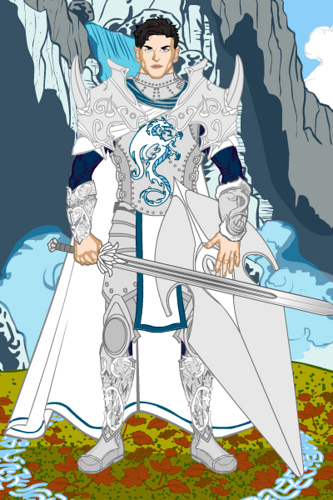
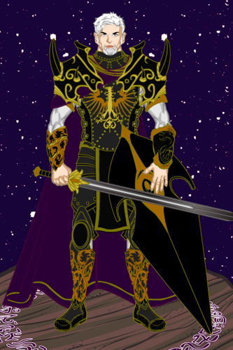
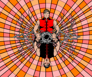
Hammerknight had what I thought was one of the most striking and creative entries this week, which made me really sit back and take notice. He still does things with this program I never would have thought of in a million years.
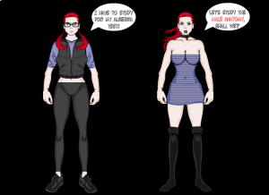
In a similarly creative vein, I enjoyed Song Bird's duo; the dialog really capped it, I literally laughed out loud.
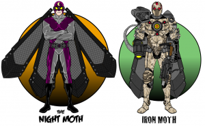
I now have to put in my obligatory Imp submission. I love the guy's work, what can I say? I don't have any penetrating insights to offer, I just thought both of these guys were cool, and they look like they'd be mirror universe folks, you know?
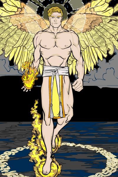
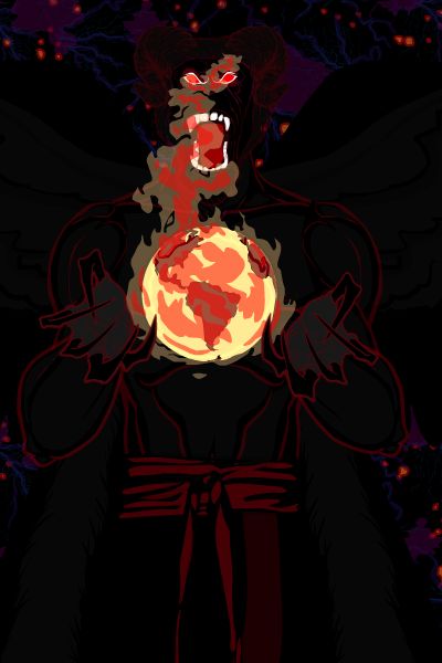
King Monkey submitted two of the best images I've seen to date yet, each very powerful in its way, and each just that much more affecting when seen as two sides of the same coin. Really nice work on both of these, KM. The mood is totally different, and yet works great for each.
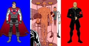
Finally, we come to our winner. I am going to give you two of his submissions because I thought they were both fantastic, either very much deserving of a win. First was his Nazi-turned soldier, which I'll let him describe:
He was our greatest weapon against the Nazi’s but while on a mission in occupied France, the Patriot was captured. He managed to escape but not before Nazi scientists had harvested his DNA. Now Hitler has created his own weapon. Stronger, faster, smarter … perfect.
And next is a killer cover, called "The Magician", which I just loved.
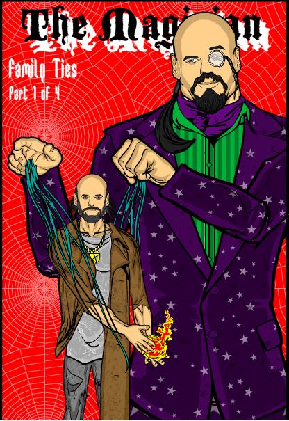
Congratulations, Lawrence! Both of those entries were outstanding, and although you only win one prize, I did want to highlight them both. Well done!
Thanks again to all of the entries. I hope you had as much fun creating them as I did seeing them!

