I admit, the whole "Image Nineties" contest was pretty specific, and probably meant that a lot of people not as "in" on what went down during that decade were probably turned off, BUT ... the entries I did get made me laugh. Like, a lot. So it was all worth it in the end!
Having said that, I think even those who aren't as morally outraged by the artistic excesses of super-hero comics in the Nineties will get a kick out of these Honorable Mentions and, of course, the overall winner that appears at the end of the post.
Without further ado, let's jump in the Wayback Machine!
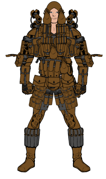
The first entry was, in fact, the first entry, and I got such a chuckle out of it I had to include it. So thanks, Berserker! Your use of pouches to cover almost every square inch of the character is truly an inspiration to us all. His super power must be the ability to instantly recall the exact location of everything in his plethora of pouches. If you could capture that and sell it to women with excessively large purses, you'd make a fortune.
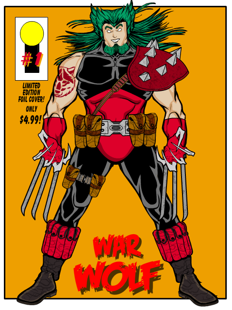
Next I wanted to spotlight two attempts at doing full-on comic book covers, both of which are just great. I love the character designs and the way the covers came out as well. First is Imp's "War Wolf" number 1:
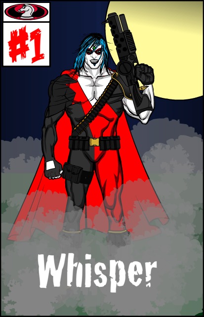
And next is MartianBlue's "Whisper", which has the best "fog" effect I've seen yet in a HeroMachine image.
Rancid also did interesting things with layout, and put together what I think is one of the best custom poses I've yet seen. Leaving out the forearms completely and putting the foot right behind the right leg worked really great. While the claws and the open mouth are definitely Nineties Image, overall I'm including this one much more for the awesome pose than how well it met the contest criteria, because it just looks so good.
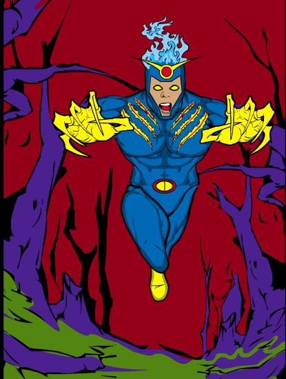
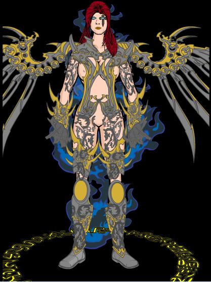
Two of the entrants produced actual cool characters, who literally would have fit right in (in a serious way) with the kind of comics that were successful in the Nineties. Since they do not actively mock the Image stereotype I didn't pick them to win, but they're great designs and definitely worthy of your time to look at. First is Rancid again, with a Witchblade sort of homage that uses a black background and blue flames to nice effect:
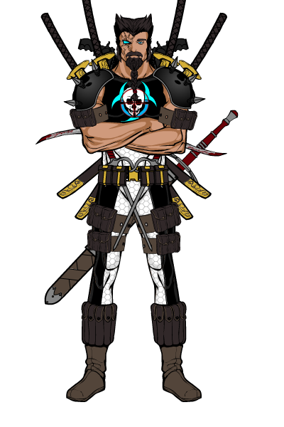
Timespike's "Bloodblade" also fits the bill, looking kind of bad-ass with that scarring or whatnot on the right side of his face. The porcupine-like assortment of blades jutting out all over is very much within the cliche, so kudos for that, but unfortunately the guy just looks too cool to win this sort of mean-spirited mock-fest. If only Timespike had no artistic integrity!
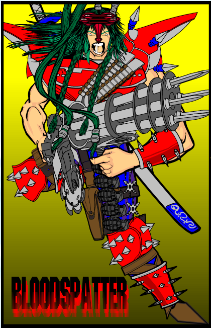
Finally, I wanted to bring you the First Runner Up and the Winner, both of which I think captured what I was going for very nicely -- outright silliness and completely hyperbolic kitsch. And I mean that in the nicest possible way. First Runner Up Ian, for instance, hits all the high notes: the hiding of the feet, the gaping mouth, the excessive hair flying every which-way, the plethora of weapons and spikes, the nonsensical color scheme, and the obnoxious violence-related name. The real clencher, though, is the machine gun that shoots swords! Why oh why did Image not think of that twenty years ago, they might have made millions! I mean, more millions.
The overall winner, though, was pretty clear to me, as judged by the "How loud did I laugh when I first looked at it" scale, was Fishpants' "KillZone":
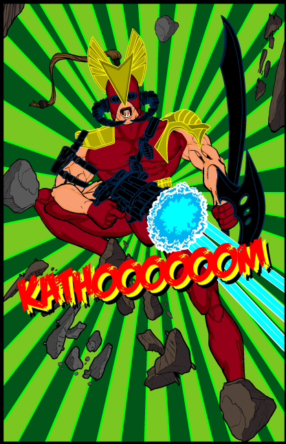
Not only does he hit a lot of the major cliches, he ALSO has an onomontoPOWia, which is one of the best parts of the whole decade! Plus, this pose just screams "ACTION!", practically bursting right out of the screen. I loved it the instant I saw it. Well done, sir! Fishpants wins either a caricature of his head or any one item of his choice to be included in the final HeroMachine 3 application, congratulations!
Many thanks to everyone who entered, I know this was a lot more insider-y than most of the contests, but I hope you enjoyed seeing the great illustrations that resulted and got a chuckle out of them.
I'll post the next contest later today. We're going to take a break from character designs to do another Caption Contest for a little variety, so dust off your "funny" hats and get ready to bring the hilarity.

