While unintentional, you have to admit that posting so late at night IS fairly terrible. Unlike the following Honorable Mentions and our ultimate winner, which are all made of pure awesome!
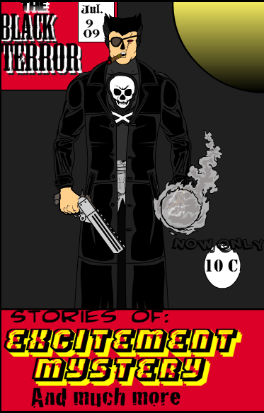
First I wanted to give a shout-out to Almost Insane's attempt at putting together an entire classic pulp comic book cover, because that's just really cool. He even included the "Now Only 10 cent" graphic, which always struck dread in my wee heart as a child because I knew it inevitably presaged a price hike.
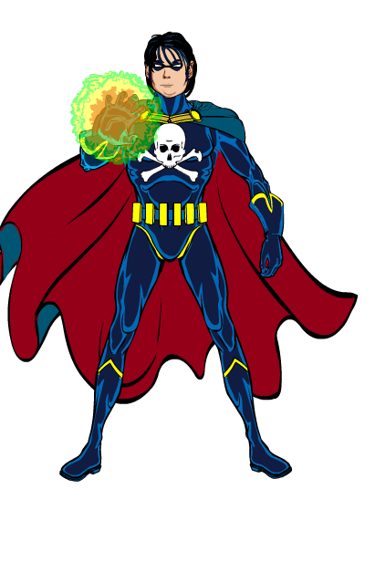
Two other entries also struck a fun chord with their innovative poses. First up was Ian's terrible twosome, the Terror Twins. I really liked the complementary costume designs, but what really sells it is the girl's crouched energy-flinging pose. Both characters have a sense of dynamism and fun, and when you're looking to "re-cast" a series, that's gotta be close to the top of the "Must Have" list.
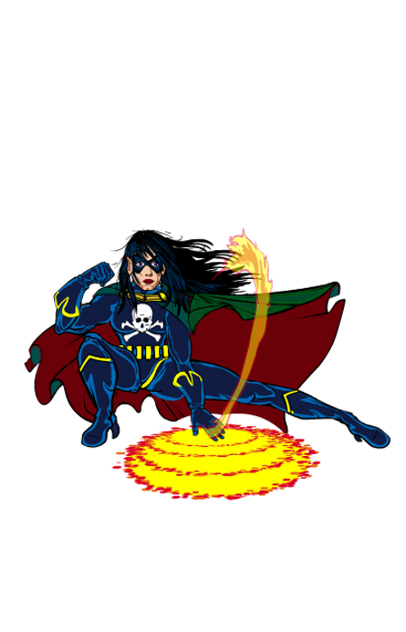
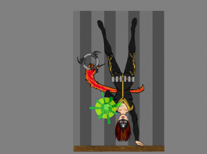
The other "fun pose" entry I wanted to highlight was Isia's one-hand-stand female take on the character. Swapping the gender of a character has a long and storied history in the annals of the comic book industry, so I can definitely see that happening with ol' BT.
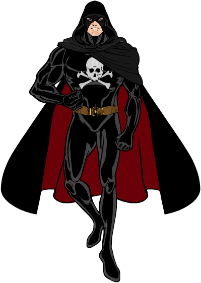
The next entries I thought had the best overall take on what the character relaunch might really be like. We'll start with Brons' very simple "modernizing" of the basic costume which, let's be honest, was already pretty cool. With just a few tweaks the basic integrity of the original is preserved, while still looking much more up-to-date. The cowl, the hood, swapping the blue cape out for black, a thicker more utilitarian belt, and removing the yellow piping show that you don't have to go crazy to get current.
DoomedPixel went for a more radical redesign, while still keeping a few select elements to honor the original spirit of the character. I love the use of the jaw bone and the white shoulder discs to suggest a skull without being an actual skull, for instance. The mechanized, almost steam-punk look works really well, and would make me want to know what changed, why he's still called the same name as the original, and what he's all about. In terms of the image itself, the attempted flame effect at the bottom doesn't quite do it for me, and I could probably do without the clawed hands, but overall it's a really good assemblage. The pseudo-skull definitely sells it, though.
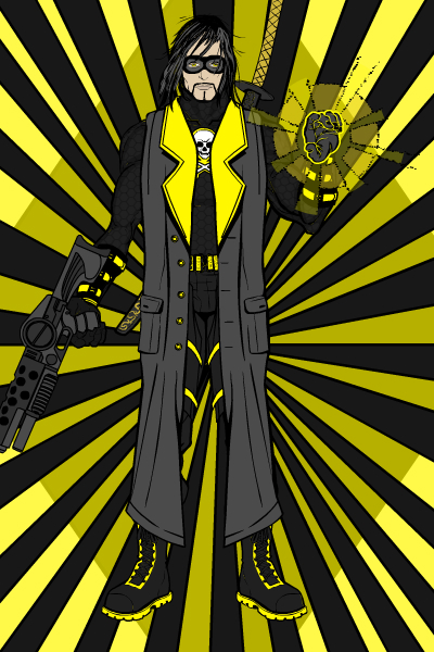
HecNukem also went in a completely different direction with the reimagining, with his strong yellow-and-black gun-toting character. Whereas Brons lost the yellow to good effect, HecNukem chose instead to really go with it, turning what was a weakness in the original character design into a strength. On a technical note, I liked the shadow blob behind the character, it adds a nice sense of dimensionality to the whole image. Ultimately, though, I thought this wasn't quite right for the "Black Terror" franchise.
The winner overall for me was our first two-time winner, and he's doing it in style -- back to back! Timespike takes the prize with his seventh version of the character:
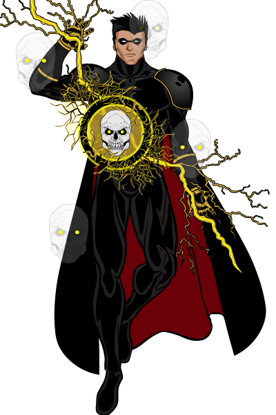
I thought this design should win for several reasons. First, I like that some elements of the original were kept, including that silly domino mask. It works with the rest of the costume here for some reason, maybe it's just the lack of a string. I also like that he kept the red-lined cape, switching the back from blue to black like others did but still retaining that flair. And I really love that the skull has been moved off the chest and into the projection, which is a killer effect. The semi-transparent floating skulls also tell you that this character is about more than just the physical, opening up the possibility of arcane story arcs. In short, I thought this was the best overall take both as an image design, and as a potential jumping off point for a new comics series. Which was, after all, the point of the exercise.
So congratulations to two-time winner Timespike, and to everyone who took the time to create an entry. This was a fun contest and I hope you had as good a time coming up with your design, even if it didn't win, as I did in reading and viewing what you came up with.

 (Click to embiggen.)