I wanted to thank everyone who entered Character Contest 9. You submitted a total of 75 illustrations on the "Elemental" theme, and the quality as always was very high. So if you screwed up your courage to submit an entry, take a second to pat yourself on the back because I really appreciate it!
And now, on to the handful of illustrations I selected for a general overview as Honorable Mentions, and then your overall winner.
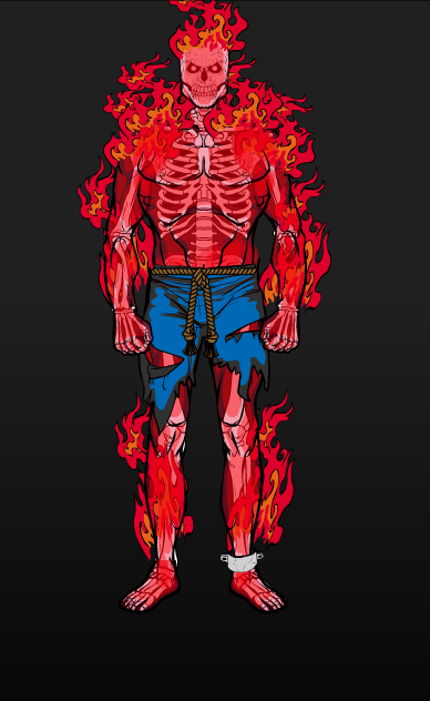
We're going to start off by playing with fire, which was easily the most-represented element of all those submitted. Even though there isn't a formal "aura" slot yet, I think Anarchangel showed how it's done quite nicely here with his "Fire Elemental":
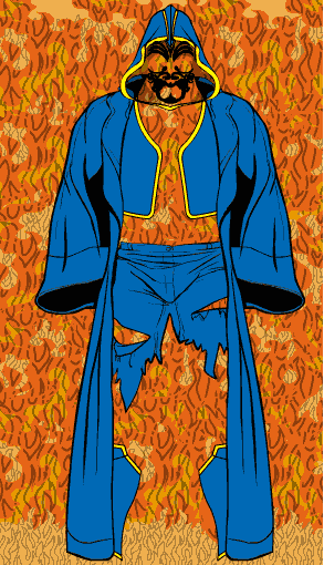
Creator also went with a fire elemental concept, only he forgot something -- the body! I think this is a great example of how good use of negative space (what's left out rather than what's left in) and carefully selected fitted items can trick the mind into seeing something that isn't there:
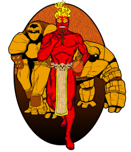
NGpm went up the elemental lord food chain with his "King of Fire", which I included because a) it's a nice character design and b) the use of the two similarly-colored companions helped bring the whole thing to life. With a little color he was able to take two Earth-elementals and turn them into magma beasts. Which is cool.
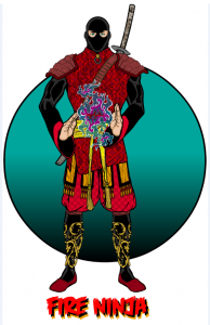
Your obligatory Imp drawing is a "Fire Ninja". I don't know how stealthy a flaming ninja would be, but he looks so nifty I don't really care -- I mean, look at that patterning! As always, a very strong composition and execution from Imp.
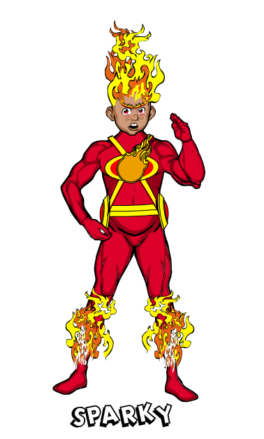
Finally, there were two "humorous" drawings I just couldn't bear to leave out, starting with Ian's "Sparky", who appears to be more of the fire-starter spark rather than the electrical kind; regardless, that face is just wrong and I love it:
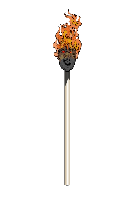
And then there was Mr. Vampire's "Firestarter", a hot-head if I've ever seen one:
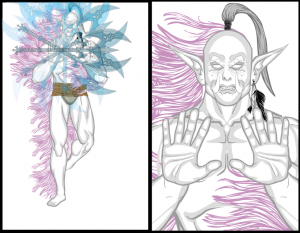
Not everyone went with Fire, though, and I wanted to highlight a few of the other notable entries from the other elements, starting with Crinold's Air Elemental:
That drawing is just chock-full of goodness, from the excellent coloring choices for the body to the multiple weapons spinning and grayed out to look like one in motion, to the cool tendrils flying off of him. A really nice concept well-executed.
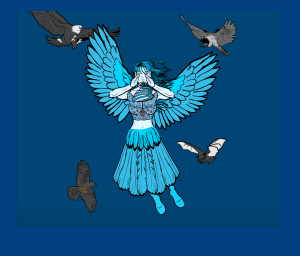
Isia also went with air, although her "Irillianna" is a bit more solid than Crinold's:
I liked the positioning of the body and her use of the "Tail" to act as a skirt. Also note that when the rest of the limbs in question are hidden, you're freed up to position the feet how you like, as she did here to nice effect. By repositioning the wings and surrounding her with birds and a blue background, she also "sells" the idea that the character is flying. A very nice composition.
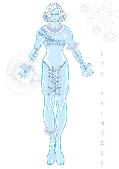
Haydn also was able to assemble a nice female figure, and used great coloring and item selection to put together a convincing "Ice Princess":
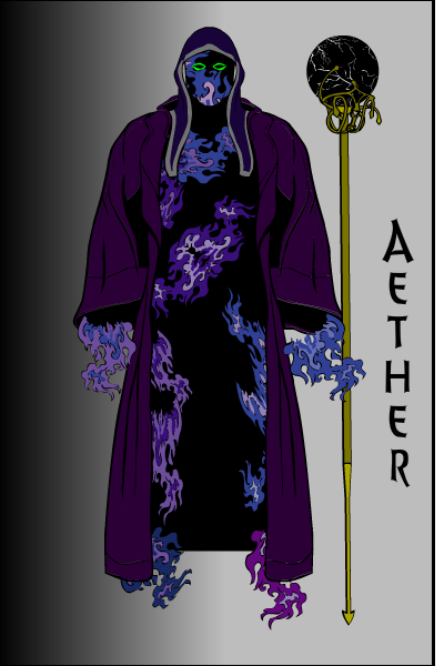
Finally, I loved Whit's use of multiple flames to create the impression of a body in his "Aether":
Ultimately, of course, I have to pick one overall winner, and this week I am happy to announce that person to be ... Andre and his "Fire Satyr"!
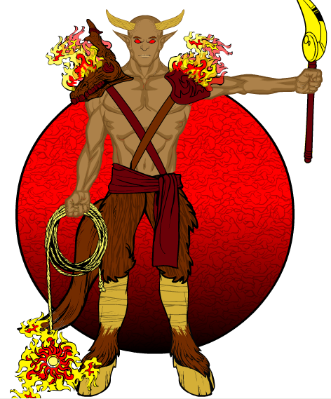
I love love love his flaming rope weapon, the flaming bull's-head shoulder pads, and satyr-feet. The whole character is very well put together and just works, top to bottom.
Andre will get to choose either a caricature of his head or one item to be included in the final HeroMachine 3 product.
Congratulations to all of our finalists, and to everyone else who took the time to enter. I hope you enjoyed putting your creations together as much as I enjoyed seeing them!

