Sorry I'm so late today! As promised last week, here's is the follow-up to my Super-Sizer Poses Post. I have to say, I felt kinda dumb neglecting the larger and more detailed problem of creating females.
Oh, and just so there's no puzzlement from Thursday's post, Hammerknight is doing some work or something for his stuff and asked that I go this one solo instead. Just so you don't think that I'm neglecting him.
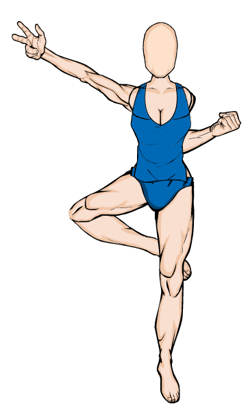
So without further ado, let's begin! 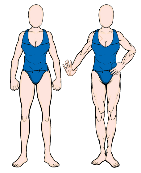 Now here we have two poses, dressed identically in boring-wear that satisfies the need for non-evocative decency. (That particular tank-top always works so well for female figures, because it can fit loosely and accurately with no masking.) The pose on the left is straight from the BodyZombie section, and looks about as action-filled and useful as an unplugged mixer on Margarita Wednesday. The one on the right is admittedly a bit stereotypical-- it's a woman checking her nails. (If you squint until you need prescription eyewear like mine, or click on the image, you'll also faintly notice where I added some Insignia to cover up the extra shoulder lines and the thumb for that cool "resting on waist" hand.) So, to kick some life into this picture, I added a little tilt to the torso and head, and added some flair to the legs.
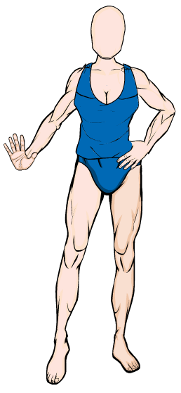 Now we've got a little bit of dance going! I tilted the head a little to the right because when we add hair, this will push her cheek out further, and with a little styling we can get her hair to cover one side of her face, giving a real 3/4 view. (Yes, even better than the one I mentioned last week.)
The hair part is simple. You'll need two sets of identical hair for this one, and a largish square or rectangle from Insignia. Place the first hair underneath the head, then stretch out the second one. This will vary, but the more you want to turn the head, the more ridiculously stretched it will need to be. (As stupid as this sounds, just wait until you try it.) Place the rectangle behind the head with the "line in the middle of the head" somewhere near a part of some kind in the hair if one exists. Mask the stretched hair into the rectangle, line up the outer edges of the stretched hair with the hair underneath, and wiggle the box to get the right connection between the two hair items. Be sure to color the back hair slightly darker...and viola!
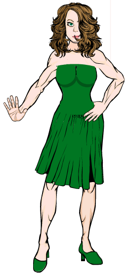 This hair was stretched to at least 150% wide before it began to look right. I used the TopsSpandex abs covering (colored the same shade of green in all three color categories) for the top half of her dress, with the moon-shapes creating a softer transition between her stomach and chest areas. Since there's only one actual dress, I shortened it and rotated slightly to give it that little "twist and flair." I used a third moon-shape for her right shoe, since there wasn't anything remotely accurate in the shoe department. And thus a too-stereotypical female pose became a little saucy and a bit naughty instead. (And if you look closely, you can see the box I used to Mask the hair.)
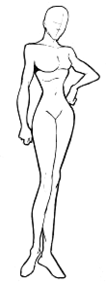
Now, this little beauty to the right here is one of Jeff's own--from a list of poses he drew himself more than a few months back when he was still deciding how he wanted to do HM3. I saved the picture and cropped this one out especially for this post. (I also enlarged it and cleaned it up a bit--it was low res.) I wanted to see if I could pull something off like this, so I started experimenting with the legs, then the right arm. I knew the left arm was going to be the easiest. And I came up with:
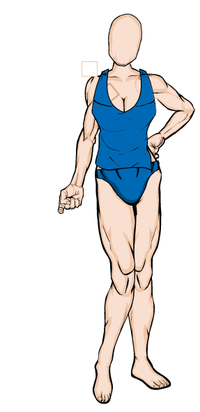 Now, to start off this one, I would like to say that yes, that position is nigh impossible and uncomfortable as heck. I know--I tried it to see if it was actually humanly possible. I barely managed, though I think someone with the requisite bone structure might have a slightly easier time of it. But anyway.
I really wanted to keep that gun pose, too. So I started working up a sort of "biker-chick" look that would allow the pose to really have some bite to it. Plus, the Poll had just started and everyone was talking about the Baroness, so I decided that I'd play off that a little and see where I ended up. Also note that I left the insignia highlighted again--you'll need those two on your left to cover the extra lines from the arm. There actually isn't one on your right--that's the arm itself.
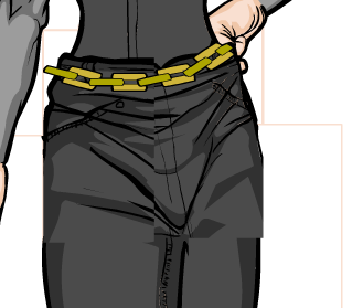
The pants were, I think, the hardest, because I actually masked four sets of pants to get the look I wanted. Not only was it a pain in the butt keeping track, but let me tell you, it wasn't easy trying to line them up afterwards and look even halfway good. But here's the result: 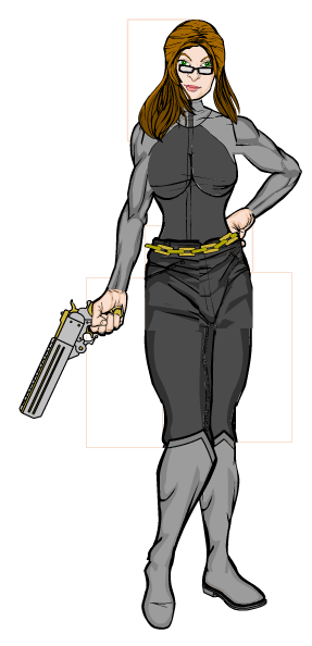
Yowza! The Baroness's kid sister in biker leather, holding a pistol that looks like it shoots deer slugs, her auburn hair drifting sensually across her cheek, around her glasses and down her shoulders--
...
...ahrem...
I mean, it came out pretty well, all things considered. The hair "waving" gives it a more realistic look than I'd expected. (I used the same trick as mentioned before. Look for the lines.) But the pants were still the hardest part by for. Take a look at this closeup:
That's two square Insignia on the hips, and two Background rectangles for the thighs. The lines don't match up quite right this close, but further away that's harder to notice.
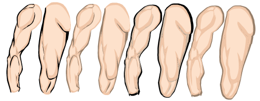
Also, notice that these last two pictures don't look particularly muscular. By carefully choosing the body parts I wanted to use, I was able to diminish the appearance of "masculinity." The legs I couldn't do much about directly, but by masking items over them instead of to them, I was able to hide a lot of leg muscles. Hammerknight will be covering this topic in detail later also, but if you use some carefully sized Insignia, you can cover up some of the offending musculature. Just be sure to leave some of the outer edge--if not, you'll lose some of the more realistic 3-D effect of dual coloring. Also remember the wonders of line coloring:
These are, in order: Regular with black lines, regular with brown lines, light brown lines with a black background, tan lines with brown background.
I included this to show the world of difference that changing line colors can make. By softening the line colors, your muscles appear to shrink, stand out less. If you absolutely need that darker outline, using a second body part stretched slightly can give you an outline while leaving the "muscles" alone. And personally, I've found that using a brown line color instead of black really gives a more realistic skin appearance. Experiment and see what you prefer!
Now here, I decided to do a much more complicated pose than most. This one took me quite awhile to do, especially since Jeff decided to mess with the Save feature halfway through =(
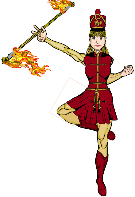
I really wanted to capture a sense of motion with this piece. Something that would need to move, regardless of being only 2-D. So I decided to do a member of a marching band. The idea grew into a drum majorette as I went, requiring more clothing options and activity.
The skirt was the hardest, because I had to match up the lines along her top (stretched vertically until the black chest shadings and collar were in the right locations, then masked to the body) with the lines of the skirt. Then I used a Background rectangle behind her leg to mask a second skirt, stretched 150% and placed just over top. The pleats go the wrong way, but unless you're looking hard it's not obvious. And here it is:
To capitalize on the motion, I used the trick I mentioned the first Poses post to foreshorten the baton--using a shortewr, thinner one along the top and a longer, thicker one for the bottom. The baton ends work the same way, and the flames are not only different sizes but stretched to show the movement.
As mentioned in Yesterday's post, I also experimented with making her look younger, more adolescent. By enlarging the head slightly, and stretching the eyes vertically to give a more youthful appearance, I feel that she came across much more like a middle-schooler than college- or adult-age.
Well, that's all I've got for today. Hope this helps!

